Introduction
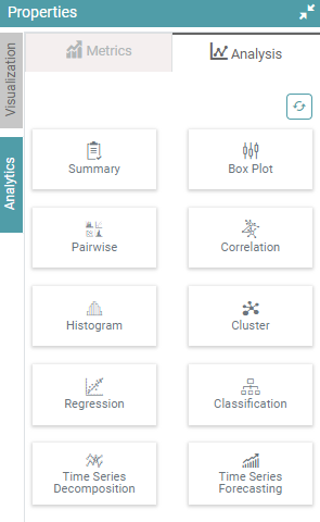
The analytics section in properties has another option called “Analysis”. The analysis part helps users to get more analytical results for their data sources.
Step 1: Under the ‘Navigator’ section, click on the data source you want to perform the analysis on.
Step 2: Drag the Data set to Dimensions under Designer. Your data set will open.
Step 3: Click on Analytics and select Analysis. The list below contains all the options available to the users for analysis of their data.
- Summary
- Box Plot
- Pairwise
- Correlation
- Histogram
- Cluster
- Regression
- Classification
- Time Series Decomposition
- Time Series Forecasting
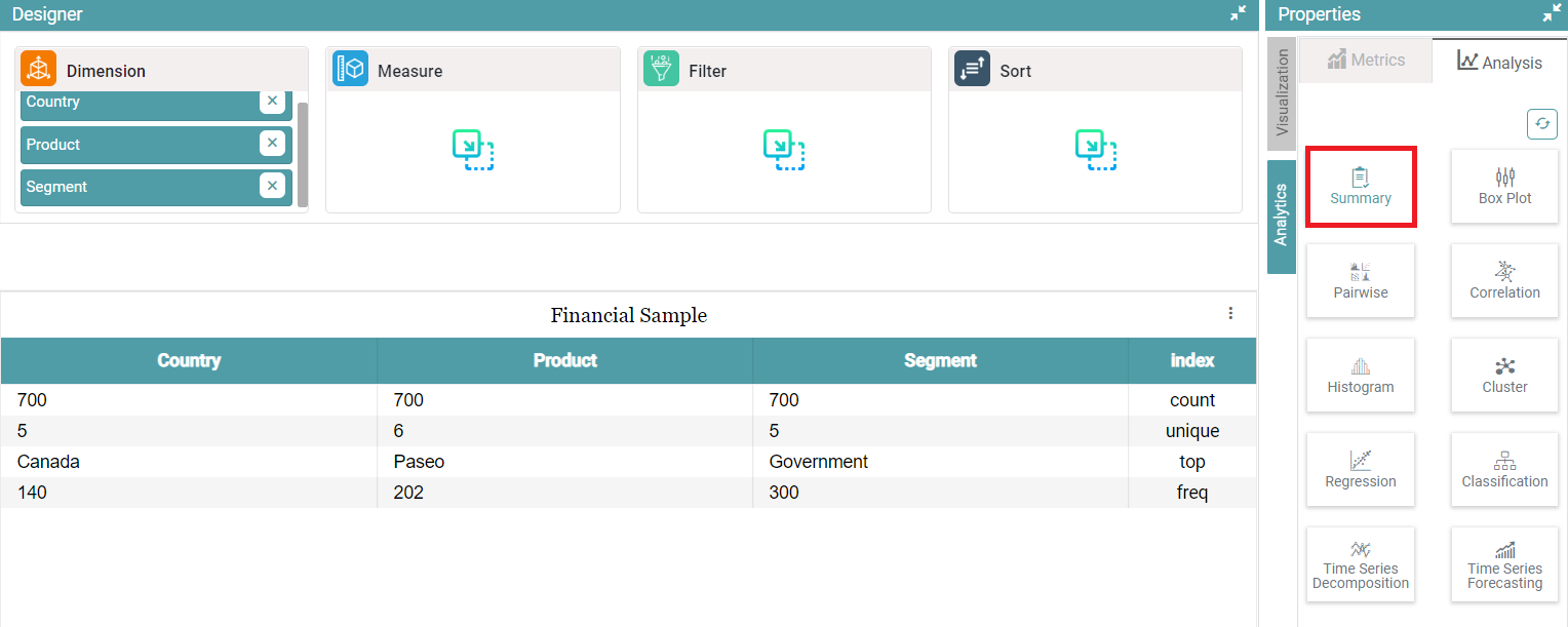
Summary
Step 1: Under the ‘Navigator’ section, click on the data source you want to perform the analysis on.
Step 2: Drag the Data set to Dimensions under Designer. Your data set will open.
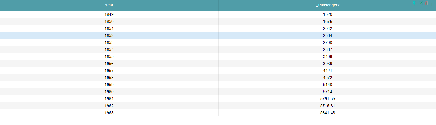
Step 3: Click on the “Summary Tab” to get the summary of your database. (Refer to the image below).


Box Plots
Box plots help in distribution of data into five ways-
- Minimum
- Quartile 1 (Q1)
- Median
- Quartile 3(Q3)
- Maximum
Step 1: Under the ‘Navigator’ section, click on the data source you want to perform the analysis on.
Step 2: Drag the Data set to Measure under Designer. Your data set will open.
Step 3: Click on “Box Plot” icon to get the summary of your data as Box Plots. (Refer to the image below).

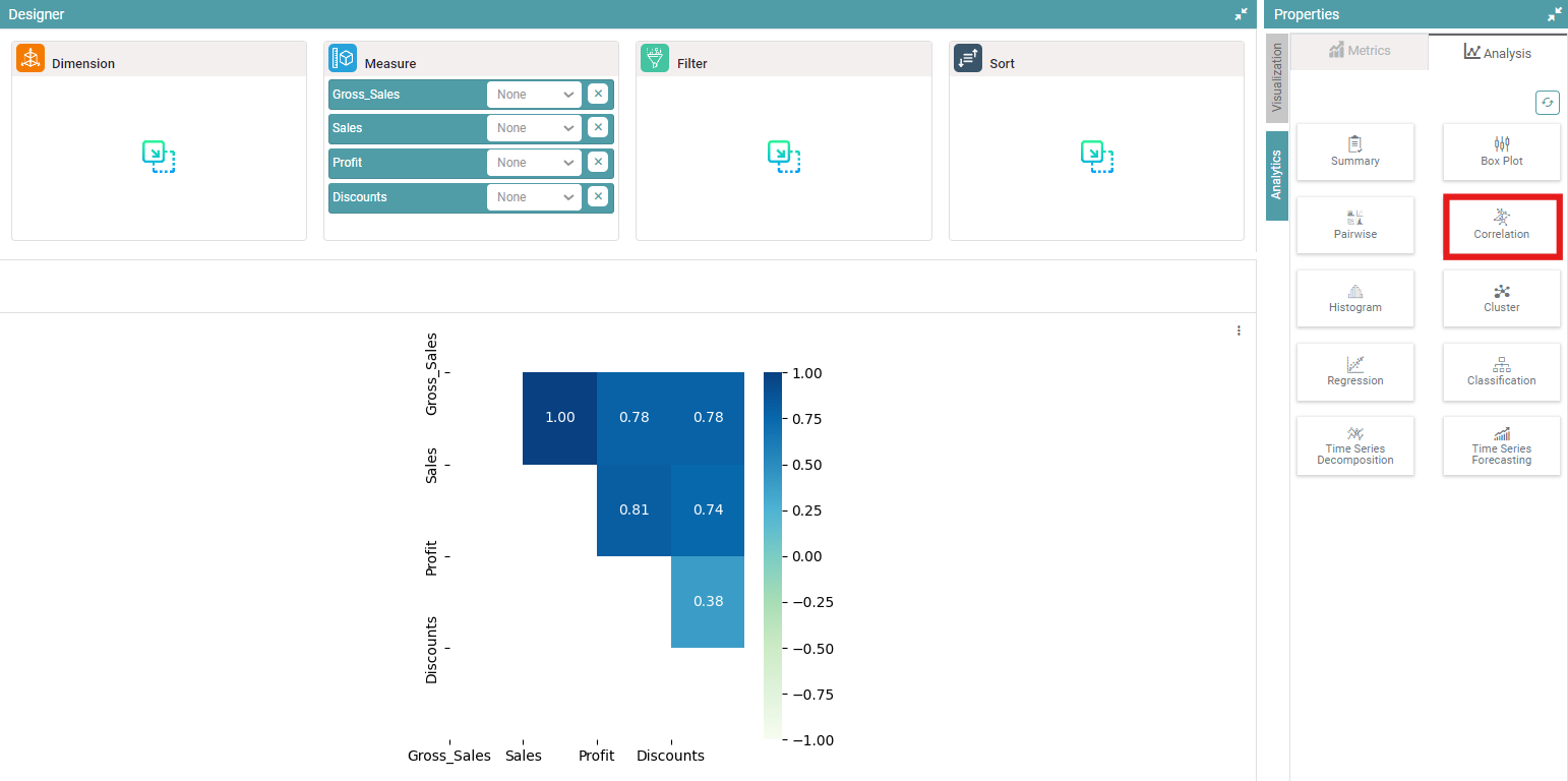
Correlation
Correlation helps the users to measure the relationship between two data.
Step 1: Under the ‘Navigator’ section, click on the data source you want to perform the analysis on.
Step 2: Drag the Data set to Measure under Designer. Your data set will open.
Step 3: Click on the “Correlation” icon to get the relation between two data sets. (Refer to the image below).
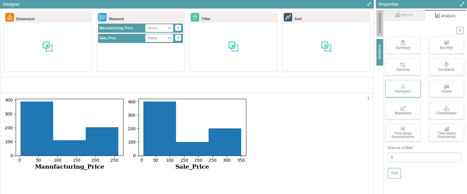
Histogram
Like bar charts, “Histogram” are graphs which show the frequency distribution. It is used to plot the frequency of score occurrences in a continuous data set.
Step 1: Under the ‘Navigator’ section, click on the data source you want to perform the analysis on.
Step 2: Drag the Data set to Measure under Designer. Your data set will open.
Step 3: Click on the “Histogram” icon and enter the Number of Bins. Click on Plot to get the graphical representation of the data as a Histogram. (Refer to the image below).
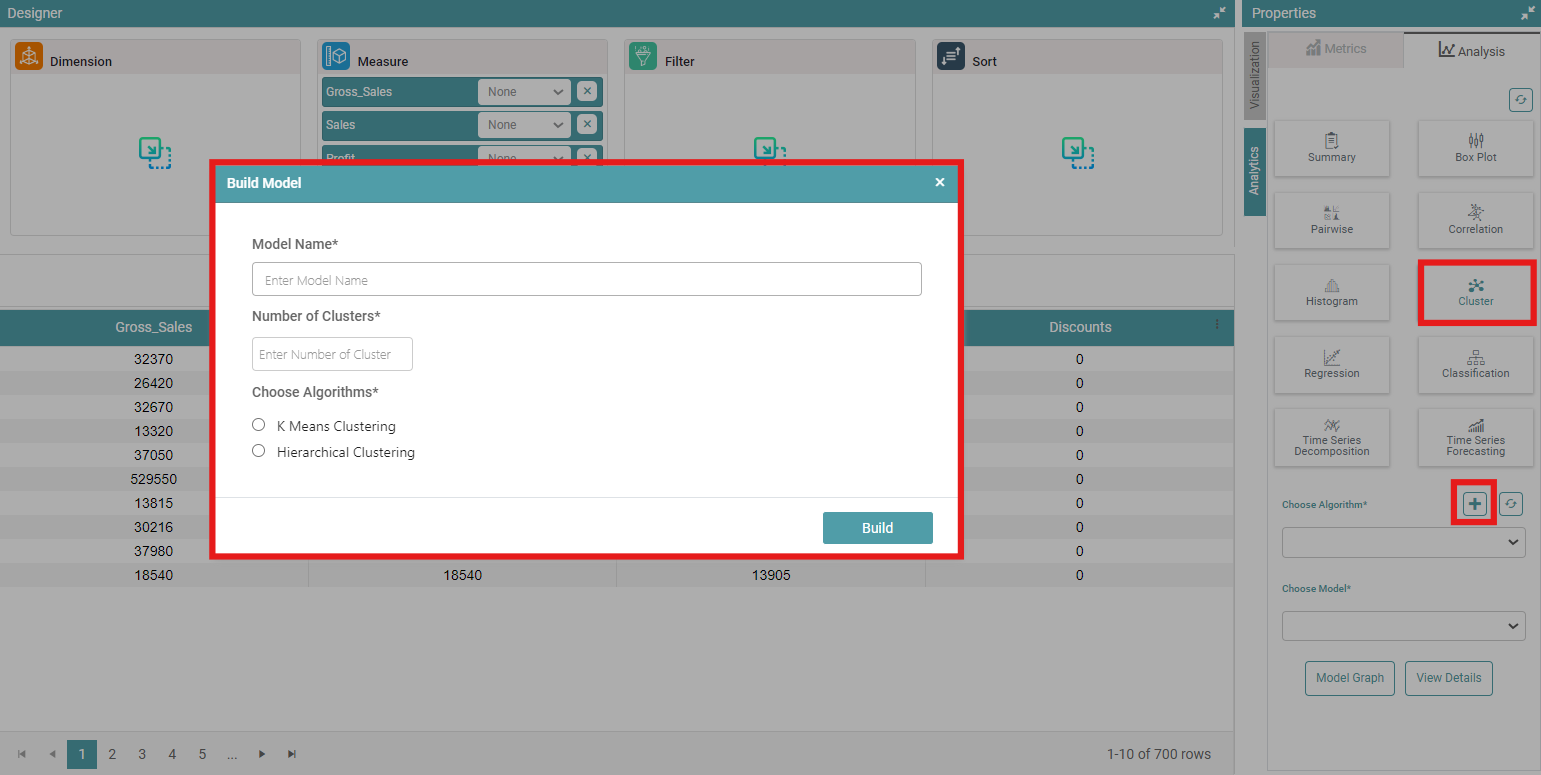
Cluster
As the name suggests, clustering is a technique which helps divide the data into multiple groups.
Step 1: Under the ‘Navigator’ section, click on the data source you want to perform the analysis on.
Step 2: Drag the Data set to Measure under Designer. Your data set will open.
Step 3: Click on the “Cluster icon” under analysis.
Step 4: Scroll down to the cluster algorithm. Click on “+” sign to build the model.
Step 5: Build Model popup appears. Enter the “Model Name”, “Number of clusters” you want to have, and then select the Algorithm for clustering between “K Means Clustering” or “Hierarchical Clustering”. Finally click on “Build” to build your desired chart. (Refer to the image below).
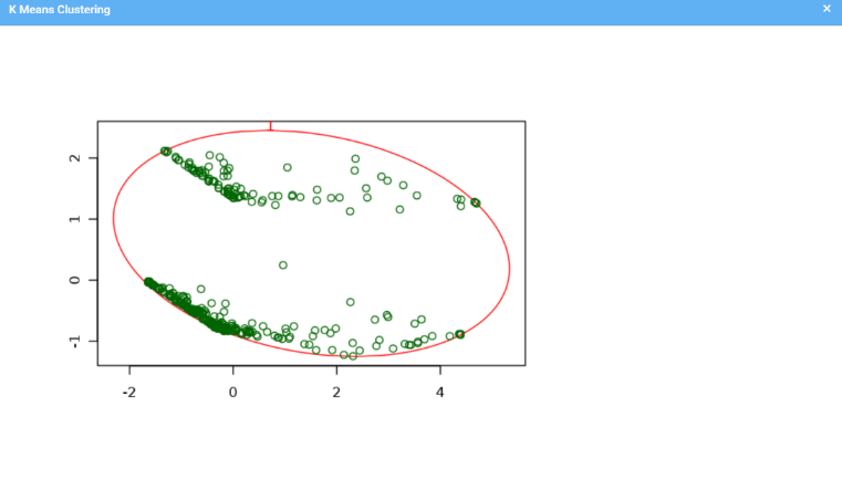
Step 6: Now, the chart is displayed in the form of a cluster. (Refer to the image below).
Regression
Regression helps in estimating the relationship between dependent variables and one or more independent variable.
Step 1: Under the ‘Navigator’ section, click on the data source you want to perform the analysis on.
Step 2: Drag the Data set to Measure under Designer. Your data set will open.
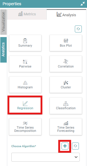
Step 3: Select “Regression” under Analysis in Properties.
Step 4: Scroll down to cluster algorithm. Click on “+” sign to build the model. (Refer to the image below).
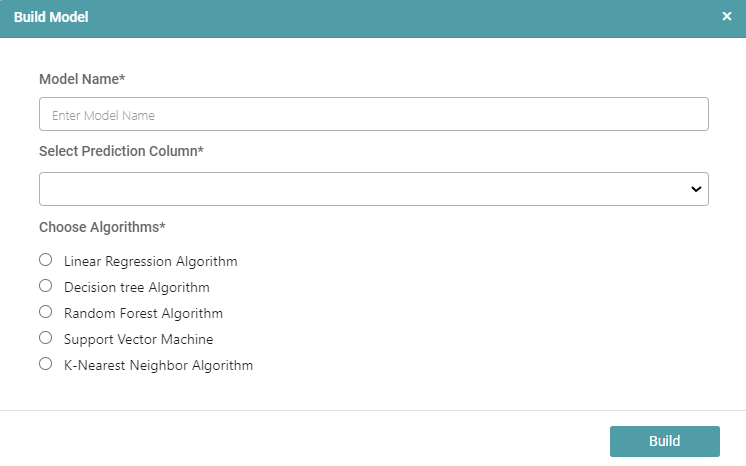
Step 5: A pop-up appears. Enter “Model Name”, “Select Prediction Column”, and then choose algorithms. The user can select any algorithm- “Linear Regression Algorithm”, “Decision Tree Algorithm”, “Random Forest Algorithm”, “Support Vector Machine” and “K-Nearest Neighbor Algorithm”. Then, click on “Build” to build the model. (Refer to the image below).
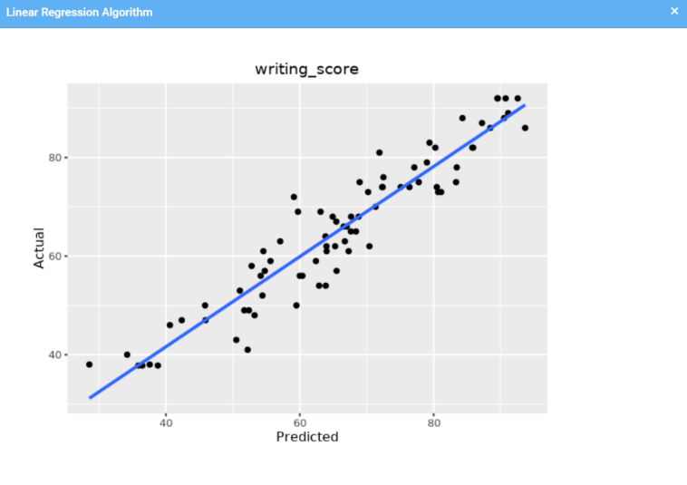
Step 6: The users can now view the desired model. (Refer to the image below).
Classification
Classification algorithms are used to categorize data into classes or categories.
Step 1: Under the ‘Navigator’ section, click on the data source you want to perform the analysis on.
Step 2: Drag the Data set to Measure under Designer. Your data set will open.
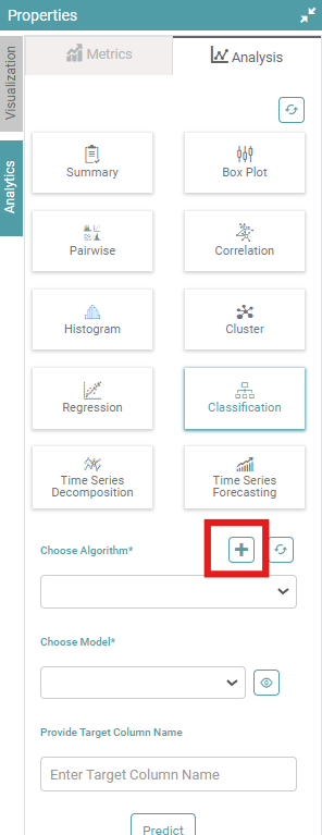
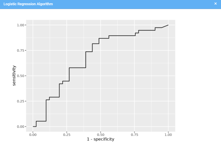
Step 3: Select “Classification” under Analysis in Properties.
Step 4: Scroll down to cluster algorithm. Click on “+” sign to build the model. (Refer to the image below).
Step 5: A pop-up appears. Enter “Model Name”, “Select Prediction Column”, and then choose algorithms from “Linear Regression Algorithm”, “Decision Tree Algorithm”, “Random Forest Algorithm”, “Support Vector Machine”, “K-Nearest Neighbor Algorithm”, “Naive Bayes Algorithm”. Then, finally click on “Build” to build the model. (Refer to the image below).

Step 6: The user can view the desired model. (Refer to the image below).
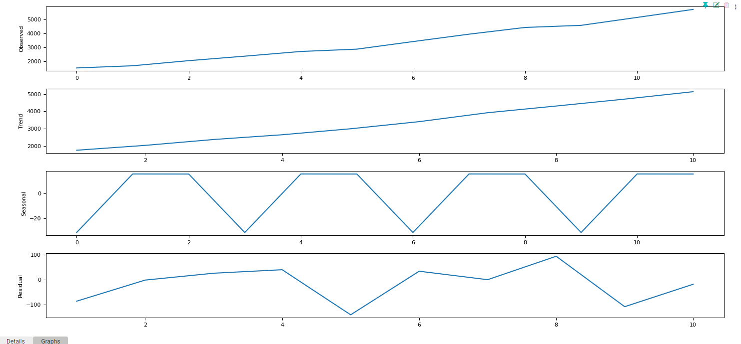
Time Series Forecasting
Time series forecasting involves predicting future values of a data set based on its historical trends and patterns.
Step 1: Under the ‘Navigator’ section, click on the data source you want to perform the analysis on.
Step 2: Drag the Data set to Measure under Designer. Your data set will open.
Step 3: Navigate to the Analytics tab on the right. Now click on the Analysis tab. Select “Time Series Forecasting” under Analysis in Properties. (Refer to the image below).
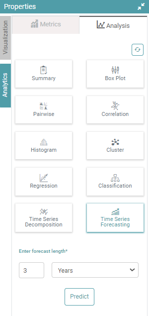
Step 4: Now, enter the forecast length and choose between Days, Weeks, Months and Year under the dropdown. Click on Predict. (Refer to the images below).
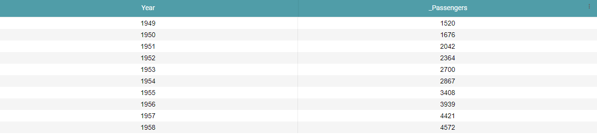
Before Forecasting:
After Forecasting: