Introduction
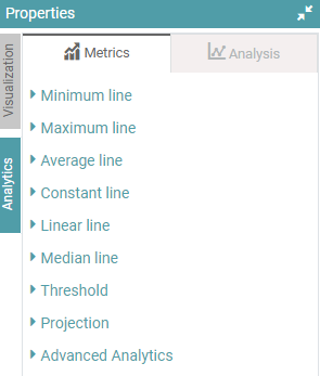
The Metrics part contains the following options –
- Minimum line
- Maximum line
- Average line
- Constant line
- Median line
- Threshold
- Projection
- Advanced Analytics
(Refer to the image below).
Minimum Line
This denotes the ‘minimum line’ in a chart. This tab comes with lots of customization options for the users.
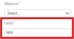
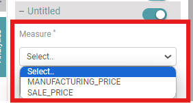
Measure– Select the options for the chart which you want to see. (Refer to the image below).

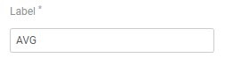
Label– For Minimum Line, users can name the line as “MIN” or whichever name you want to give to the minimum line. (Refer to the image below).
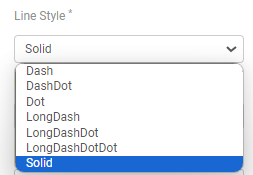
Line Style– Line style has a lot of options. Select the option you need your line to be represented by. The Options available are “Dash”, “DashDot”, “Dot”, “LongDash”, “LongDashDot”, “LondDashDotDot”, and “Solid”. (Refer to the image below).

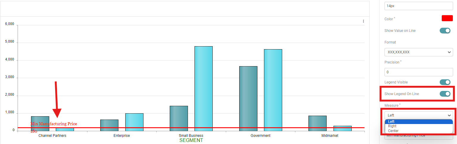
Measure– Measure is used to align the chart. Users can select the alignment that they want to see in the chart. The options available are “Left”, “Right”, and “Center”. (Refer to the image below).

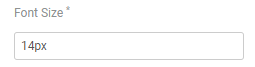
Font Size– Users can also change the font size of the text in the chart. Click on Font size and enter the font size. (Refer to the image below).

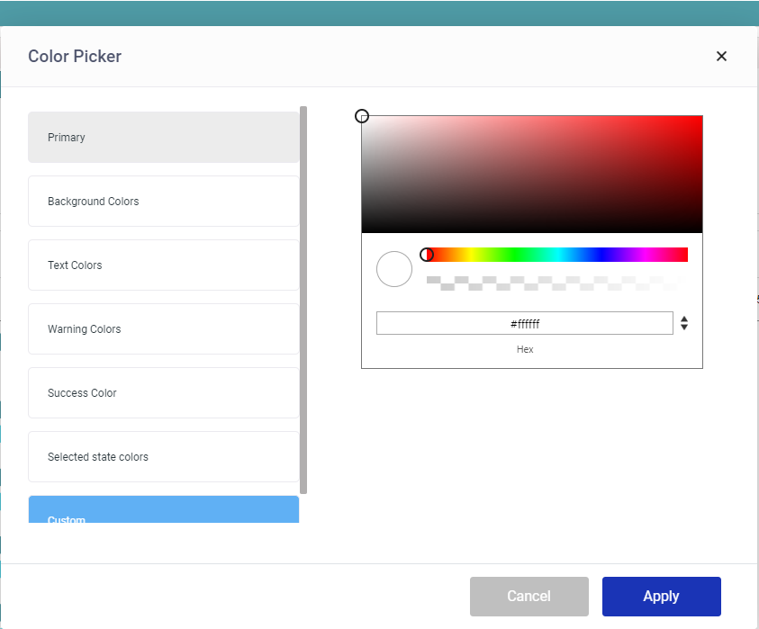
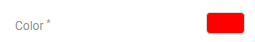
Color– The color option is also available for the charts. This option is not available for the table. Click on the color icon. (Refer to the image below).

A color picker pop-up opens. Users can select the options that are already available. Click on “Apply” after selection. Under custom, users can select whichever color they like and in any shade. Click on “Apply” after selection. (Refer to the image below).


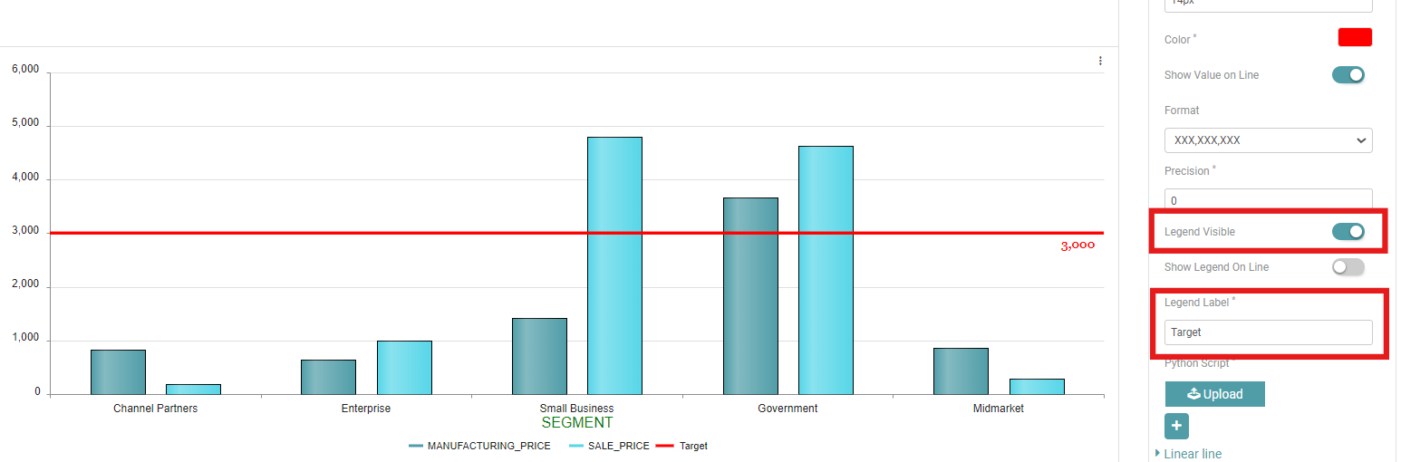
Show Value on Line- The user can Enable the show value on line toggle to show the value on the line. You can also apply formatting and give precision to the said value. (Refer to the image below).

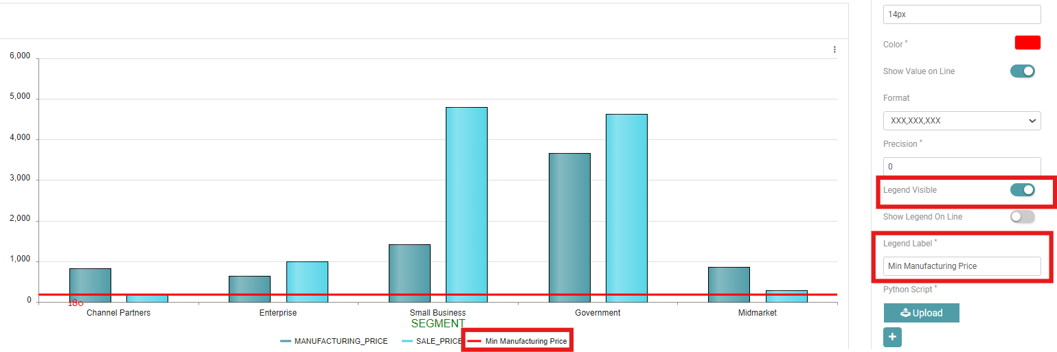
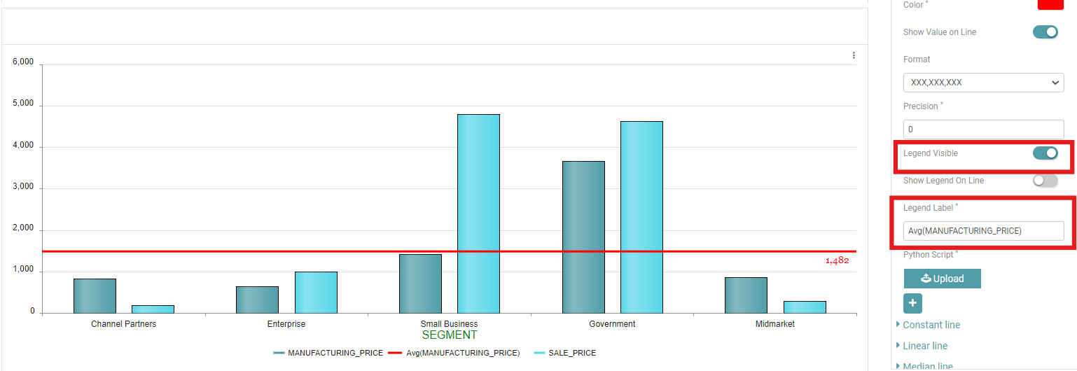
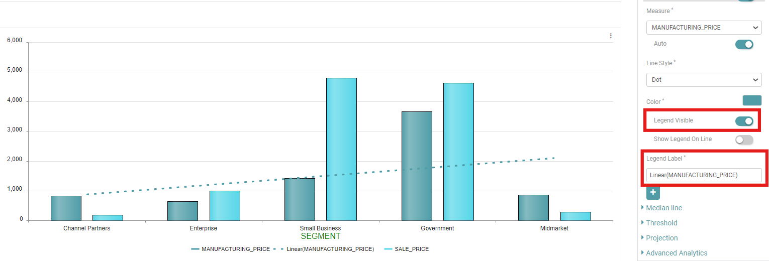
Legend Visible- Toggle on “Legend Visible.” The legend will now be displayed on the chart.
Legend Label- You can enter the label you want to assign to your legend. (Refer to the image below).
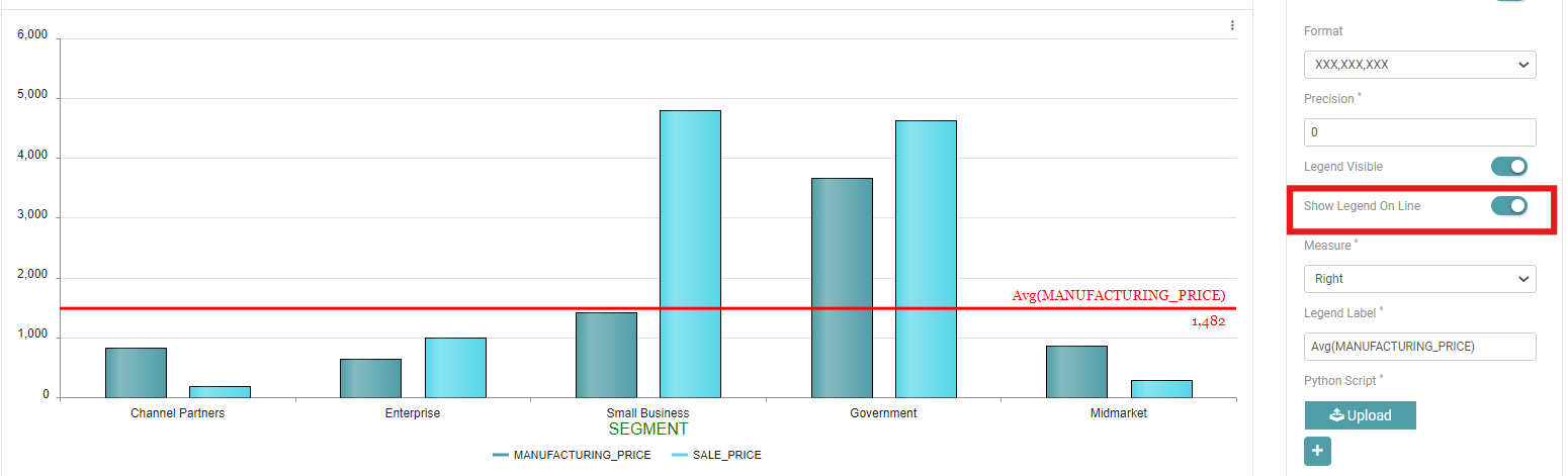
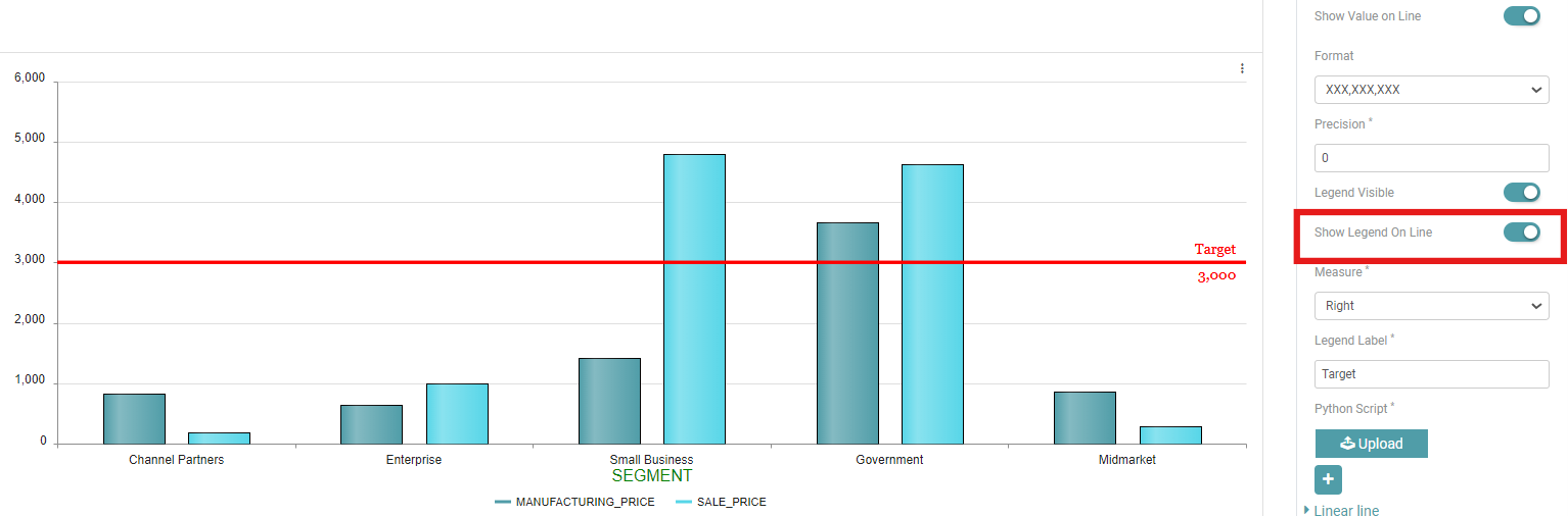
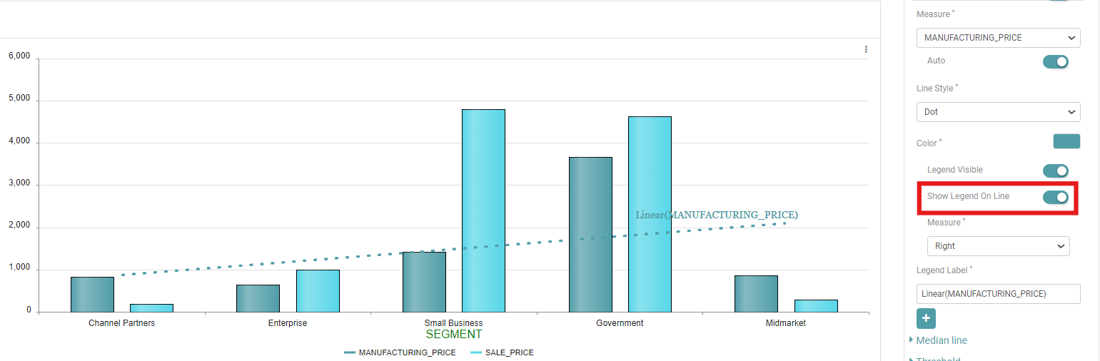
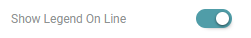
Show Legend On Line- Toggle on “Show Legend On Line”. The legend will now be displayed on the line. (Refer to the image below).
Maximum Line
This denotes the maximum line in a chart. This tab comes with lots of customization options for users. Like the minimum line, this also comes with lots of customization options.
Measure– Select the options for the chart which you want to see. (Refer to the image below).

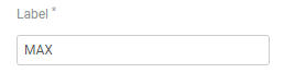
Label– The user needs to enter the label or the name with which the Maximum line will be denoted. (Refer to the image below).
Line Style– Line style has a lot of options. Select the option you need your line to be represented by. The Options available are “Dash”, “DashDot”, “Dot”, “LongDash”, “LongDashDot”, “LondDashDotDot”, and “Solid”. (Refer to the image below).

Measure– Measure is used to align the chart. Users can select the alignment that they want to see in the chart. The options available are “Left”, “Right”, and “Center”. (Refer to the image below).

Font Size– Users can also change the font size of the text in the chart. Click on Font size and enter the font size. (Refer to the image below).

Color– The color option is also available for the charts. This option is not available for the table. Click on the color icon. (Refer to the image below).

A color picker pop-up opens. Users can select the options that are already available. Click on “Apply” after selection. Under custom, users can select whichever color they like and in any shade. Click on “Apply” after selection. (Refer to the image below).

Show Value on Line– The user can Enable the show value on line toggle to show the value on the line. You can also apply formatting and give precision to the said value. (Refer to the image below).

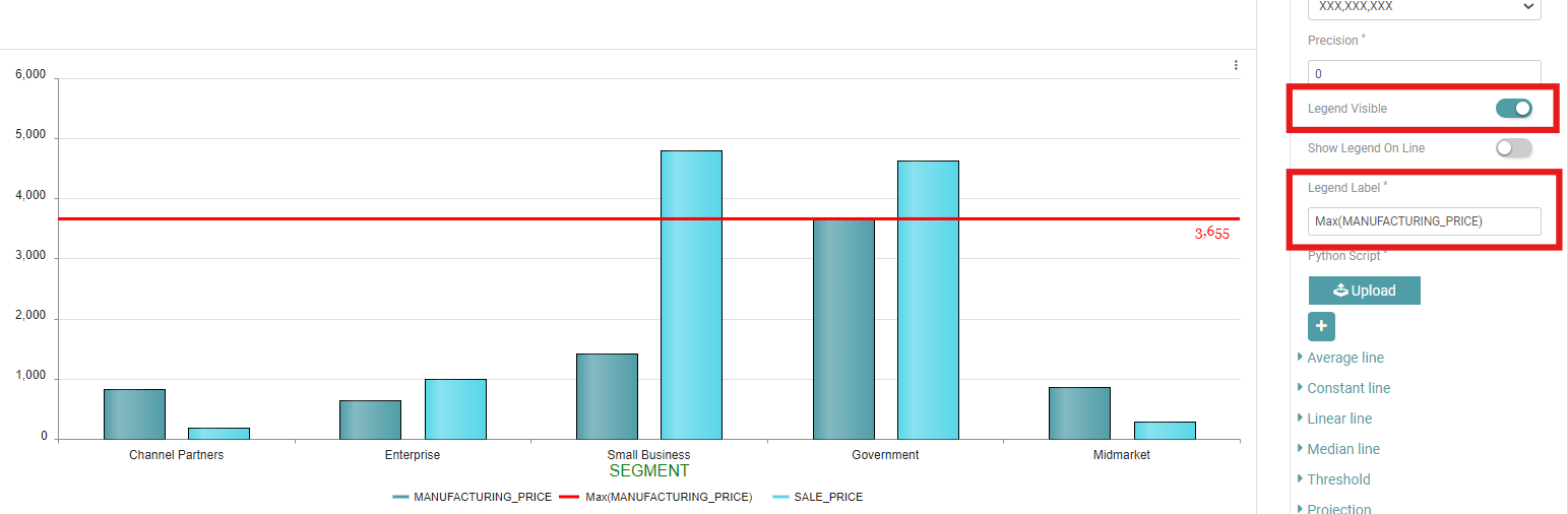
Legend Visible– Toggle on “Legend Visible.” The legend will now be displayed on the chart.
Legend Label– You can enter the label you want to assign to your legend. (Refer to the image below).
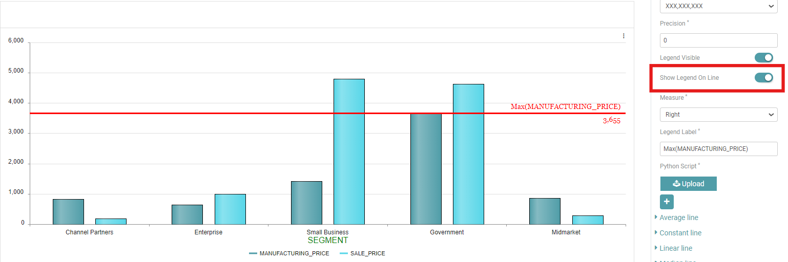
Show Legend On Line– Toggle on “Show Legend On Line”. The legend will now be displayed on the line. (Refer to the image below).
Average Line
The average line is the line which gives the average in the chart. Similar to minimum and maximum line, this also comes with lots of customization options.
Measure– Select the options for the chart which you want to see. (Refer to the image below).

Label– The user needs to enter the label or the name with which the Average line will be denoted. (Refer to the image below).
Line Style– Line style has a lot of options. Select the option you need your line to be represented by. The Options available are “Dash”, “DashDot”, “Dot”, “LongDash”, “LongDashDot”, “LondDashDotDot”, and “Solid”. (Refer to the image below).

Measure– Measure is used to align the chart. Users can select the alignment that they want to see in the chart. The options available are “Left”, “Right”, and “Center”. (Refer to the image below).

Font Size– Users can also change the font size of the text in the chart. Click on Font size and enter the font size. (Refer to the image below).
Color– The color option is also available for the charts. This option is not available for the table. Click on the color icon. (Refer to the image below).

A color picker pop-up opens. Users can select the options that are already available. Click on “Apply” after selection. Under custom, users can select whichever color they like and in any shade. Click on “Apply” after selection. (Refer to the image below).
Show Value on Line- The user can Enable the show value on line toggle to show the value on the line. You can also apply formatting and give precision to the said value. (Refer to the image below).

Legend Visible- Toggle on “Legend Visible.” The legend will now be displayed on the chart.
Legend Label- You can enter the label you want to assign to your legend. (Refer to the image below).
Show Legend On Line- Toggle on “Show Legend On Line”. The legend will now be displayed on the line. (Refer to the image below).
Constant Line
The constant line, as the name suggests, remains constant. The value of the constant line does not change. Like the tabs above, this line has many customization options.
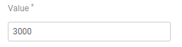
Value– The user needs to enter the value for the constant line. (Refer to the image below).
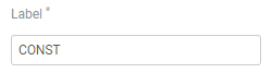
Label– The user needs to enter the label or the name with which the constant line will be denoted. (Refer to the image below).
Line Style– Line style has a lot of options. Select the option you need your line to be represented by. The Options available are “Dash”, “DashDot”, “Dot”, “LongDash”, “LongDashDot”, “LondDashDotDot”, and “Solid”. (Refer to the image below).
Measure– Measure is used to align the chart. Users can select the alignment that they want to see in the chart. The options available are “Left”, “Right”, and “Center”. (Refer to the image below).

Font Size– Users can also change the font size of the text in the chart. Click on Font size and enter the font size. (Refer to the image below).

Color– The color option is also available for the charts. This option is not available for the table. Click on the color icon. (Refer to the image below).
A color picker pop-up opens. Users can select the options that are already available. Click on “Apply” after selection. Under custom, users can select whichever color they like and in any shade. Click on “Apply” after selection. (Refer to the image below).

Show Value on Line– The user can Enable the show value on line toggle to show the value on the line. You can also apply formatting and give precision to the said value. (Refer to the image below).

Legend Visible– Toggle on “Legend Visible.” The legend will now be displayed on the chart.
Legend Label– You can enter the label you want to assign to your legend. (Refer to the image below).
Show Legend On Line– Toggle on “Show Legend On Line”. The legend will now be displayed on the line. (Refer to the image below).
Linear Line
A linear line represents a straight-line relationship between two variables, indicating a constant rate of change.
Measure– Select the options for the chart which you want to see. (Refer to the image below).
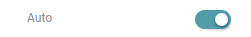
Auto– You can enable “Auto” to automatically set the linear line. (Refer to the image below).
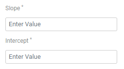
Slope & Intercept– The slope and intercept of a linear line define its steepness and where it crosses the y-axis, respectively. (Refer to the image below).
Line Style– Line style has a lot of options. Select the option you need your line to be represented by. The Options available are “Dash”, “DashDot”, “Dot”, “LongDash”, “LongDashDot”, “LondDashDotDot”, and “Solid”. (Refer to the image below).

Color– The color option is also available for the charts. This option is not available for the table. Click on the color icon. (Refer to the image below).

A color picker pop-up opens. Users can select the options that are already available. Click on “Apply” after selection. Under custom, users can select whichever color they like and in any shade. Click on “Apply” after selection. (Refer to the image below).

Legend Visible– Toggle on “Legend Visible.” The legend will now be displayed on the chart.
Legend Label– You can enter the label you want to assign to your legend. (Refer to the image below).
Show Legend On Line– Toggle on “Show Legend On Line”. The legend will now be displayed on the line. (Refer to the image below).
Measure– Measure is used to align the chart. Users can select the alignment that they want to see in the chart. The options available are “Left”, “Right”, and “Center”. (Refer to the image below).

Median Line
The median line gives the middle value for the chart that has been selected. Similar to the tabs above, this also comes with lots of customization options.
Measure– Select the options for the chart which you want to see. (Refer to the image below).
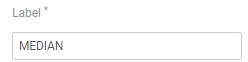
Label– The user needs to enter the label or the name with which the median line will be denoted. (Refer to the image below).
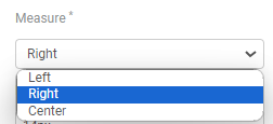
Measure– Measure is used to align the chart. Users can select the alignment that they want to see in the chart. The options available are “Left”, “Right”, and “Center”. (Refer to the image below).
Font Size– Users can also change the font size of the text in the chart. Click on Font size and enter the font size. (Refer to the image below).

Color– The color option is also available for the charts. This option is not available for the table. Click on the color icon. (Refer to the image below).

A color picker pop-up opens. Users can select the options that are already available. Click on “Apply” after selection. Under custom, users can select whichever color they like and in any shade. Click on “Apply” after selection. (Refer to the image below).

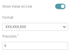
Show Value on Line– The user can Enable the show value on line toggle to show the value on the line. You can also apply formatting and give precision to the said value. (Refer to the image below).
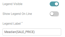
Legend Visible– Toggle on “Legend Visible.” The legend will now be displayed on the chart.
Legend Label– You can enter the label you want to assign to your legend. (Refer to the image below).
Show Legend On Line– Toggle on “Show Legend On Line”. The legend will now be displayed on the line. (Refer to the image below).
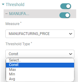
Threshold
Threshold value is the performance value that users can set which can be visually reflected on the real-time page in case the value is met or exceeded. Threshold does not work on bar charts. It works on tables.
Step 1: Click on “Threshold” under Metrics. Enter the “Measure” for threshold. Next, Select the threshold type- “Const”, “Max”, “Min” or “Average”. (Refer to the image below).
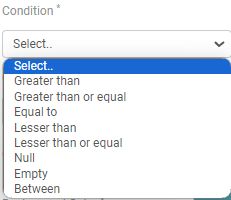
Step 2: Select any of the required conditions- “Greater than”, “Greater than or equal”, “Equal to”, “Lesser than”, “Lesser than or equal”, “Null”, “Empty”, or “Between” for the threshold. (Refer to the image below).
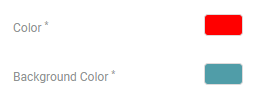
Step 3: You will get the value desired. To highlight the value, you can select the color you want and the background you want to apply. (Refer to the image below).
Step 4: Click on the color icon. A color picker pop-up opens. Users can select the options that are already available. Click on “Apply” after selection. Under custom, users can select whichever color they like and in any shade. Click on “Apply” after selection. (Refer to the image below).

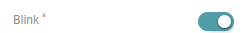
Blink
Users also get the “Blink” option. This option will continuously blink the reflected value in the real-time page. Press the toggle on to start the blink. (Refer to the image below).