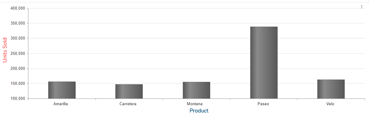
Creating a Bar Chart
Step 1: On the top right corner of the page, click on visualization under properties. Click on the Bar Chart icon under properties. (Refer to the image below).
Step 2: Drag and drop columns into dimension and measure. The data is represented in the form of a bar chart. (Refer to the image below).


Properties
Title
Same as Table chart.
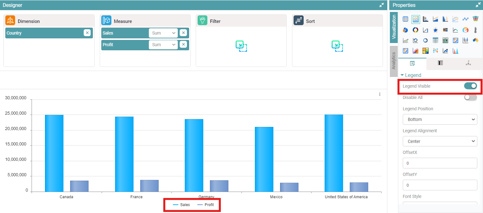
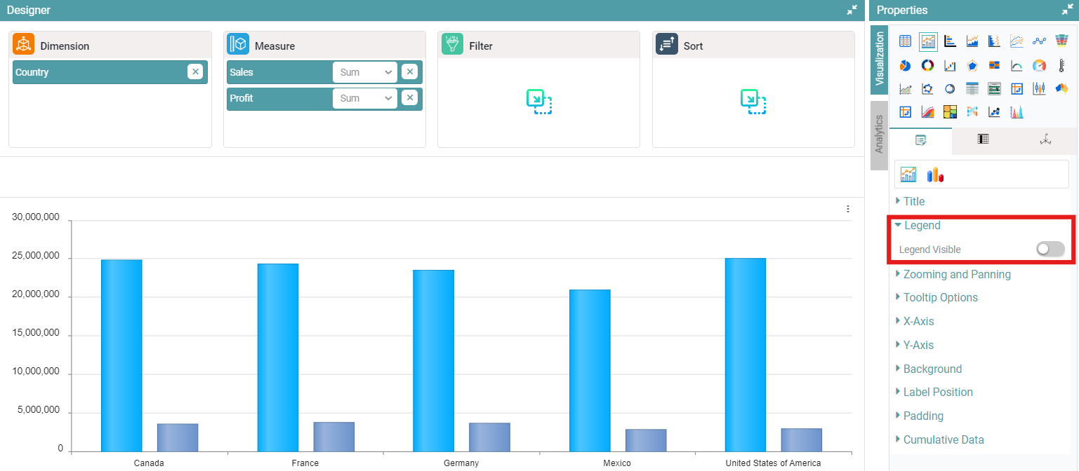
Legend Position
Step 1: On the top right corner of the page, click on visualization under properties. Click on the Bar Chart icon.
Step 2: Now, click on the properties icon under visualization.
Step 3: Click on legend position, enable legend visible toggle, then legend is visible under the chart. (Refer to the image below).
Step 4: Disable legend position, then legend is not available in the chart. (Refer to the image below).
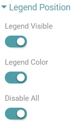
Step 5: Enable the ‘legend visible, legend color and disable all’ toggle, then icon is available in chart. (Refer to the image below).
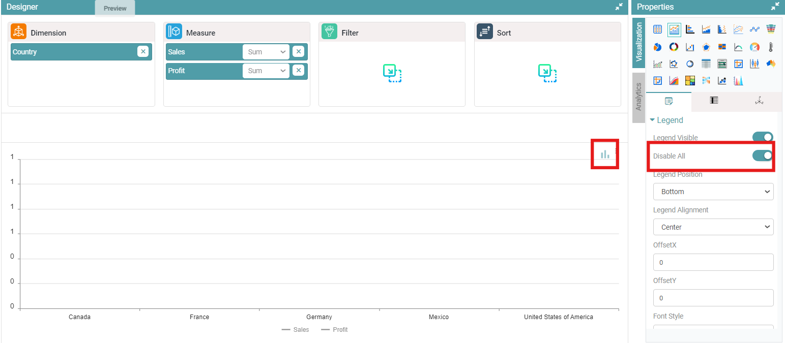
Step 6: Click on disable all icon, then bar graphs are not visible in the chart. (Refer to the image below).
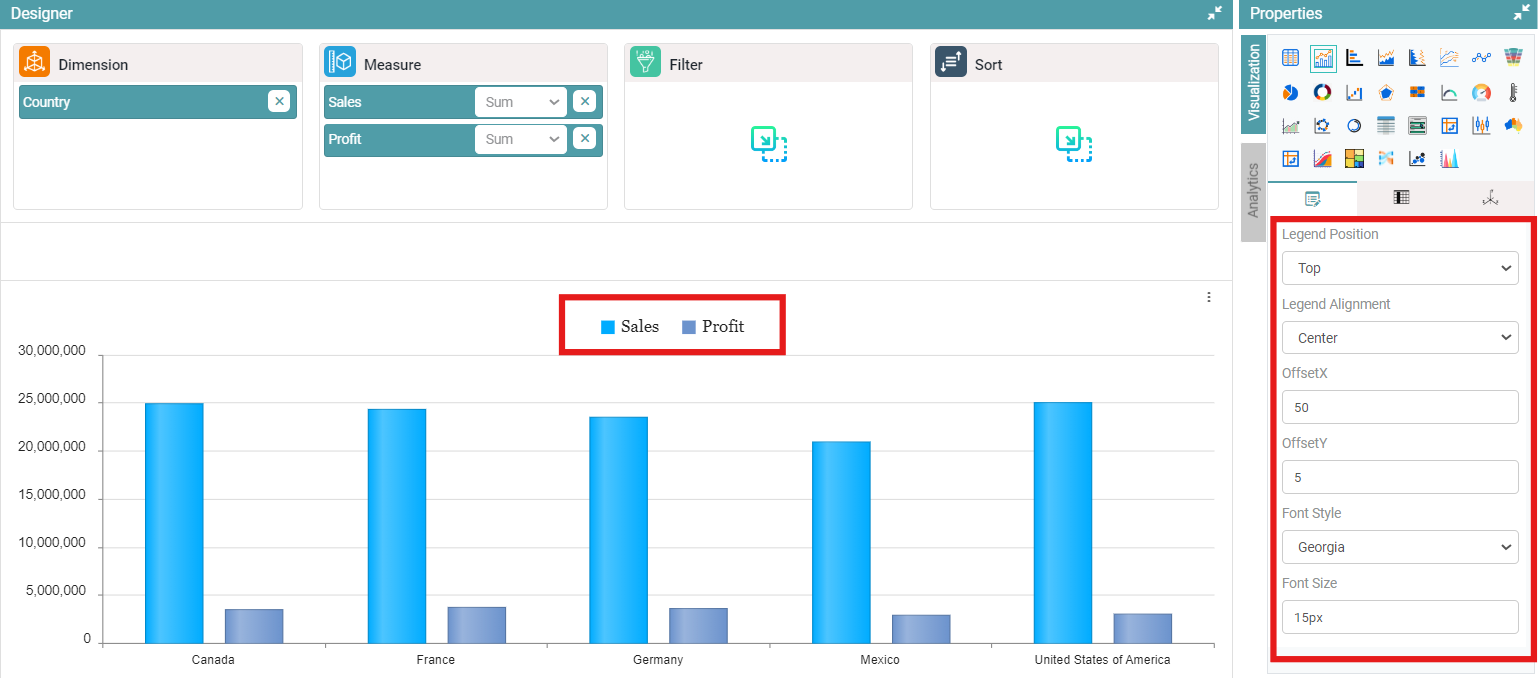
Step 7: Select legend position, alignment and enter offset X and offset Y.
Step 8: Legend will be represented based on selected values. (Refer to the image below).
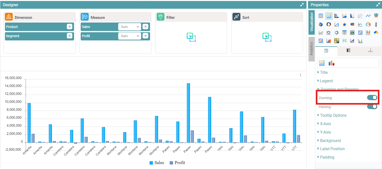
Zooming and Panning
Step 1: On the top right corner of the page, click on visualization under properties. Click on the Bar Chart icon.
Step 2: Now, click on the properties icon under visualization.
Step 3: Under zooming and panning, enable zooming toggle, now you will be able to zoom in on the chart. (Refer to the image below).
Step 4: If zooming is disabled then you can no longer zoom in on the chart.
Step 5: Under zooming and panning, enable panning toggle, now you will be able to move the chart horizontally. (Refer to the image below).
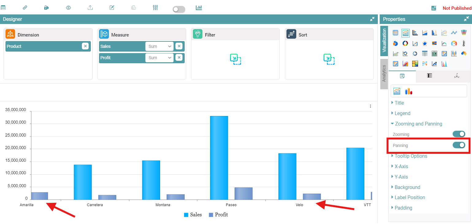
Step 6: If panning is disabled then you can no longer move the chart horizontally.
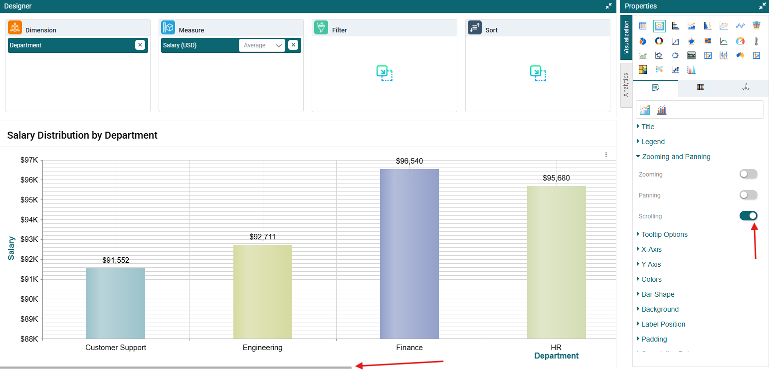
Scrolling
Step 1: On the top right corner of the page, click on visualization under properties. Click on the Bar Chart icon.
Step 2: Now, click on the properties icon under visualization. .
Step 3: Under zooming and panning, enable the scrolling toggle. Once enabled, you will be able to scroll the chart from left to right. (Refer to the image below).
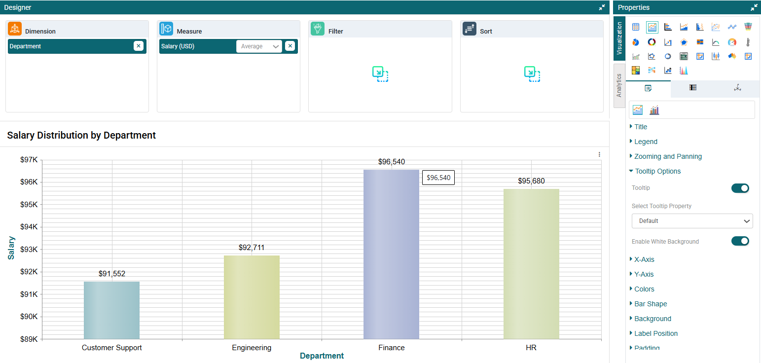
Tooltip Options
Step 1: On the top right corner of the page, click on visualization under properties.
Step 2: Now, click on the properties icon under visualization.
Step 3: Under ‘Tooltip options’, you can toggle on the Tooltip. Once this has been done, you can select the tooltip property from the dropdown.
Step 4: Under Tooltip Property, select a tooltip type — Default, Custom, or Another Report. Selecting Another Report allows you to attach another report as a tooltip.
Step 5: The tooltip will have a white background by default. To use the bar color instead, toggle off the White Background option. (Refer to the image below).
X-Axis
Step 1: On the top right corner of the page, click on visualization under properties. Click on the Bar Chart icon.
Step 2: Now, click on the properties icon under visualization.
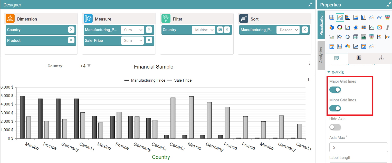
Step 3: In X-axis you have Major Grid lines, Minor Grid lines, Hide Axis, Axis Max options.
Step 4: If you enable the Major Grid lines and Minor Grid lines toggle buttons, then those lines will be added in chart. (Refer to the image below).
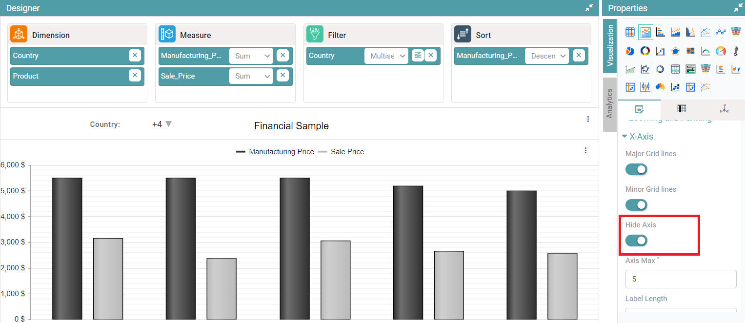
Step 5: If you enable the hide axis toggle button, then x-axis will disappear. (Refer to the image below).
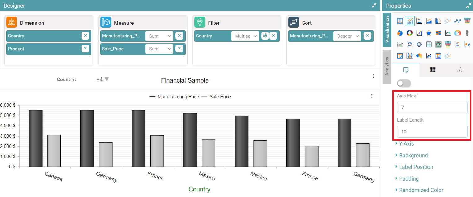
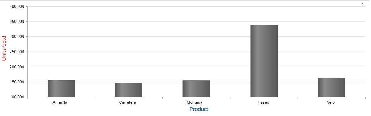
Step 6: Now, you can set the axis max value. The number of bars displayed will be in accordance with the value set. You can also set the length of the labels on the x-axis. (Refer to the image below).
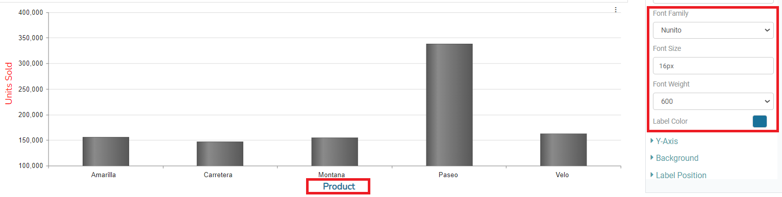
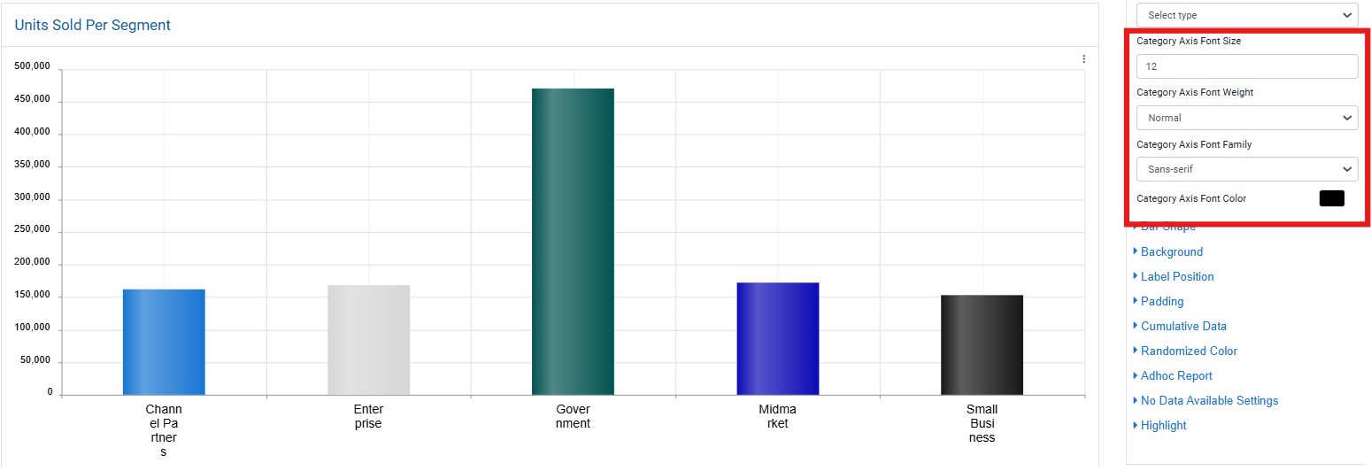
Step 7: You can also set the Font Family, Font Size, Font weight and Font color of the X-axis label. (Refer to the image below).
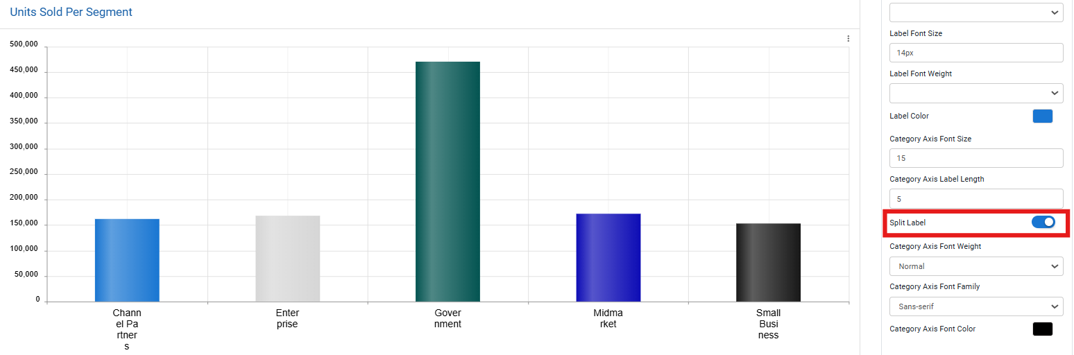
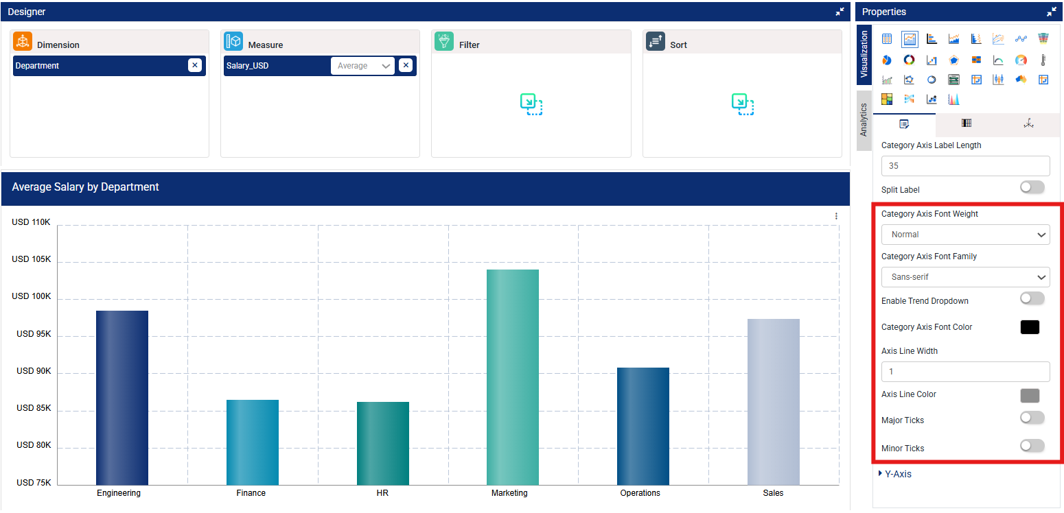
Step 8: You can customize the Category Axis by adjusting the font size, label length, font weight, font family, and font color. Additionally, you have the option to split the Category Axis label items as needed by enabling the Split Label toggle. (Refer to the image below).
Step 9: Use Category Axis Font Weight to control the thickness of axis label text.
Step 10: Use Category Axis Font Family to select a preferred typeface for the labels.
Step 11: Toggle Enable Trend Dropdown to allow or hide a dropdown menu on the chart for selecting trend views (if supported by the chart type).
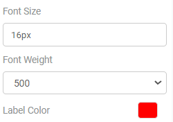
Step 12: Use Category Axis Font Color to set a color for the font. You can select from the font colors or from custom colors.
Step 13: Set the Axis Line Width to control the thickness of the X-axis line (numeric value in pixels).
Step 14: Change Axis Line Color to match the X-axis line with your preferred theme or branding colors.
Step 15: Toggle Major Ticks to show or hide primary tick marks aligned with category labels.
Step 16: Toggle Minor Ticks to show or hide smaller tick marks between the major ones for finer scale detail. (Refer to the images below).
Y-Axis
Step 1: On the top right corner of the page, click on visualization under properties. Click on the Bar Chart icon.
Step 2: Now, click on the properties icon under visualization.
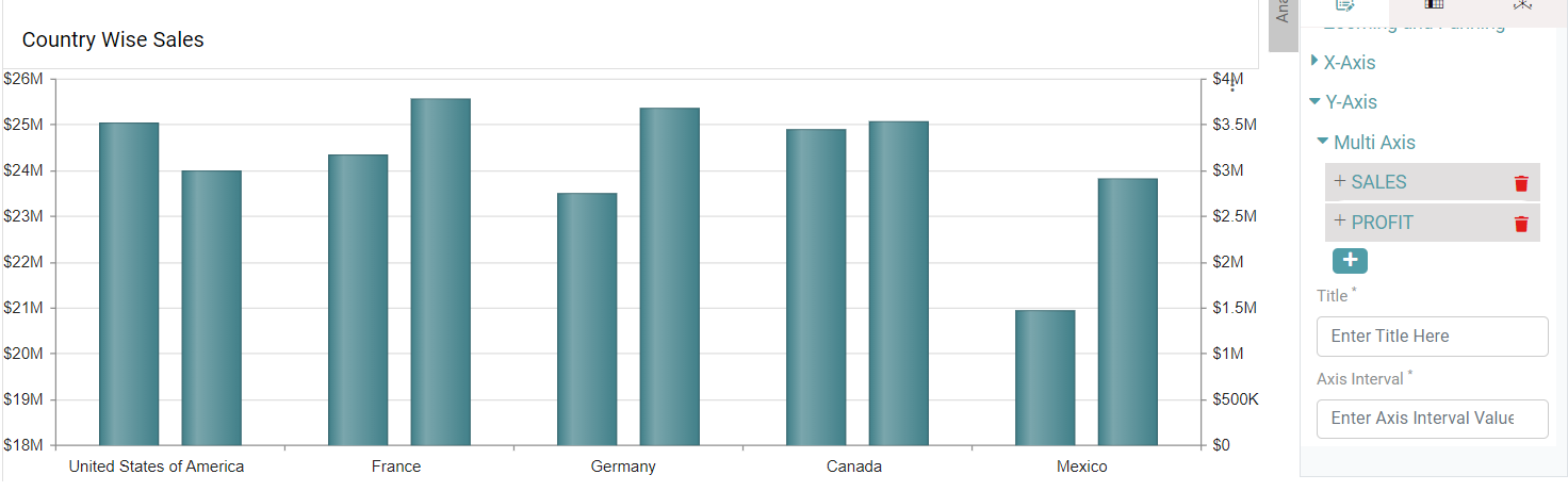
Step 3: Click on Y-axis, click on multi-axis, select column, enter title, axis interval and default limit.
Step 4: Multi-axis is represented based on selected values. (Refer to the image given below).
Step 5: You can toggle the “Dynamic axis” toggle such that the Y-axis values will auto adjust according to the range of values. (Refer to the image below).
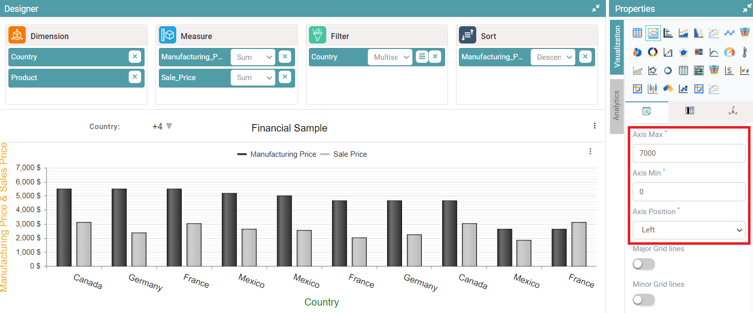
Step 6: Click on Y-axis, axis-max, axis-min and select axis position, y-axis is represented based on selected values. (Refer to the image given below).
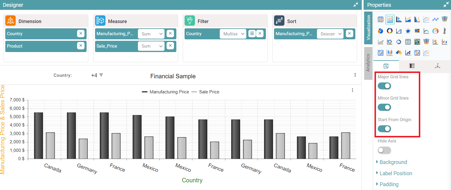
Step 7: Enable Major grid lines toggle, grid lines are now visible in the chart.
Step 8: Enable Minor grid lines toggle, grid lines are now visible in the chart.
Step 9: Enable the start from origin toggle, the chart will be starting from origin. (Refer to the image given below).
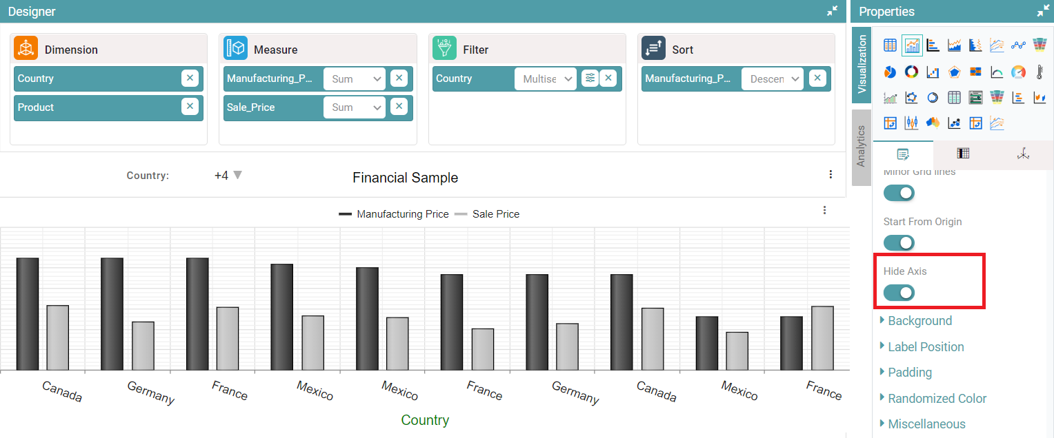
Step 10: Enable hide axis toggle, the y-axis will not be visible. (Refer to the image given below).
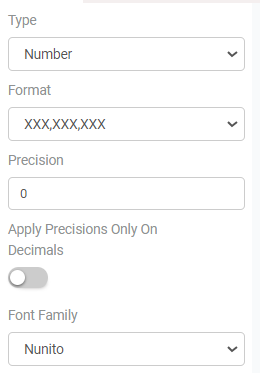
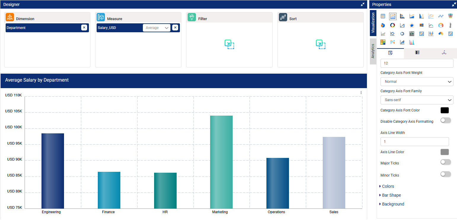
Step 11: You can also choose the value type, format, precision, font family, font size, font weight and label color of the Y-axis. (Refer to the images below).
Step 12: You can configure the Category Axis by setting the font size, font weight, font family, and assigning a font color. (Refer to the image below).
Step 13: You can also disable the category axis formatting.
Step 14: Set the Axis Line Width to control the thickness of the X-axis line (numeric value in pixels). Change Axis Line Color to match the X-axis line with your preferred theme or branding colors.
Step 15: Toggle Major Ticks to show or hide primary tick marks aligned with category labels.
Step 16: Toggle Minor Ticks to show or hide smaller tick marks between the major ones for finer scale detail. (Refer to the image below).
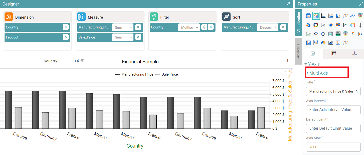
Multi-Axis
Step 1: On the top right corner of the page, click on visualization under properties. Click on the Bar Chart icon under properties.
Step 2: Drag and drop columns into “Dimension” and “Measure”. The data is represented as a bar chart.
Step 3: Click on Y-axis and click on multi-axis. Select the column, enter title, axis interval, default limit, axis-min, axis-max and axis position.
Step 4: Multi-axis is represented based on the selected values. (Refer to the image given below).
Note that the Dynamic Axis, value type, format, precision, font family, font size, font weight and label color functionality is like that of the single Y-axis.
Bar Shape
Step 1: On the top right corner of the page, click on visualization under properties. Click on the Bar Chart icon.
Step 2: Now, click on the properties icon under visualization.
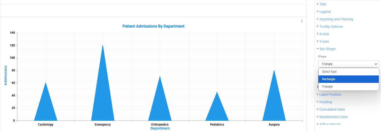
Step 3: To customize the bar chart’s appearance, open the “Bar Shape” dropdown. Here, you can select either a Rectangular or Triangular shape for the bars. Additionally, you have the option to apply a gradient to enhance the chart’s visual appeal. (Refer to the image below).
Background
Step 1: On the top right corner of the page, click on visualization under properties. Click on the Bar Chart icon.
Step 2: Now, click on the properties icon under visualization.
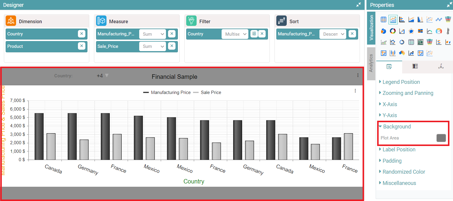
Step 3: Click on the ‘Background’ dropdown and click on plot area. The color picker popup will appear. (Refer to the image below).
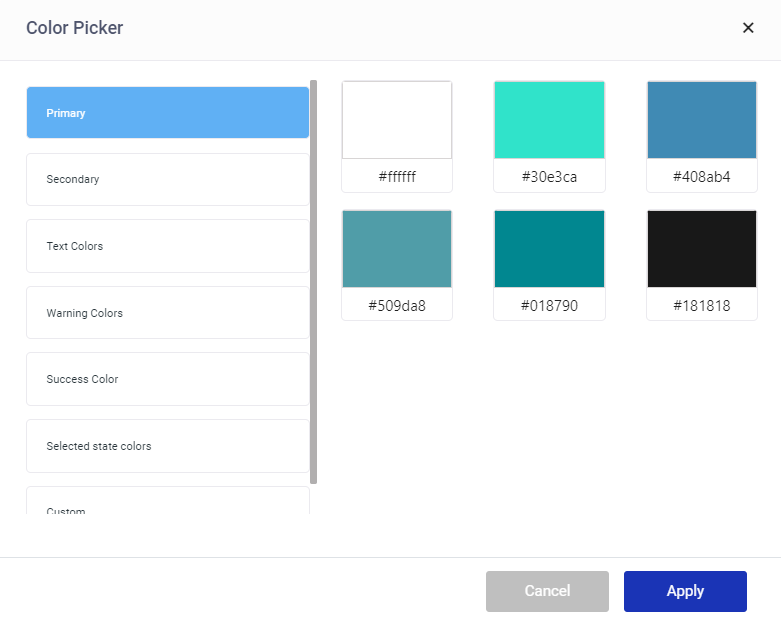
Step 4: Select the desired themes and customize colors of your choice. Click on custom, select the color and click on apply. The color selected is added as a background to the chart. (Refer to the image below).
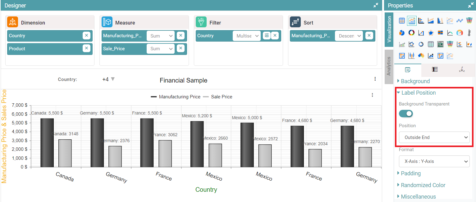
Label Position
Step 1: On the top right corner of the page, click on visualization under properties. Click on the Bar Chart icon.
Step 2: Now, click on the properties icon under visualization.
Step 3: Enable the ‘background transparent’ toggle button. The label will be displayed with a transparent background.
Step 4: The ‘label position’ can also be adjusted accordingly. Under the position dropdown, you can select outside end, center and inside end. (Refer to the image below).
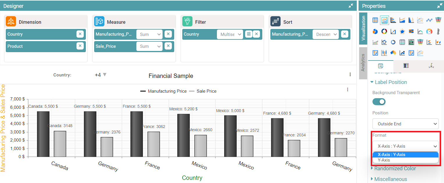
Step 5: Under the format dropdown, the users can select from ‘X-Axis: Y-Axis and Y-Axis’. (Refer to the image below).
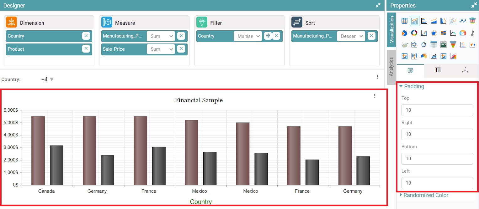
Padding
Step 1: On the top right corner of the page, click on visualization under properties. Click on the Bar Chart icon.
Step 2: Now, click on the properties icon under visualization.
Step 3: Click on padding and enter values for Top, Bottom, Left and Right.
Step 4: Padding will be applied and the chart is represented based on the values given. (Refer to the image below).
Cumulative Data
Step 1: On the top right corner of the page, click on visualization under properties. Click on the Bar Chart icon.
Step 2: Now, click on the properties icon under visualization.
Step 3: Enable the Cumulative Data toggle button. (Refer to the image below).
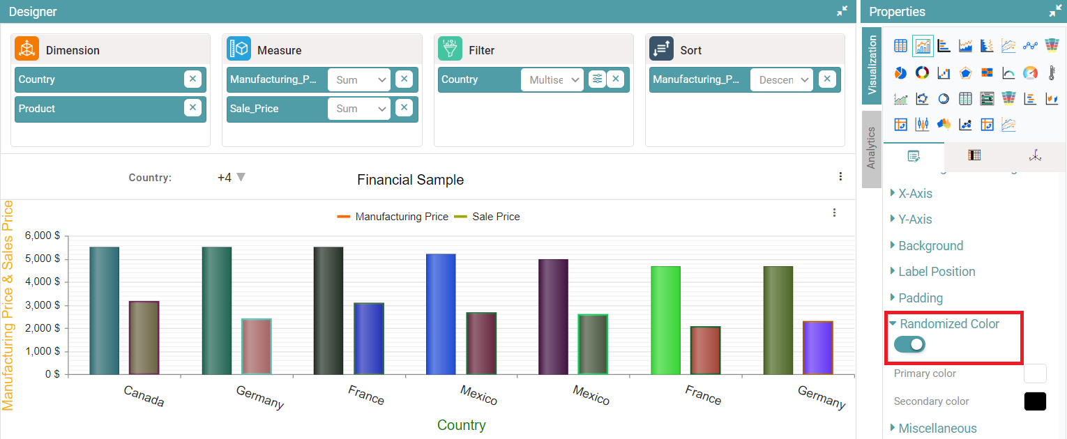
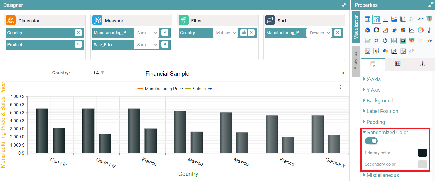
Randomized Color
Step 1: On the top right corner of the page, click on visualization under properties. Click on the Bar Chart icon.
Step 2: Now, click on the properties icon under visualization.
Step 3: Enable the randomized toggle button. The bars in the chart are represented with random colors. (Refer to the image below).
Step 4: You will be able to select primary color and secondary color. The chart will be represented based on the colors selected. (Refer to the image below).
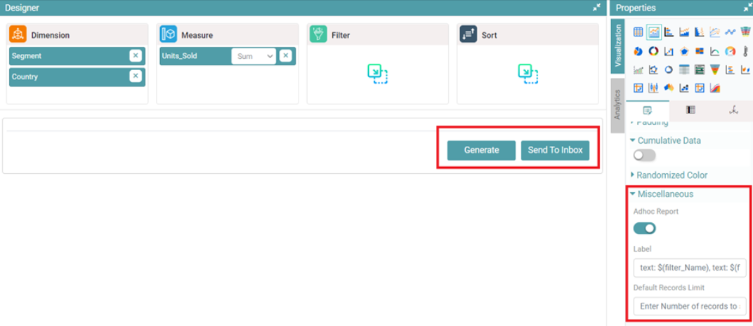
Miscellaneous
Step 1: On the top right corner of the page, click on visualization under properties. Click on the Bar Chart icon.
Step 2: Now, click on the properties icon under visualization.
Step 3: Enable the Adhoc Report toggle under miscellaneous in bar chart. You can now see two options, namely ‘Generate’ and ‘Send to Inbox’. You can also enter default records limit. (Refer to the image below).
Columns
Most of the columns are similar to that of the Table Chart.
Tool Tip
Step 1: On the top right corner of the page, click on visualization under properties. Click on the Bar Chart icon under properties.
Step 2: Drag and drop columns into “Dimension” and “Measure”. The data is represented in the form of a bar chart.
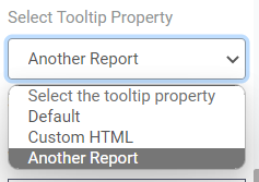
Step 3: Under columns, click on the desired column and toggle the “Tool Tip” and select the tool tip property.
Step 4: You can select the tool tip property by clicking on the dropdown.
Step 5: You choose between default, custom HTML, or another report under the tooltip property. (Refer to the image below).
Default
The default tool tip is visible when the user hovers on the chart. (Refer to the image below).

Custom HTML
You can also enter the custom HTML to display in the tool tip. (Refer to the image below).
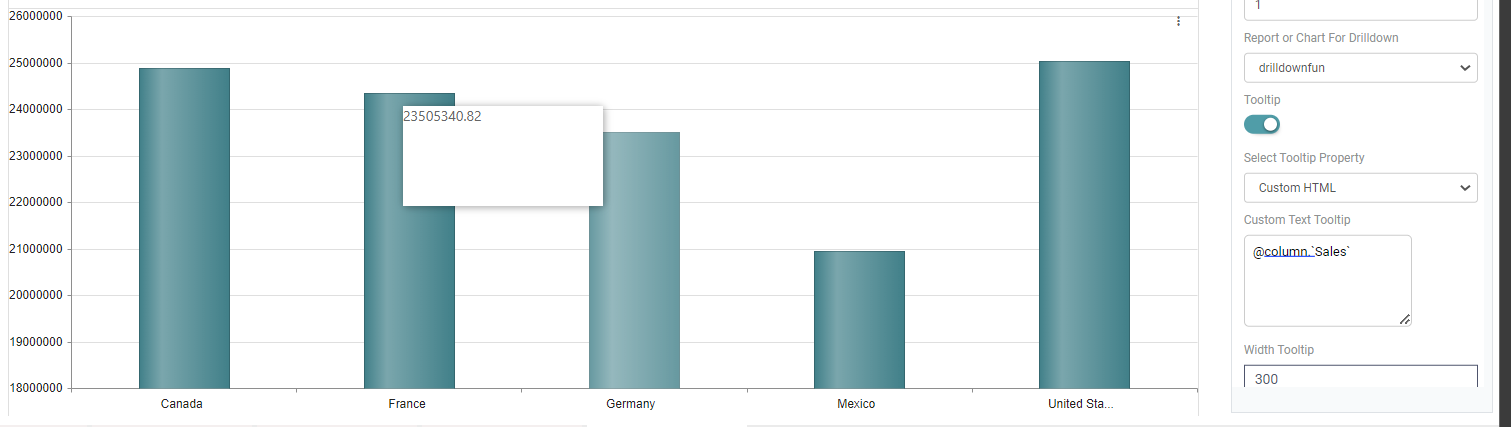
Another Report
You can attach a report or chart for drilldown and the selected chart or report will be visible in the tooltip. (Refer to the image below).

Note: These tool tip options are also available under properties.
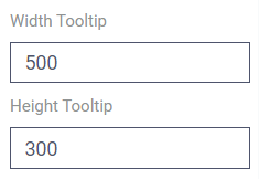
Step 6: Upon making the selection, you can adjust the width and height of the tool tip. (Refer to the image below).
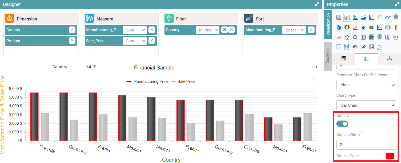
Outline
Step 1: Create a bar chart. On the top right corner of the page, click on visualization under properties.
Step 2: Now, click on ‘Columns’. Here, the dimension and measure can be customized. Navigate to the Outline option.
Step 3: Enable the outline toggle. Now, you can choose the desired width and customize the outline color. (Refer to the image below).
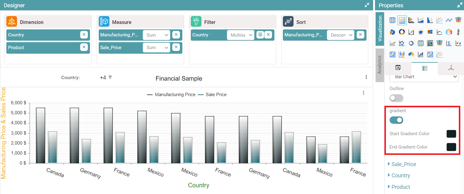
Gradient
Step 1: Create a bar chart. On the top right corner of the page, click on visualization under properties.
Step 2: Now, click on ‘Columns’. Here, the dimension and measure can be customized. Navigate to the Colors option.
Step 3: Enable the ‘Gradient’ toggle. Now, you can choose the desired ‘Start gradient color and End gradient color’ for the bar chart. (Refer to the image below).
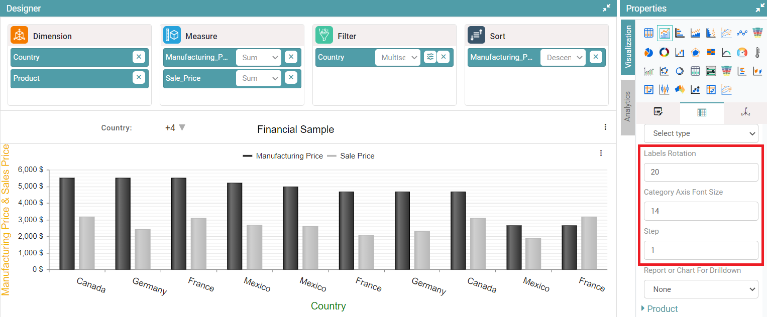
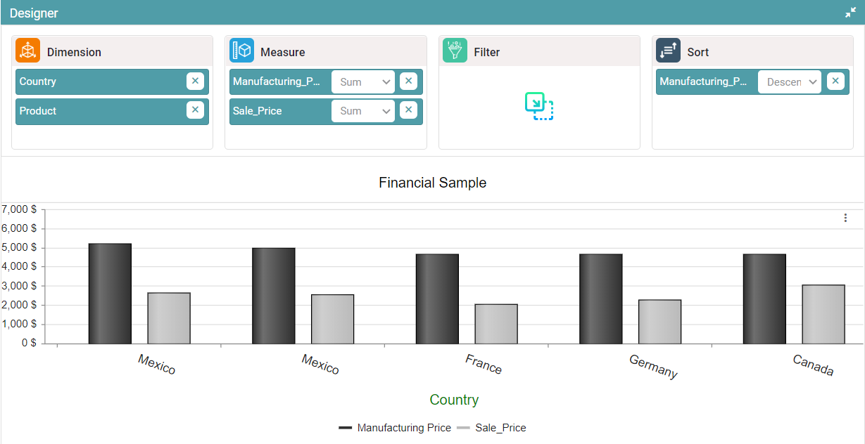
Label Rotation
Step 1: Create a bar chart. On the top right corner of the page, click on visualization under properties.
Step 2: Now, click on ‘Columns’. Here, the dimension and measure can be customized. Navigate to the Labels Rotation option.
Step 3: You can enter values from 0 to 360 under labels rotation. The label on the concerned axis rotates in accordance with the value entered.
Step 4: You can change the ‘Category axis font size and step’. The chart is customized according to the value entered. (Refer to the image below).