Create a New Chart
Follow these steps to create a New Chart:
Step 1: Click on the Design tab on the Main Navigation bar.
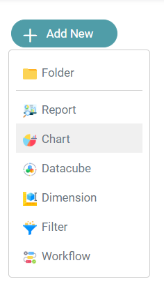
Step 2: Click on the Add Icon located on the Top Left of the screen. Click on the Chart icon. (Refer to the image below).


Step 4: You are directed to the chart designer page. (Refer to the image below).
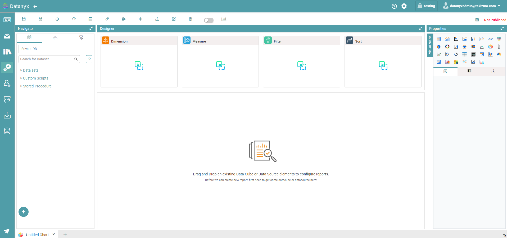
Step 5: Drag and Drop the columns under “Data Sets” onto the Dimension, Measure, Filter and Sort Boxes to start the chart creation.
- Dimension: String Columns (Text Columns) and date column to be put under this.
- Measure: Numerical Columns under this. You can also select different functions ranging from Sum, Distinct Count, Count, Average, Min, Max, Group and None.
- Filter: You can filter your chart.
- Sort: You can sort the columns by Ascending and Descending.
Filters in a Chart
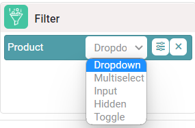
Filter: Dropdown
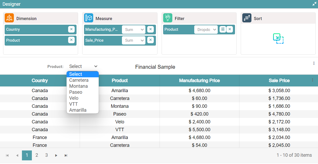
Step 1: Under the chart page in design, drag and drop the columns under Data sets into Dimension and Measure. The table is then created.
Step 2: Drag and drop any columns present under dimension or measure into the filter box.
Step 3: Select any of the options from the filter dropdown button to apply the same to the chart. Click on the dropdown option. The filter appears in the form of a dropdown. (Refer to the image below).
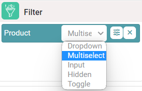
Filter: Multiselect
Step 1: Under the chart page in design, drag and drop the columns under Data sets into Dimension and Measure. The table chart is then created.
Step 2: Drag and drop any columns present under dimension or measure into the filter box. Click on the filter dropdown button and click on the Multiselect option as shown in the image below.
Step 3: Select any values from the multiselect dropdown. The data represented in the chart is based on the values that have been selected. (Refer to the image below).
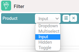
Filter: Input
Step 1: Under the chart page in design, drag and drop the columns under Data sets into Dimension and Measure. The table chart is then created.
Step 2: Drag and drop any columns present under dimension or measure into the filter box. Click on the filter dropdown button and click on the input option as shown in the image below.
Step 3: Enter any value in the text box. The data represented in the chart is based on the value that has been entered. (Refer to the image below).
Filter: Hidden
Step 1: Under the chart page in design, drag and drop the columns under Data sets into Dimension and Measure. The table chart is then created.
Step 2: Drag and drop any columns present under dimension or measure into the filter box. Click on the filter dropdown button and click on the option named Hidden. (Refer to the image below).
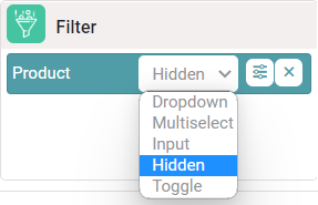
Step 3: The filter selected will not be visible in the chart. Click on the filter preferences icon. The filter configuration popup appears on the screen.
Step 4: Select logical operator and give the value of your choice and click on the save button. (Refer to the image below).
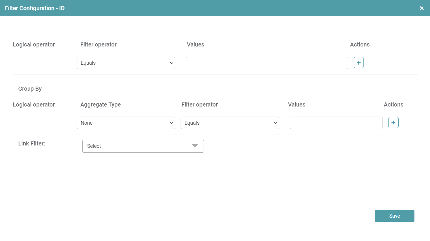
Step 5: The chart is represented based on the value given in the filter configuration dialog box.
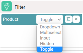
Filter: Toggle
You can toggle between two filter values, causing the charts to update dynamically in accordance with the selected filter.
Step 1: Under the chart page in design, drag and drop the columns under Data sets into dimension and measure. The table chart is then created.
Step 2: Drag and drop any columns present under dimension or measure into the filter box. Click on the filter dropdown button and click on the toggle option. (Refer to the image below).
Step 3: A filter configuration dialog box appears. You can select the font family, label color, mandatory filter, enable default value and enter filter values as well. Click on the save button once the desired values are entered.
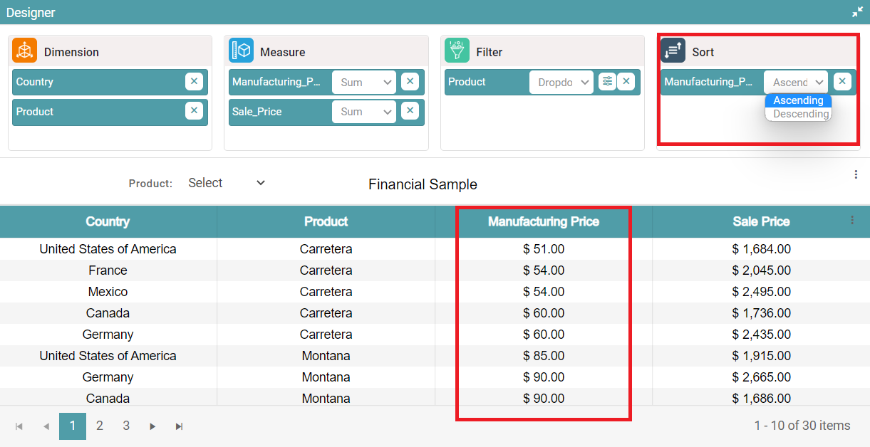
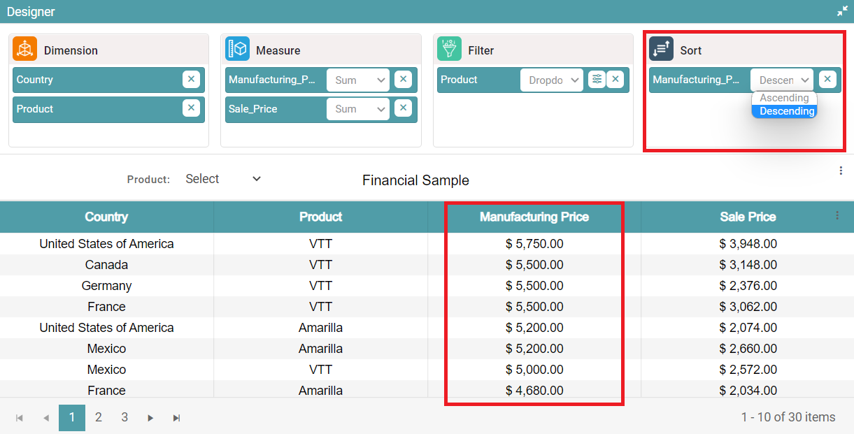
Sort
Sort – (Ascending/ Descending Order)
Step 1: Under the chart page in design, drag and drop the columns under Data sets into dimension and measure. The table chart is then created.
Step 2: Drag and drop the column that you need to sort, into the ‘sort’ section.
Step 3: Click on the dropdown button under sort and select ascending/descending order.
Step 4: The column will be sorted in ascending/descending order. (Refer to the images below).
Save
Step 1: Click on the ’Save’ icon.
Step 2: You can see that a save popup appears on the screen. Enter the name of the chart and click on the save button. Now your chart has been saved successfully.
Save As
Step 1: Click on the ’Save as’ icon and save an already existing chart.
Step 2: You can see that a popup appears. Click on the save button. Now your chart has been saved successfully.
Reset
Step 1: Under the chart page in design, drag and drop the columns under Data sets into dimension and measure. The table chart is then created.
Step 2: Click on the reset icon. A warning popup will appear. (Refer to the image below).
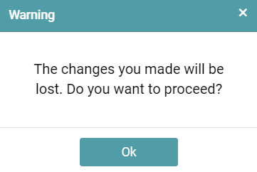
Step 3: Click on the ok button to reset the changes made.
Refresh
Step 1: Under the chart page in design, drag and drop the columns under Data sets into dimension and measure. The table chart is then created.
Step 2: Click on the refresh icon to update the data in the chart.
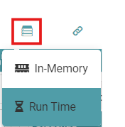
Storage Type
Step 1: Under the chart page in design, drag and drop the columns under Data sets into dimension and measure. The table chart is then created.
Step 2: The user can select the storage type from “In-Memory or Run time”. (Refer to the image below).
Embed Link
Step 1: Click on the embed link icon. A popup will appear on your screen. (Refer to the image below).
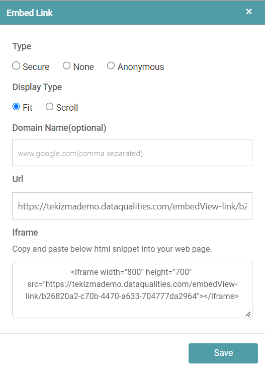
Step 2: Click on the save button after the desired changes are made.
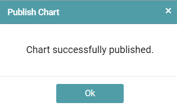
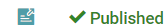
Publish
Step 1: Click on the publish icon. A popup message appears on your screen, click on the ok button to get the chart published. (Refer to the image below).
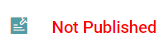
Step 2: The chart status will be updated from Not Published to Published. (Refer to the images below).
Preview
Step 1: Click on the preview icon. The preview of the chart will be displayed on the screen. (Refer to the image below).
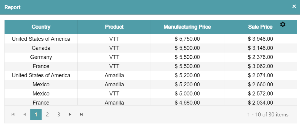
Export
Step 1: Create a chart or select any existing chart.
Step 2: Click on the Export chart icon available on the chart page.
Step 3: A RPT file will be downloaded onto the local device. (Refer image below).
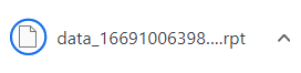
Template Editor
Step 1: Click on the template editor icon. A warning popup will appear. Click on the ok button. (Refer to the images below).

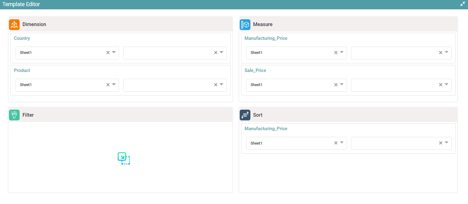
Step 2: The template editor is opened. The user will be able to make the necessary changes such as dimension, measure, filter and sort columns from the dropdown button. (Refer to the image below).
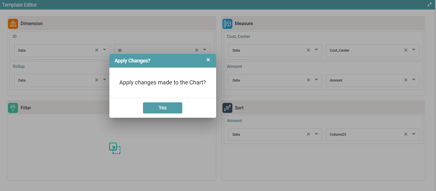
Step 3: After making the necessary changes to the columns, click on the template editor icon again.
Step 4: You will get a pop-up confirmation regarding the changes made. Click on the Yes button to update the chart. (Refer to the image below).
Hidden Widget
Step 1: Click on the Hidden Widget icon. Click on Save. (Refer to the image below).
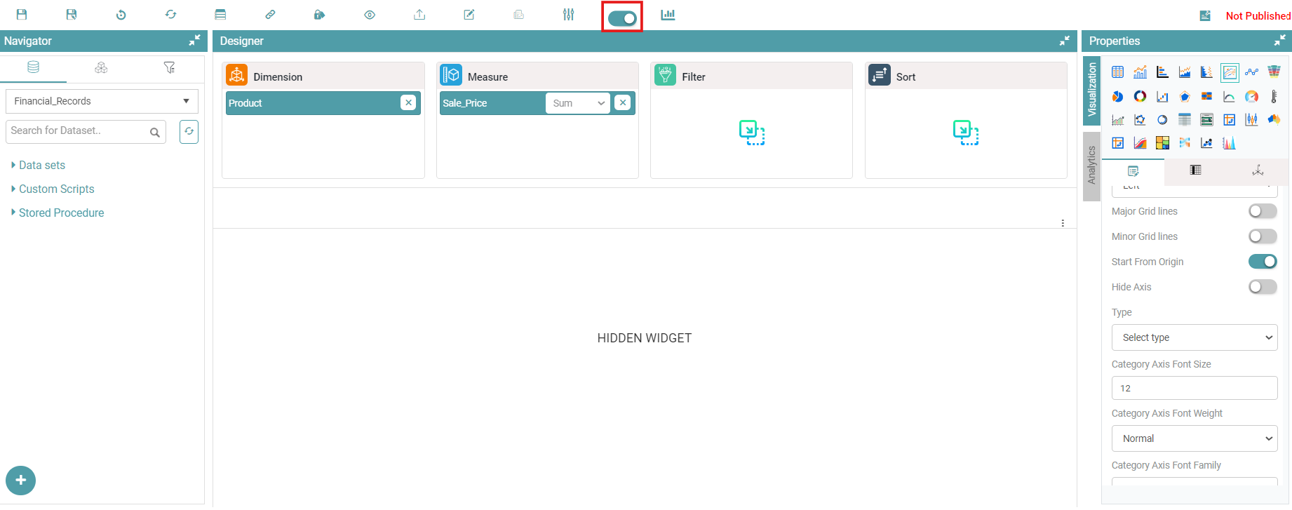
Step 2: The Chart gets hidden and will no longer be visible on the Dashboard. (Refer to the images below).
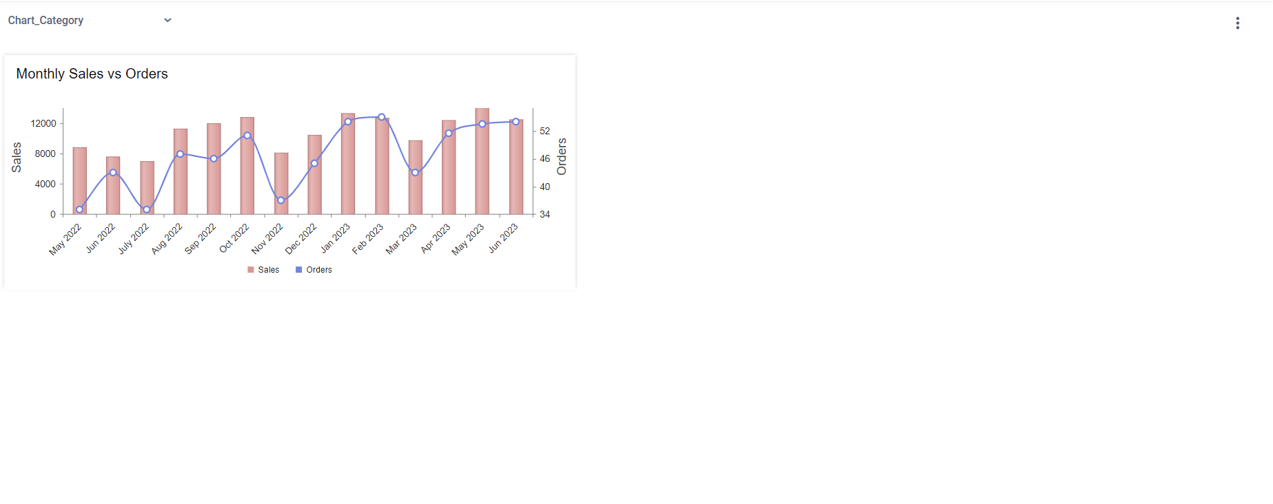
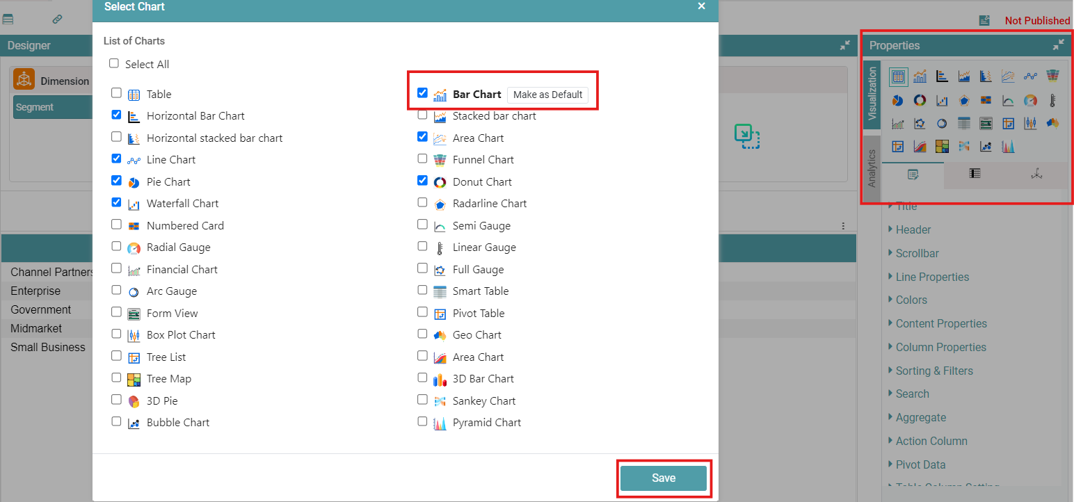
Change Chart Type
Step 1: Create a New Chart (Can be any chart from Properties). Click on the Change Chart Type icon.
Step 2: Select from the List of Chart Types.
Step 3: You can select a chart type to make as default. Right Click and select Make as Default (This would be the default chart type on the Dashboard Page). Click on Save. (Refer to the image below).
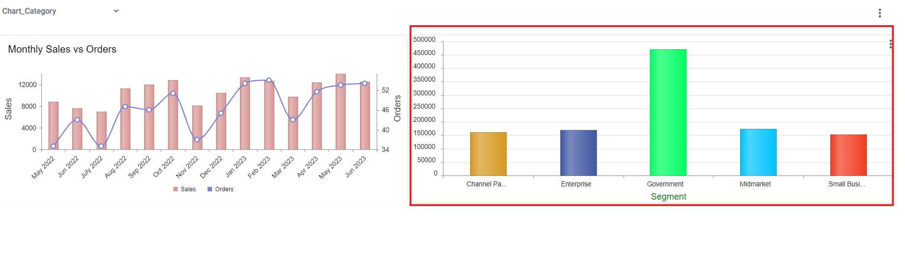
Step 4: Create a Report using the Chart that has been created.
Step 5: Navigate to the dashboard. In the image above, the default chart type is set to “Bar Chart.” However, a Table has been created. On the Dashboard Page, the chart will be displayed as a Bar Chart, following the default setting, rather than as the Table that was originally selected from the Properties. (Refer to the image below).
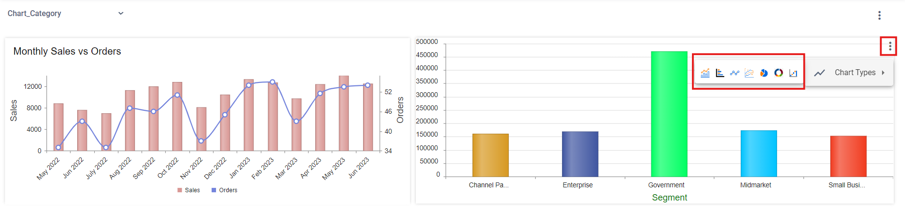
Note: You can switch between the selected charts on the dashboard. Click on the three dots menu and select the chart you need. (Refer to the images below).
Custom Script
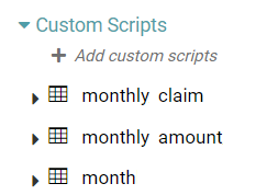
Step 1: Click on Custom script.
Step 2: In the dropdown, the user is able to add custom scripts and is able to choose the previously created custom scripts. (Refer to the image below).
Step 3: Drag and drop the custom script columns into dimension and measure.
Step 4: Then data will be shown in the form of a table.
Step 5: To change the chart type, select the desired chart from chart properties.
Custom script – Drill Down
If the drilldown chart has been created using a custom script, follow the steps below to make the filters work.
Step 1: Open the drill down chart in the chart designer.
Step 2: In the drill down chart, drag and drop the column that needs to be used as a filter under the filter box in the chart design page.
Step 3: Make the filter as Hidden and save the chart.
Step 4: Now, navigate to the main chart and go to columns and click on the Report or Chart for Drill down dropdown and click on none.
Step 5: Click on the drop down once more and select the required drill down chart.
Step 6: Toggle on the Apply Filter on Click toggle and select the fields that you want the filter to be applied on.
Step 7: Once the steps above have been adhered to save the chart.
Custom Variable
Step 1: Click on the Design tab on the Main Navigation bar.
Step 2: Click on the add icon located on the bottom right of the screen. Click on the add new icon.
Step 3: Give a preferred name to your project.
Step 4: Click on the chart icon to ‘Create a new chart’.
Step 5: Drag and drop the columns required to create a table.
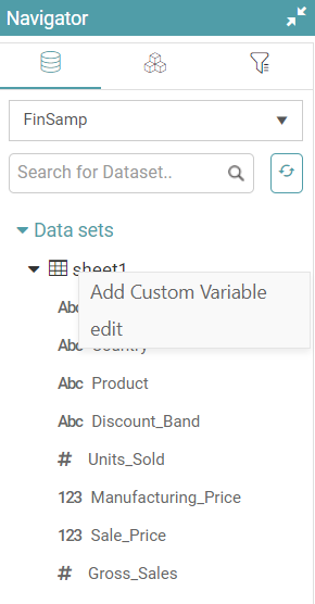
Step 6: Right click on the data set and click on add custom variable. A custom variable popup appears. (Refer to the image below).
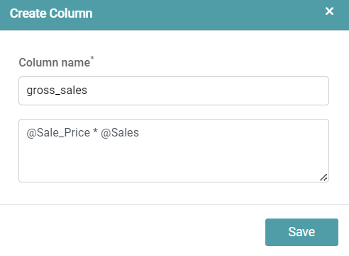
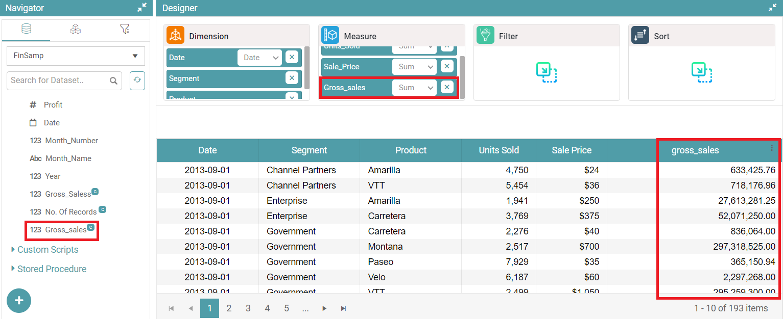
Step 7: You can enter the preferred column name and enter the action that they want to perform. In the example, Sales Price has been multiplied by Sales to get gross sales. (Refer to the image below).
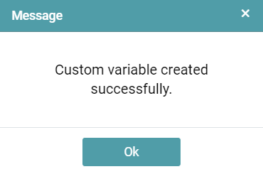
Step 8: Click on the save button. A popup that indicates the successful creation of the custom variable appears. Click on ok. (Refer to the image below).
Step 9: You will be able to find the custom variable that has been created to the left under the Navigator. The custom variable would be represented by a “C” at the end of the name.
Step 10: If you drag and drop the custom variable you’ve made to the “measure” section, it will appear as a column in the table for you to view. (Refer to the image below).
Note: We can use any Numeric, character, Date or Conversion functions.
Some of the operations that the user can perform are as under:
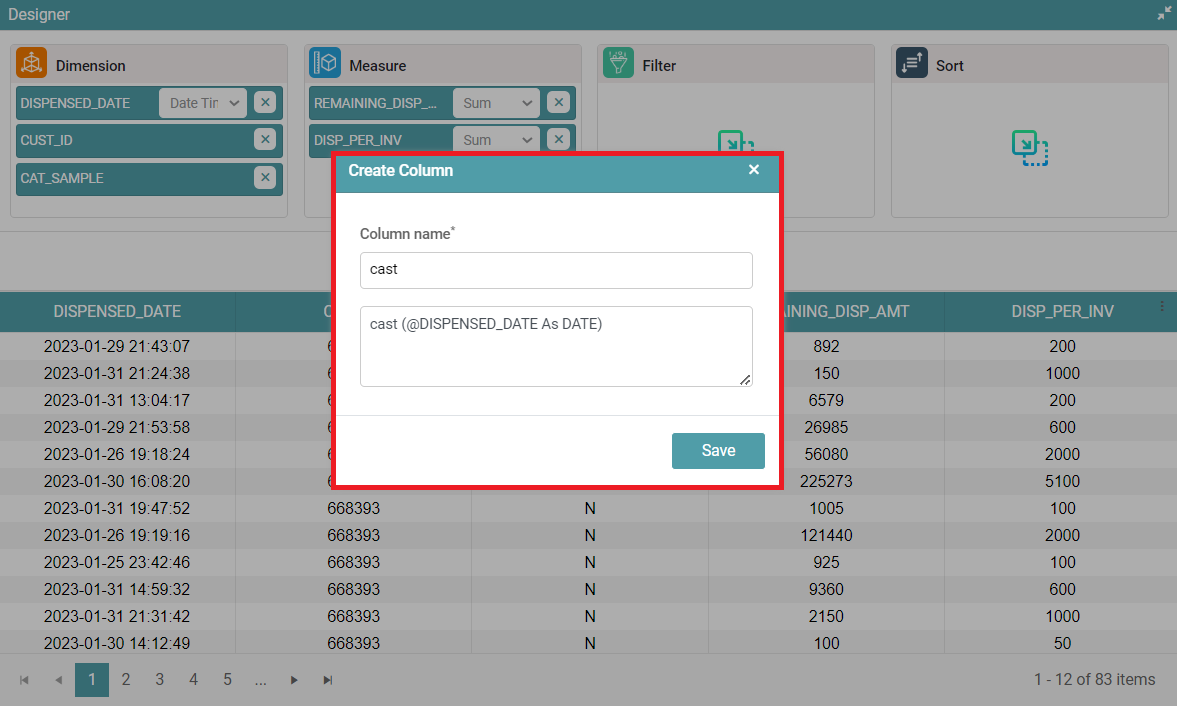
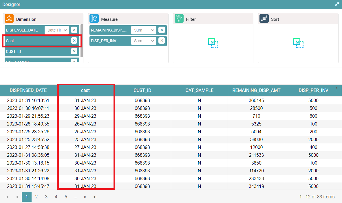
cast (@column_name As date) – The date and time column will be displayed as date only. (Refer to the images below).
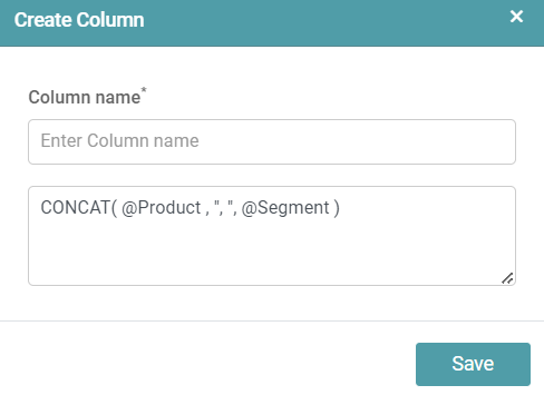
CONCAT(@column1_name,”,”, @Column2_name) – Combines the text from multiple strings. (Refer to the images below).

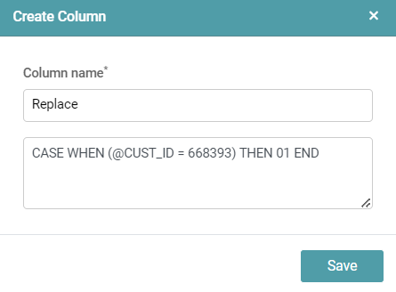
CASE WHEN (@ column1_name = Value) THEN replace_value END – Replaces the original value with another value the user requires. (Refer to the images below).

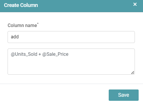
@ Column1_name + @ Column2_name – Adds the values of two columns. @ Column1_name – @ Column2_name – Subtracts the values of two columns. @ Column1_name / @ Column2_name – Divides the values of two columns.
The example below gives us the result of the “Add” operation. (Refer to the images below).

Note: The user can perform multiple complex operations with the aid of custom variables. There can be multiple custom variables created under one dataset.