Creating a Full Gauge Chart
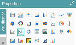
Step 1: On the top right corner of the page, click on visualization under properties. Click on the Full Gauge icon under properties. (Refer to the image below).
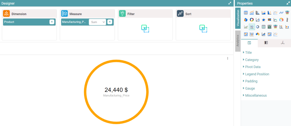
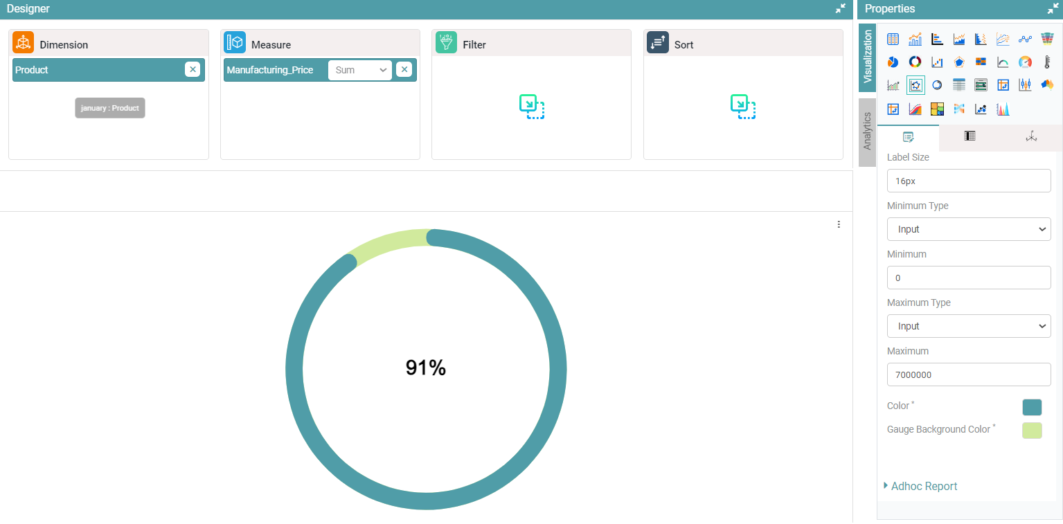
Step 2: Drag and drop the required columns in dimension and measure. The data is represented in the form of a Full Gauge Chart. (Refer to the image below).
Properties
Gauge
Step 1: On the top right corner of the page, click on visualization under properties. Click on the Full Gauge icon under properties.
Step 2: Drag and drop the required columns in dimension and measure. The data is represented in the form of a Full Gauge Chart.
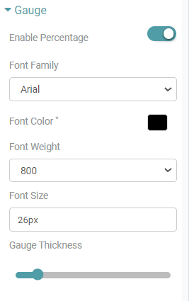
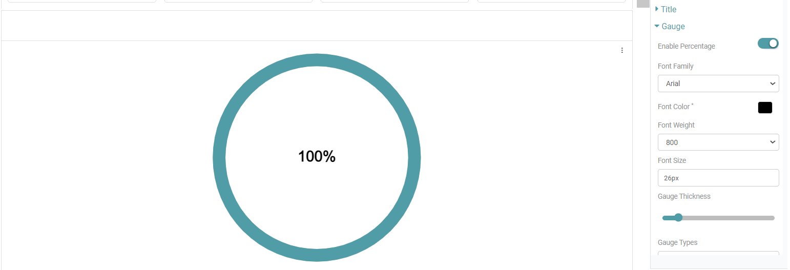
Step 3: Click on Gauge. Enable percentage and select font color, font weight and font size. The percentage is represented with the chosen color. (Refer to the images below).


Step 4: Now, you can select Gauge Type, Label Family, Label Color, Label Weight, Label Size, Minimum Type, Minimum, Maximum Type and Maximum. (Refer to the image below).
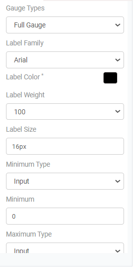
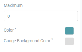
Step 5: Finally, you can select the Color of the gauge and the Gauge Background Color. (Refer to the images below).
Minimum and Maximum Values are the same as Semi Gauge Chart.
Miscellaneous is similar to Bar Chart and Table Chart.
Columns
Columns are the same as Table Chart, Bar Chart and Pie Chart columns.