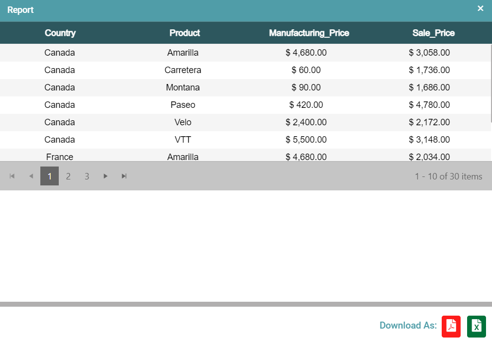
Creating a Table Chart
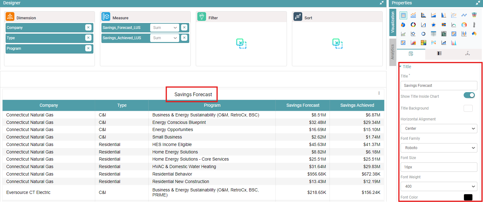
Step 1: Once a new chart has been created, select the Datasource from the dropdown and expand the dataset. (Refer to the image below).


Step 2: Drag and drop the columns into dimension and measure to create a table. (Refer to the image below).

Step 3: Click on the save icon. Now your Chart has been saved successfully.
Properties
Title
Step 1: On the top right corner of the page, click on visualization under properties. (Refer to the image below).
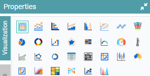
Step 2: Now, click on the properties icon under visualization.
Step 3: You can now enter the title, select the title background, show title inside chart, choose the options under horizontal alignment, select your desired font, adjust the size of your font, select the font weight and choose the font color.
Step 4: The desired title is applied. (Refer to the image below).
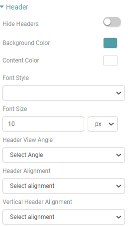
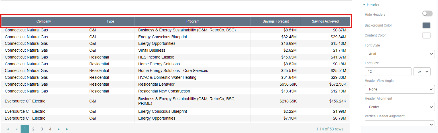
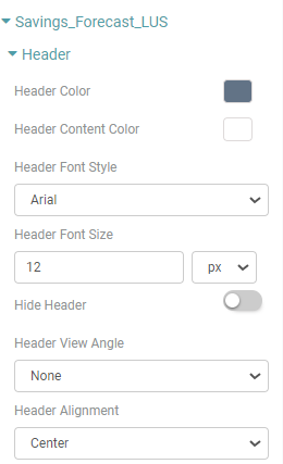
Header
Step 1: On the top right corner of the page, click on visualization under properties.
Step 2: Now, click on the properties icon under visualization.
Step 3: You can now customize the Table Header by navigating to the Header option under the properties tab.
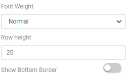
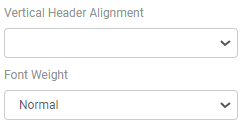
Step 4: You can Hide the headers, select the Background color, Content color, Header Font style, Header Font Size, Header view angle, Header Alignment, Vertical Header Alignment, Font weight, Row height and show the bottom border of the header. (Refer to the images below).
Step 4: The Table Header has now been customized according to your requirement. (Refer to the image below).
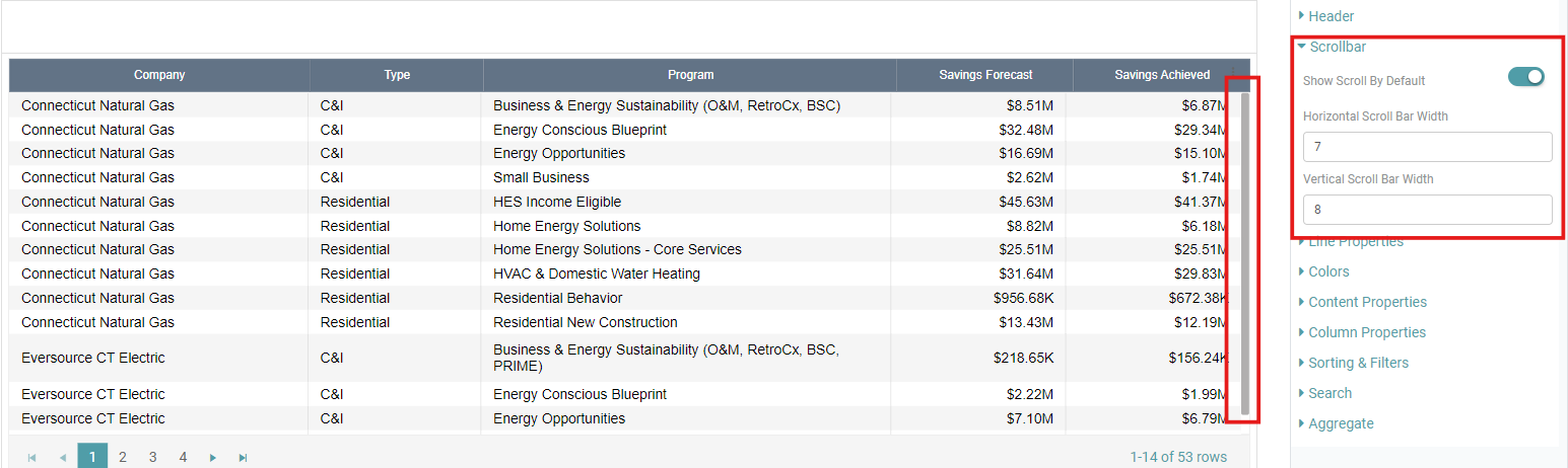
Scroll Bar
Step 1: On the top right corner of the page, click on visualization under properties.
Step 2: Now, click on the properties icon under visualization.
Step 3: You now have the option to display a scroll bar on the table. To toggle the scroll bar on or off, go to the properties tab and click on Scroll Bar.
Step 4: You have the ability to specify the width of both the horizontal and vertical scroll bars on the table. (Refer to the image below).
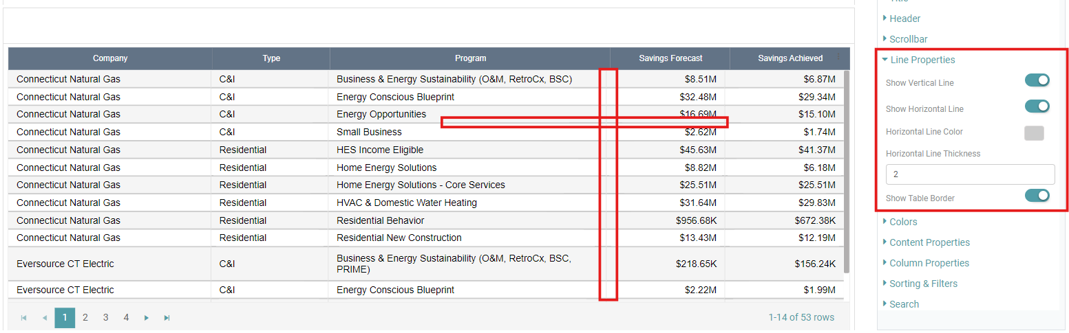
Line Properties
Step 1: On the top right corner of the page, click on visualization under properties.
Step 2: Now, click on the properties icon under visualization.
Step 3: You now have the option to display lines on the table. To toggle the Vertical Line, Horizontal Line and Table Border on or off, go to the properties tab and click on Line Properties.
Step 4: You can select the Horizontal Line Color and Horizontal Line Thickness to fit your requirement. (Refer to the image below).
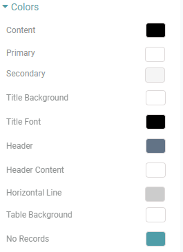
Colors
Step 1: On the top right corner of the page, click on visualization under properties.
Step 2: Now, click on the properties icon under visualization.
Step 3: You now have the option to customize the colors on the table by navigating to the Colors option under the properties tab.
Step 4: You can customize the Content color, Primary color & Secondary color of alternate rows, Title background, Title font, Header color, Header content color, Horizontal line color, Table background color and the color of No records. (Refer to the image below).
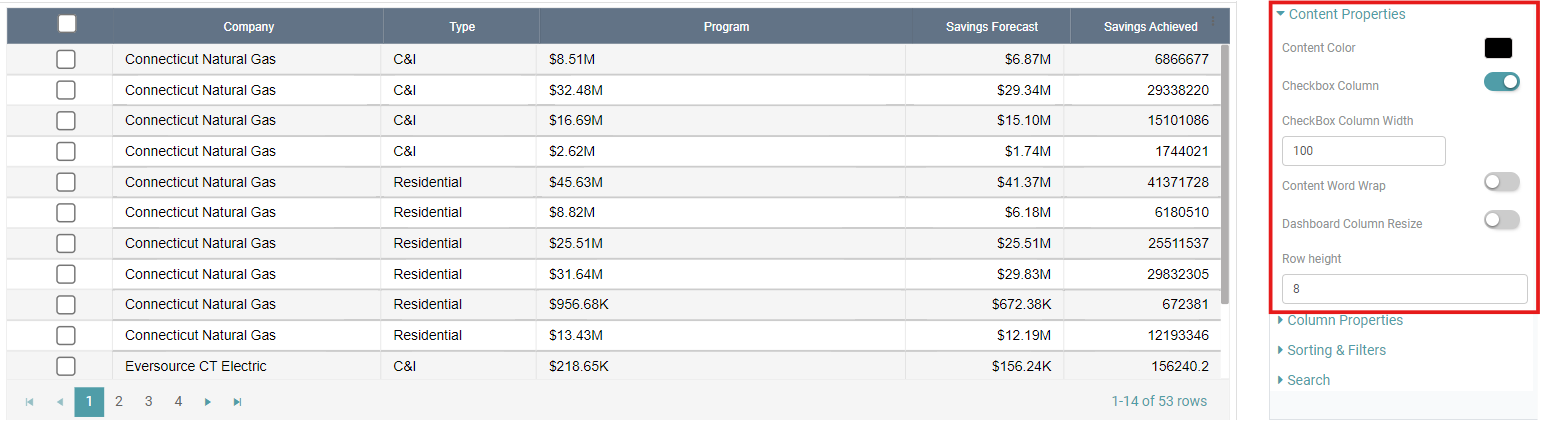
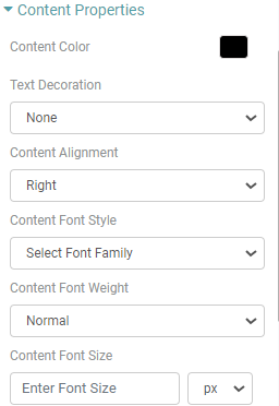
Content Properties
Step 1: On the top right corner of the page, click on visualization under properties.
Step 2: Now, click on the properties icon under visualization.
Step 3: You now have the option to customize the content on the table by navigating to the Content Properties option under the properties tab.
Step 4: Now, you are able to customize the Color, add a checkbox column, Word wrap the content, Dashboard column resize and alter the row height of the table. (Refer to the image below).
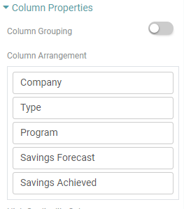
Column Properties
Step 1: On the top right corner of the page, click on visualization under properties.
Step 2: Now, click on the properties icon under visualization.
Step 3: Navigate to the Column Properties option under the properties tab to Group the columns, Arrange the columns in order. (Refer to the image below).
Step 4: Click on the High Cardinality Column and select the columns to be ordered in a sequence. In the following example, the Company, Type, Program is arranged in ascending order (A to Z). (Refer to the images below).
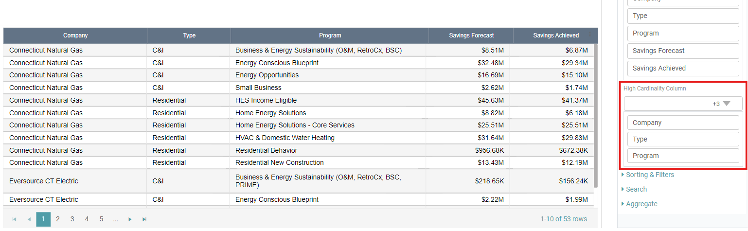
Note: If there is a large volume of data and no sorting or ORDER BY clause is applied, the data may appear in a random or inconsistent order.
To ensure consistent ordering in charts, it is recommended to choose a column with high cardinality (i.e., more unique values). This ensures that the data will always be sorted based on the selected column, giving a consistent and predictable order in your charts.
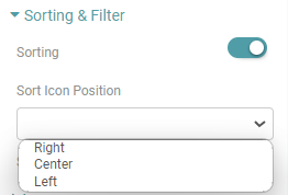
Sorting & Filters
Step 1: On the top right corner of the page, click on visualization under properties.
Step 2: Now, click on the properties icon under visualization.
Step 3: Navigate to the Sorting & Filter option under the properties tab to Sort and Filter the Columns in your table. (Refer to the image below).
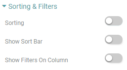
Step 4: To arrange the table, simply click the “Sorting” toggle wherein the data would be sorted between ascending and descending order. Moreover, enable “single column sorting” to sort one column at a time. Customize the position of the sorting icon on the header by selecting from the options in the “Sort icon position” dropdown menu. (Refer to the image below).

Note: Double click on the header to perform this operation.
Step 5: Click the “Show Sort Bar” toggle to reveal a sorting bar on the table. In this section, you can choose the columns where you wish to apply a particular sorting function, specify the alignment of the sorting bar, input the sorting label, and optionally toggle on the “Default Column Sort”.
Step 6: Additionally, toggle the “Show filters On Column” option to display filters for each column individually. (Refer to the images below).


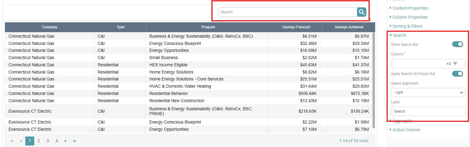
Search
Step 1: On the top right corner of the page, click on visualization under properties.
Step 2: Now, click on the properties icon under visualization.
Step 3: Navigate to the Search option under table properties. Enable the Show Search Bar toggle, select the column, Apply search on focus out toggle, select the alignment of the search bar and input a Label for the search bar. You can see that a search bar appears in the chart. (Refer to the image below).
Step 4: Disable the Show Search Bar toggle in table properties. The search bar is no longer visible in the chart.
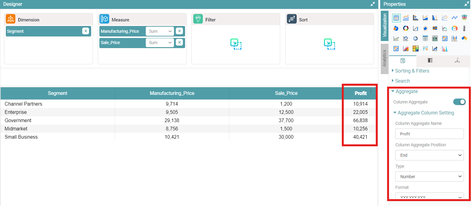
Aggregate
Step 1: On the top right corner of the page, click on visualization under properties.
Step 2: Now, click on the properties icon under visualization.
Step 3: Under table properties, click on ‘Aggregate’ to enable the table “Column Aggregate”.
Step 4: You can customize the column aggregate name, position, type, currency name, formats, format suffix, unit orientation, precision, column width, header color, header content color and the content color by clicking on the “Aggregate Column Setting” option.
Step 5: The data represented in the table will be in accordance with the values entered. (Refer to the image below).
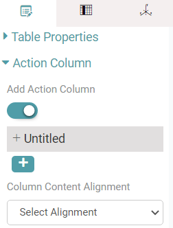
Action Column
Step 1: On the top right corner of the page, click on visualization under properties.
Step 2: Now, click on the properties icon under visualization.
Step 3: Enable the Add Action Column toggle under Action column (Refer to the image below).
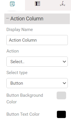
Step 4: Click on untitled and enter the display name.
Step 5: Click on the Action dropdown button and choose the desired option. You can choose the action type, Select type, Font Style, Background Color, Button Text color. If you select Icon, you can choose the existing icons or import your own. (Refer to the image below).
Step 6: Click on the Select Permissions dropdown to choose from existing permissions. (Refer to the image below).
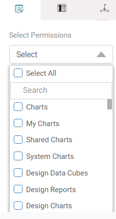
Step 7: You can also add new permissions by clicking on the icon.
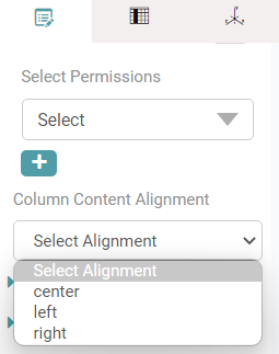
Step 8: You can also align the content by clicking on the dropdown under column content alignment. (Refer to the image below).
Pivot Data
Step 1: On the top right corner of the page, click on visualization under properties.
Step 2: Now, click on the properties icon under visualization.
Step 3: Enable Pivot the Data toggle under Pivot Data. You can now select the measure for pivot by clicking on the dropdown.
Step 4: Enable the show pivot heat map. You can see the Min Heat and Max Heat reflected in the chart. You can select the desired color of your choice. (Refer to the image below).
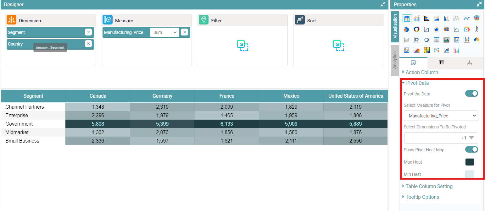
Table Column Setting
Step 1: On the top right corner of the page, click on visualization under properties.
Step 2: Now, click on the properties icon under visualization.
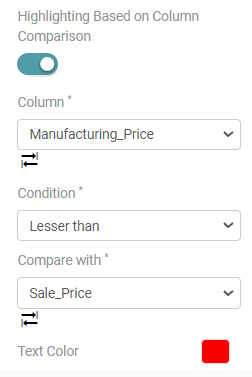
Step 3: Under ‘Table Column Setting’, you can select the Column, Condition and the other columns you want to compare the first column with.
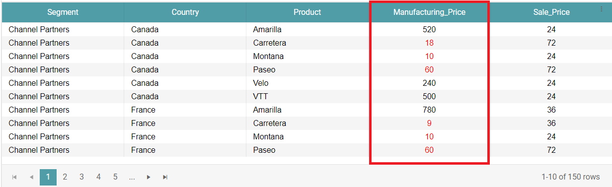
Step 4: You can also change the color of the values according to the condition selected. (Refer to the images below).
Tooltip Options
Step 1: On the top right corner of the page, click on visualization under properties.
Step 2: Now, click on the properties icon under visualization.
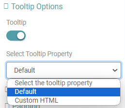
Step 3: Under ‘Tooltip options’, you can toggle on the Tooltip. Once this has been done, you can select the tooltip property from the dropdown. (Refer to the image below).
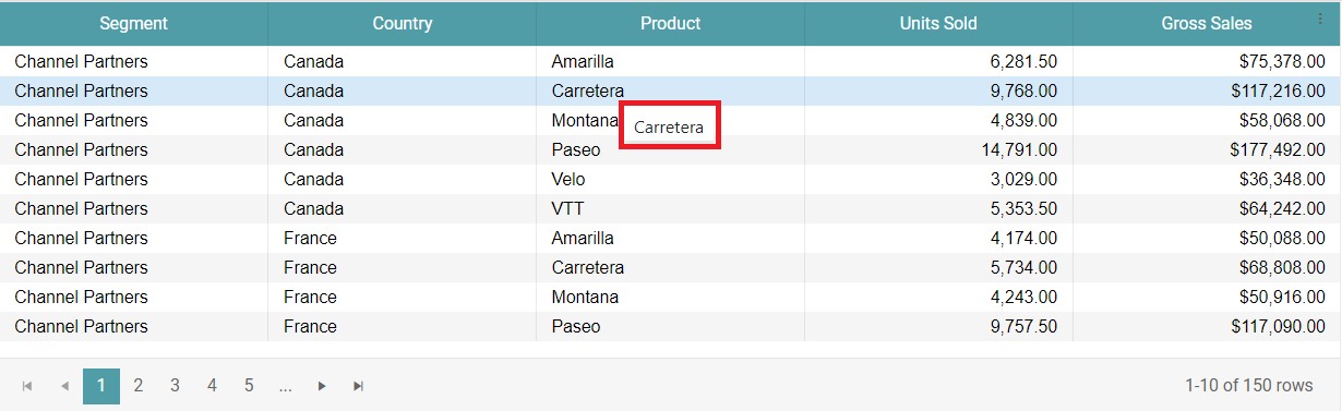
Step 4: The tooltip appears on the table when you hover on the column values. (Refer to the image below).
Note: The tool tip can be enabled for the entire table under properties. If you require a tool tip for a specific column, then you can navigate to columns and enable the tool tip.
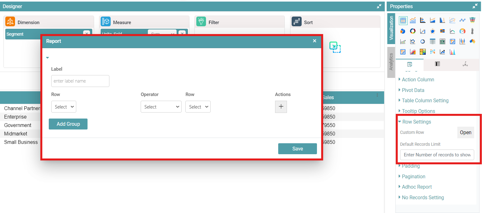
Row Settings
Step 1: On the top right corner of the page, click on visualization under properties.
Step 2: Now, click on the properties icon under visualization. Navigate to Row Settings.
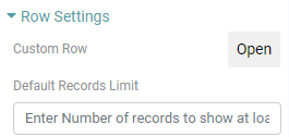
Step 3: Click on ‘Open’ under Custom Row function.
Step 4: A Report popup dialog box appears. You can customize the Label name, Row, Choose the Operator and Row. You can also Add Groups. Click on the Save button to save the changes made.
Step 5: You can also set a default records limit. (Refer to the images below).
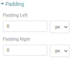
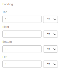
Padding
Step 1: On the top right corner of the page, click on visualization under properties.
Step 2: Now, click on the properties icon under visualization.
Step 3: You can enter the desired value under Padding and choose Padding Left and/ or Padding Right. The values can be represented as px, pt, cm, rem and %.
Step 4: The table moves from the Left and the Right in accordance with the value that has been entered under Padding. (Refer to the image below).
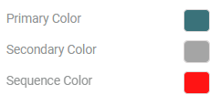
Pagination
Step 1: On the top right corner of the page, click on visualization under properties.
Step 2: Now, click on the properties icon under visualization.
Step 3: Click on pagination in properties and enter the page size.
Step 4: Select primary and secondary color. The selected colors are applied. You can also change the sequence color. (Refer to the images below).
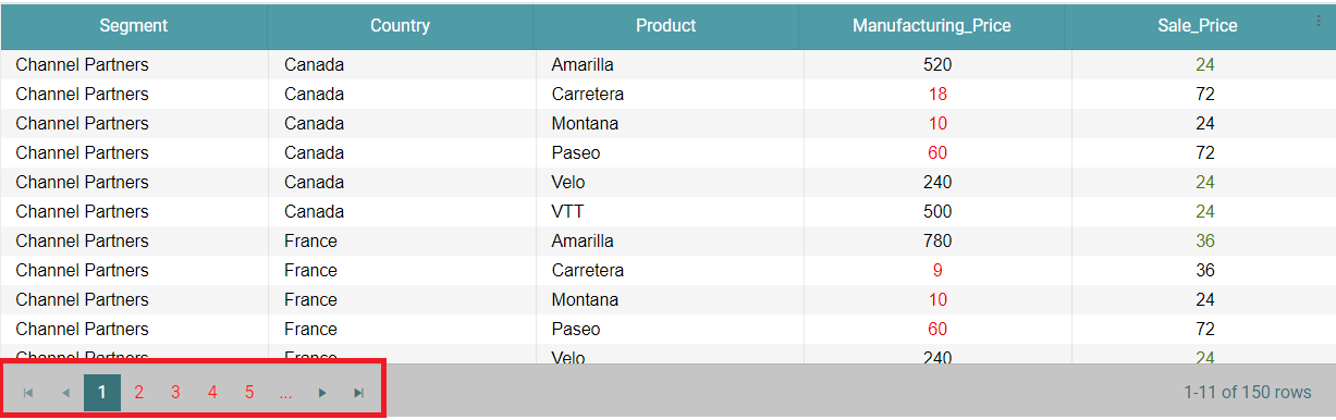
Step 5: You can also change the shape of the pagination. Click on the shape toggle. (Refer to the image below).

Step 6: If you want to toggle off the shape of the pagination and revert it back to how it was initially, click on the toggle again. (Refer to the image below).

Note: You can also give Custom Pagination to the table by toggling on the Custom Paging option.
Adhoc Report
Step 1: On the top right corner of the page, click on visualization under properties.
Step 2: Now, click on the properties icon under visualization.
Step 3: Enable the Adhoc Report toggle under Adhoc Report in the table chart. You can now see two options, namely ‘Generate’ and ‘Send to Inbox’.
Step 4: You can also enter default records limit, then only that number of columns will be displayed in the chart.
Step 5: You can select either of the options. If the ‘Generate’ option is clicked, a popup window of the report appears. The same can be downloaded as a pdf or Excel file. (Refer to the image below).
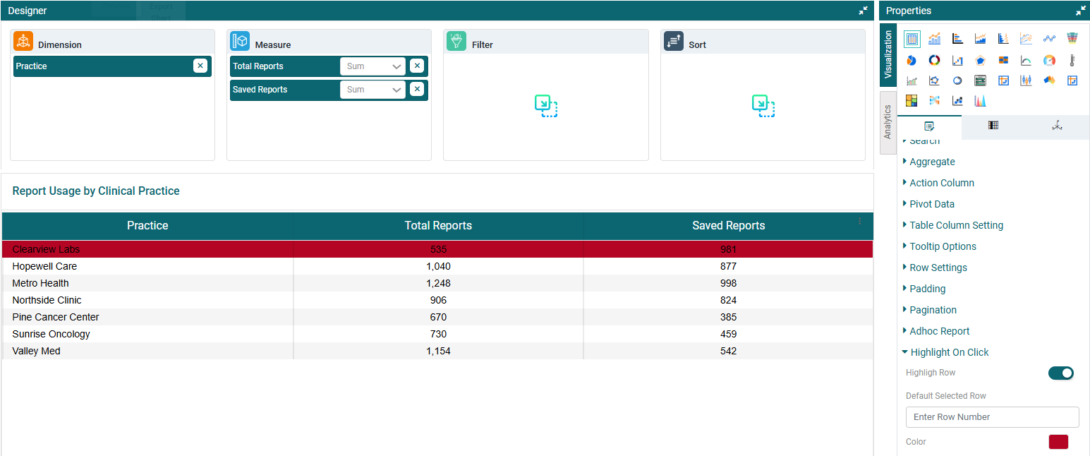
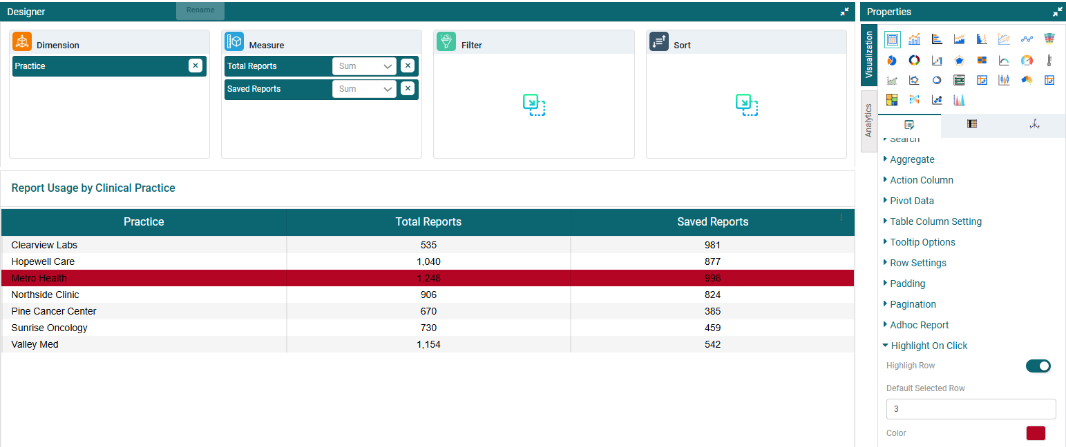
Highlight On Click
Step 1: On the top right corner of the page, click on visualization under properties.
Step 2: Now, click on the properties icon under visualization. Navigate to the Highlight On Click option under the properties tab.
Step 3: You can customize the the row that ought to be highlighted on the table upon click. (Refer to the image below).
Step 4: You can also specify a default row number to be selected, so that it is highlighted by default. (Refer to the image below).
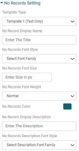
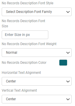
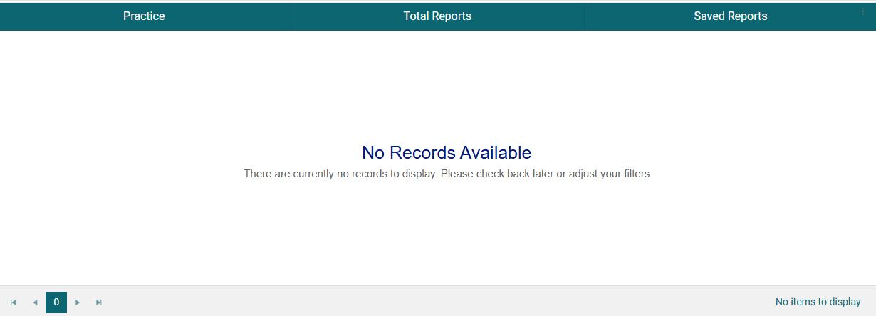
No Records Setting
Step 1: On the top right corner of the page, click on visualization under properties.
Step 2: Now, click on the properties icon under visualization. Navigate to the No Records Setting option under the properties tab.
Step 3: Configure the appearance of the ‘No Records’ message by setting the template type, title and description text, font styles, sizes, weights, colors, and text alignment options. (Refer to the images below).
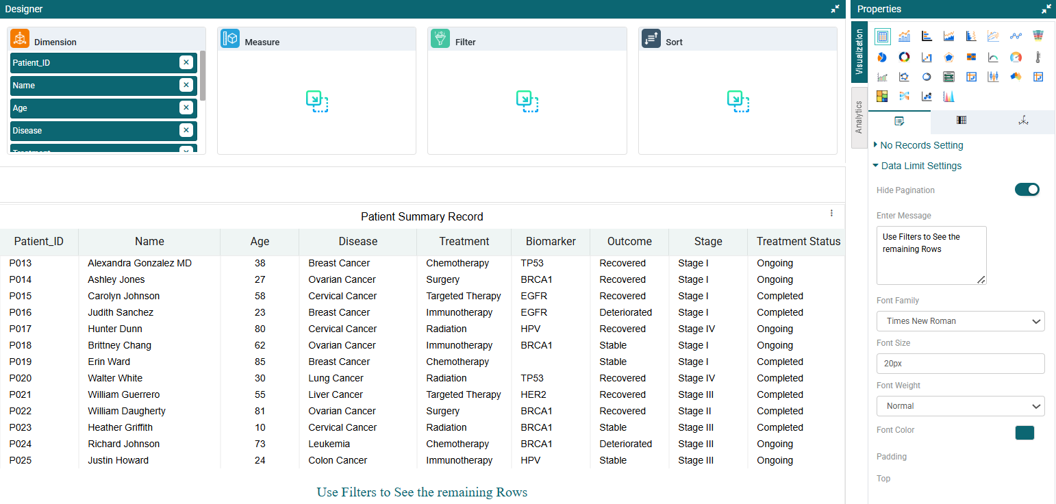
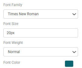
Data Limit Settings
Step 1: On the top right corner of the page, click on visualization under properties.
Step 2: Now, click on the properties icon under visualization. Navigate to the Data Limit Settings option under the properties tab.
Step 3: Turn off the Pagination toggle to display a fixed number of records without pagination.
Step 4: Type a custom message to be displayed at the end of the data. For example: “To view more data, please apply filters.” (Refer to the image below).
Step 5: Customize the message using the available styling options — font family, font color, font size, font weight, and padding (top, bottom, left, right). (Refer to the images below).
Columns
Note: Below are the listed customizations available for the Measure Columns:
Header
Step 1: Create a table chart. On the top right corner of the page, click on visualization under properties.
Step 2: Now, click on the ‘Columns’ tab. Here, the dimension and measure columns can be customized.
Step 3: Click on the column you want to customize.
Step 4: To customize your Header, click on the header option. Here, you can change the header color, header content color for the column selected, header font style, header font size, hide the header, change the header view angle, align the header and change the font weight of the header. (Refer to the image below).
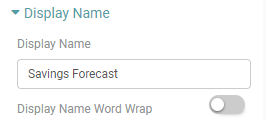
Display Name
Step 1: Create a table chart. On the top right corner of the page, click on visualization under properties.
Step 2: Now, click on the ‘Columns’ tab. Here, the dimension and measure columns can be customized.
Step 3: Click on the column you want to customize.
Step 4: Click on the Display Name option to personalize the Display name according to your requirement.
Step 5: Here, you can change the display name and can apply word wrap to it by clicking on the Display Name Word Wrap toggle. (Refer to the image below).
Content Properties
Step 1: Create a table chart. On the top right corner of the page, click on visualization under properties.
Step 2: Now, click on the ‘Columns’ tab. Here, the dimension and measure columns can be customized.
Step 3: Click on the column you want to customize.
Step 4: Now, you are able to customize the Color, add a checkbox column, Word wrap the content, Dashboard column resize and alter the row height of the table for the column that you have selected. (Refer to the image below).
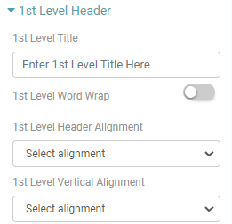
1st Level Header
Step 1: Create a table chart. On the top right corner of the page, click on visualization under properties.
Step 2: Now, click on the ‘Columns’ tab. Here, the dimension and measure columns can be customized.
Step 3: Click on the column you want to customize.
Step 4: You will be able to add 1st Level Title, 1st Level Word Wrap, choose 1st Level Header Alignment and 1st Level Vertical Alignment. (Refer to the image below).
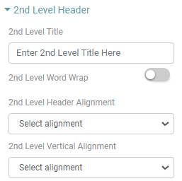
2nd Level Header
Step 1: Create a table chart. On the top right corner of the page, click on visualization under properties.
Step 2: Now, click on the ‘Columns’ tab. Here, the dimension and measure columns can be customized.
Step 3: Click on the column you want to customize.
Step 4: You can add 2nd Level Title, 2nd Level Word Wrap, choose 2nd Level Header Alignment and 2nd Level Vertical Alignment. (Refer to the image below).
Sorting & Filter
Step 1: Create a table chart. On the top right corner of the page, click on visualization under properties.
Step 2: Now, click on the ‘Columns’ tab. Here, the dimension and measure columns can be customized.
Step 3: Click on the column you want to customize.
Step 4: You can sort the column by clicking the “Sorting” toggle wherein the data would be sorted between ascending and descending order. Customize the position of the sorting icon on the header by selecting from the options in the “Sort icon position” dropdown menu. (Refer to the image below).
Note: Double click on the header to perform this operation.
Step 5: Additionally, toggle the “Show filters On Column” option to display filters for the specific column you have clicked on. You can restrict the values displayed in the filter by entering them into the filter values box. (Refer to the images below).
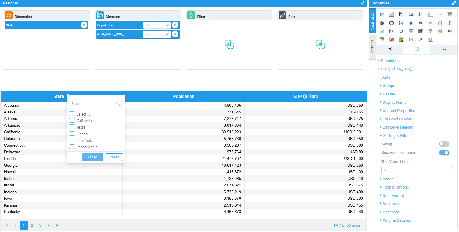
Image
Step 1: Create a table chart. On the top right corner of the page, click on visualization under properties.
Step 2: Now, click on the ‘Columns’ tab. Here, the dimension and measure columns can be customized.
Step 3: Click on the column you want to customize.
Step 4: Navigate to Image. Click on the ‘Enable Image’ toggle. Now, you can upload an image of your choice into that column. The uploaded image appears instead of the header.
Step 5: To replace the uploaded image, you can click on upload image and choose a new image of their choice. You can also personalize the image by adjusting the height and the width of the image. (Refer to the image below).
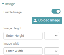
Tooltip Options
Step 1: Create a table chart. On the top right corner of the page, click on visualization under properties.
Step 2: Now, click on the ‘Columns’ tab. Here, the dimension and measure columns can be customized.
Step 3: Click on the column you want to customize.
Step 4: You can toggle on the Tooltip. Once this has been done, you can select the tooltip property from the dropdown. The tool tip will be visible on hover for the specific column you have selected. (Refer to the image below).
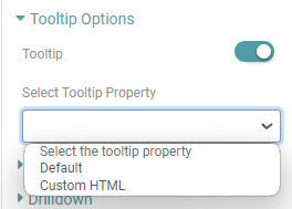
Type
Step 1: Create a table chart. On the top right corner of the page, click on visualization under properties.
Step 2: Now, click on the ‘Columns’ tab. Here, the dimension and measure columns can be customized.
Step 3: Click on the column you want to customize.
Step 4: Under the ‘Type’ dropdown, you will be able to choose currency, date, month, quarter, number and percentage.
Step 5: Under measure, you can change the Currency name, the format, Unit orientation and precision if you choose currency as your type. (Refer to the image below).
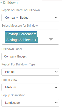
Drilldown
Step 1: Create a table chart. On the top right corner of the page, click on visualization under properties.
Step 2: Now, click on the ‘Columns’ tab. Here, the dimension and measure columns can be customized.
Step 3: Click on the column you want to customize.
Step 4: With this property you can add one chart/report as a drilldown to another chart.
Step 5: Select chart/report from the dropdown. Select the Measure for drilldown.
Step 6: Enter the Drilldown name. Select Report for Drilldown Type. You will be able to choose between pop-up, Inline, External and Fit to chart options.
Step 7: If pop-up has been selected, you can choose the pop-up view and orientation. (Refer to the image below).
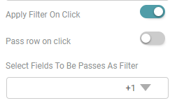
Step 8: You can Apply Filter on click, Pass row on click and select the fields to be passed as a filter. (Refer to the image below).
Step 9: The drilldown is added to the chart. If you click on any value in column, then drilldown will appear.
Heat Map
Step 1: Create a table chart. On the top right corner of the page, click on visualization under properties.
Step 2: Now, click on the ‘Columns’ tab. Here, the dimension and measure columns can be customized.
Step 3: Click on the column you want to customize.
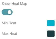
Step 4: You can enable the show heat map toggle and choose the min heat and max heat color as per requirement. (Refer to the image below).
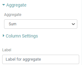
Aggregate
Step 1: Create a table chart. On the top right corner of the page, click on visualization under properties.
Step 2: Now, click on the ‘Columns’ tab. Here, the dimension and measure columns can be customized.
Step 3: Click on the column you want to customize.
Step 4: You can customize the column aggregate sum, count and average. The data represented will be in accordance with the selected aggregation.
Step 5: You can also choose a desired label name for that particular column. (Refer to the images below).
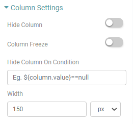
Column Settings
Step 1: Create a table chart. On the top right corner of the page, click on visualization under properties.
Step 2: Now, click on the ‘Columns’ tab. Here, the dimension and measure columns can be customized.
Step 3: Click on the column you want to customize.
Step 4: You can Hide the column, freeze the column, hide column on condition and specify the width of a specific column. (Refer to the image below).
Note: Below are the listed customizations available for the Dimension Columns:
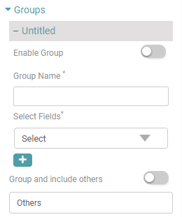
Groups
Step 1: Create a table chart. On the top right corner of the page, click on visualization under properties.
Step 2: Now, click on the ‘Columns’ tab. Here, the dimension and measure columns can be customized.
Step 3: Click on the column you want to customize.
Step 4: Give group name, select the fields and enable group. The chart will show the data as a whole for the group created.
Step 5: Additionally, you can categorize the remaining rows under “Others”. You can also give a desired name to the column. (Refer to the image below).
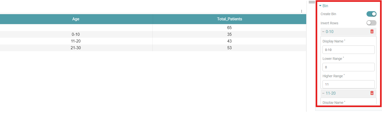
Bins
Step 1: Create a table chart. On the top right corner of the page, click on visualization under properties.
Step 2: Now, click on the ‘Columns’ tab. Here, the dimension and measure columns can be customized.
Step 3: Click on the column you want to customize. Navigate to the Bins option.
Step 4: Toggle on the Create bin option and click on the add icon next to “Untitled”.
Step 5: Name the bin according to the age range it represents. For example, the bin representing the 0-10 age range should have the following attributes: the “Lower Range” is 0, and the “Higher Range” is 11. (Refer to the image below).
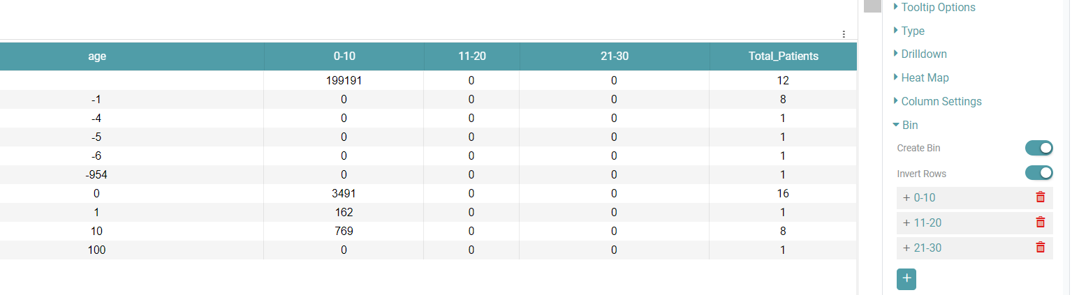
Invert Rows:
The “Invert Rows” option helps you pivot the data. Simply click on the toggle to enable it.(Refer to the image below).
The remaining features match those available in the measure column.