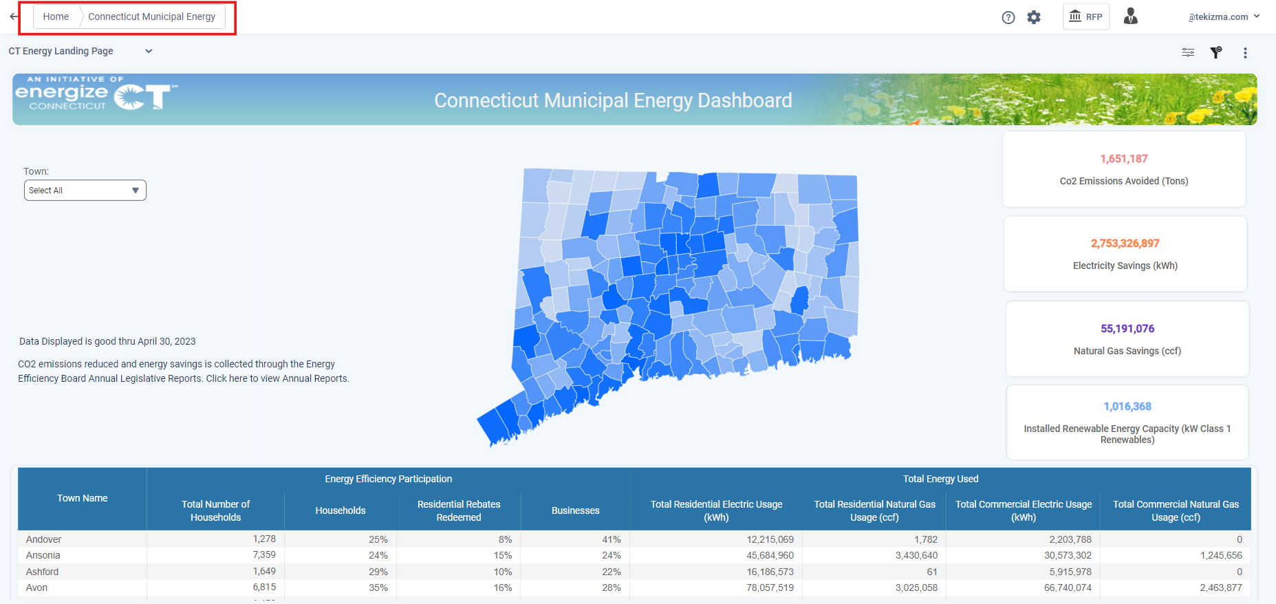
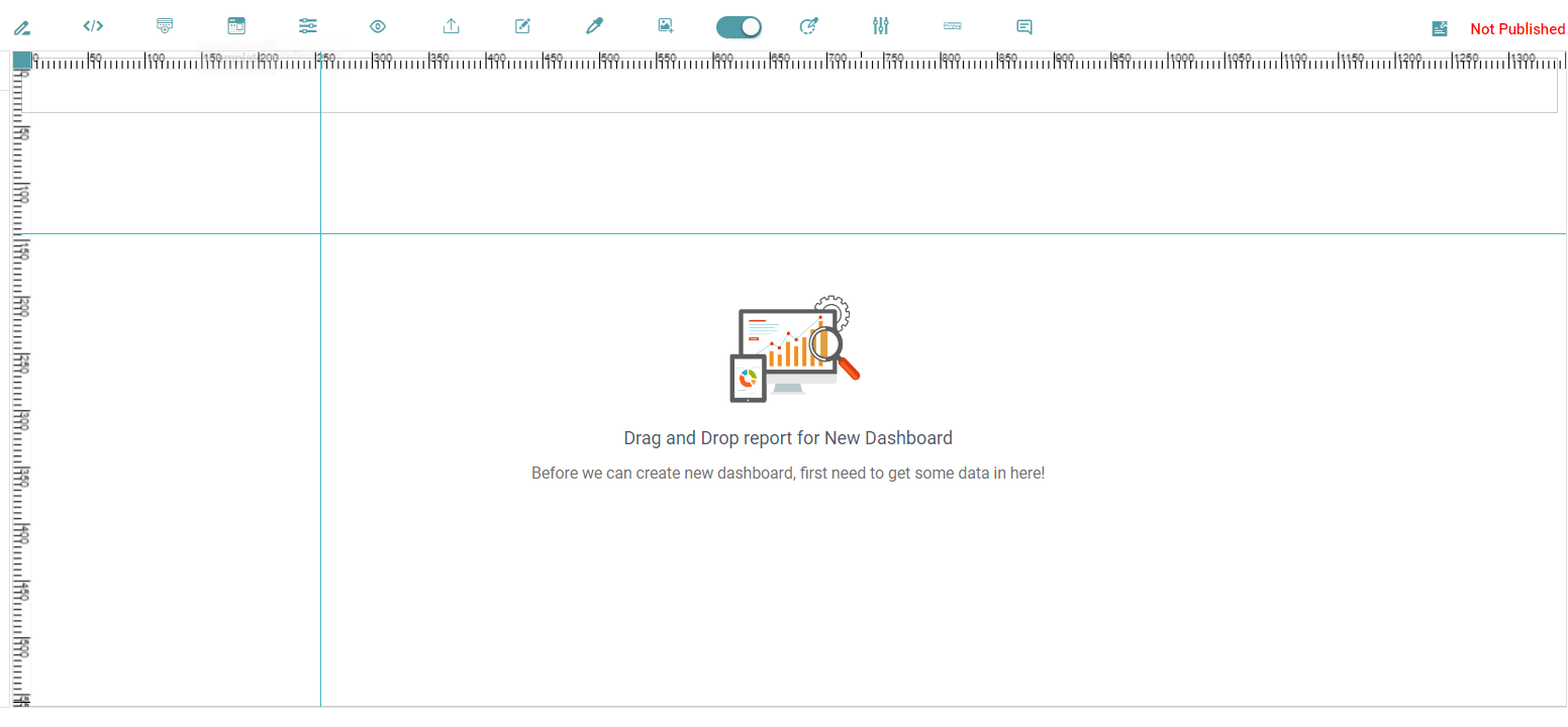
Create a Report
Step 1: Click on the Design Tab on the Main Navigation tool bar.
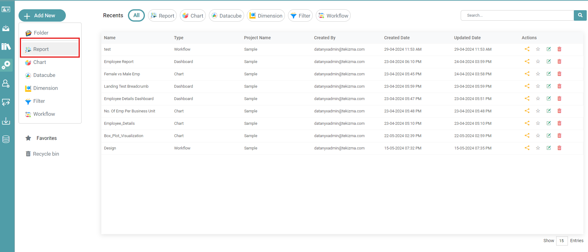
Step 2: Click on the add new button on the top left hand corner of the screen.
Step 3: Click the Folder icon in case you want to create a new project.
Step 4: Now, click the Report icon to create a new report. (Refer to the image below).


Step 5: In the pop-up that appears, you can either click on “Create from Scratch” or select a pre-designed report template.
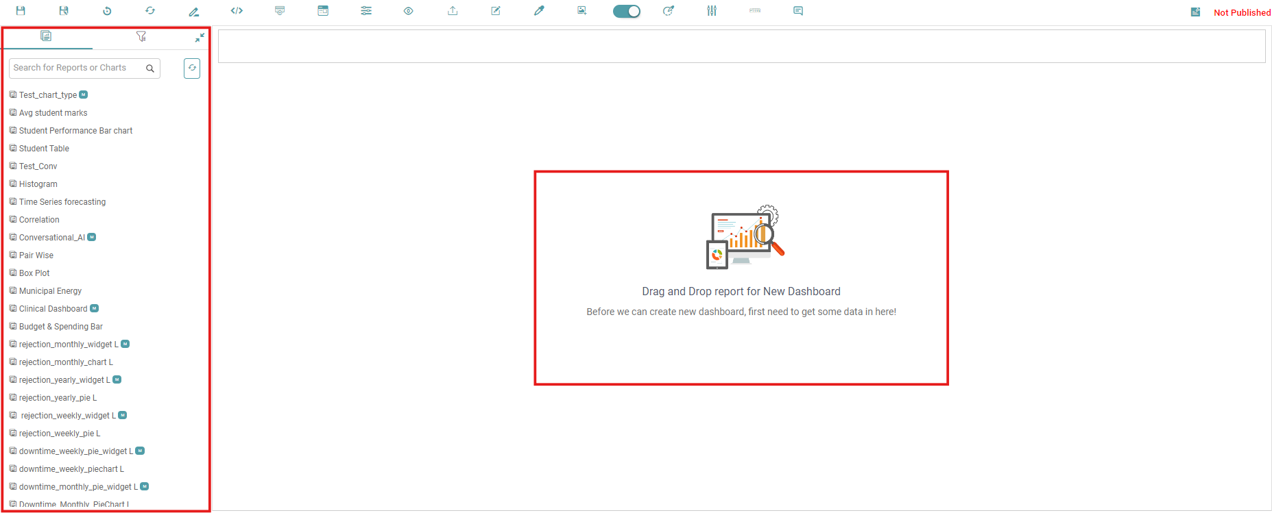
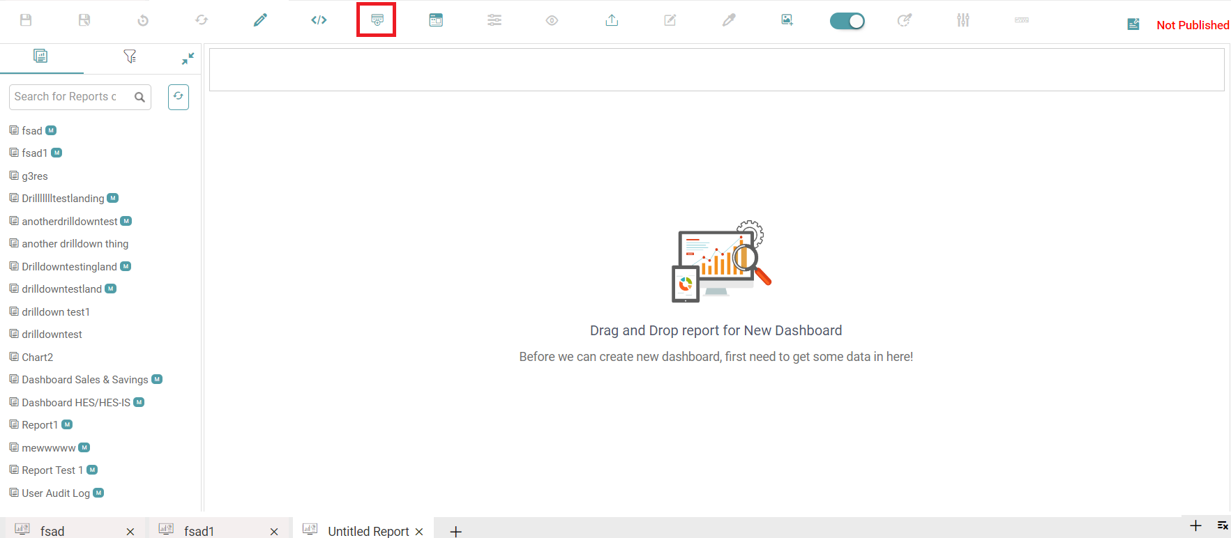
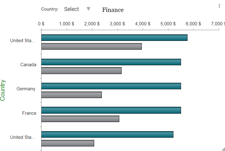
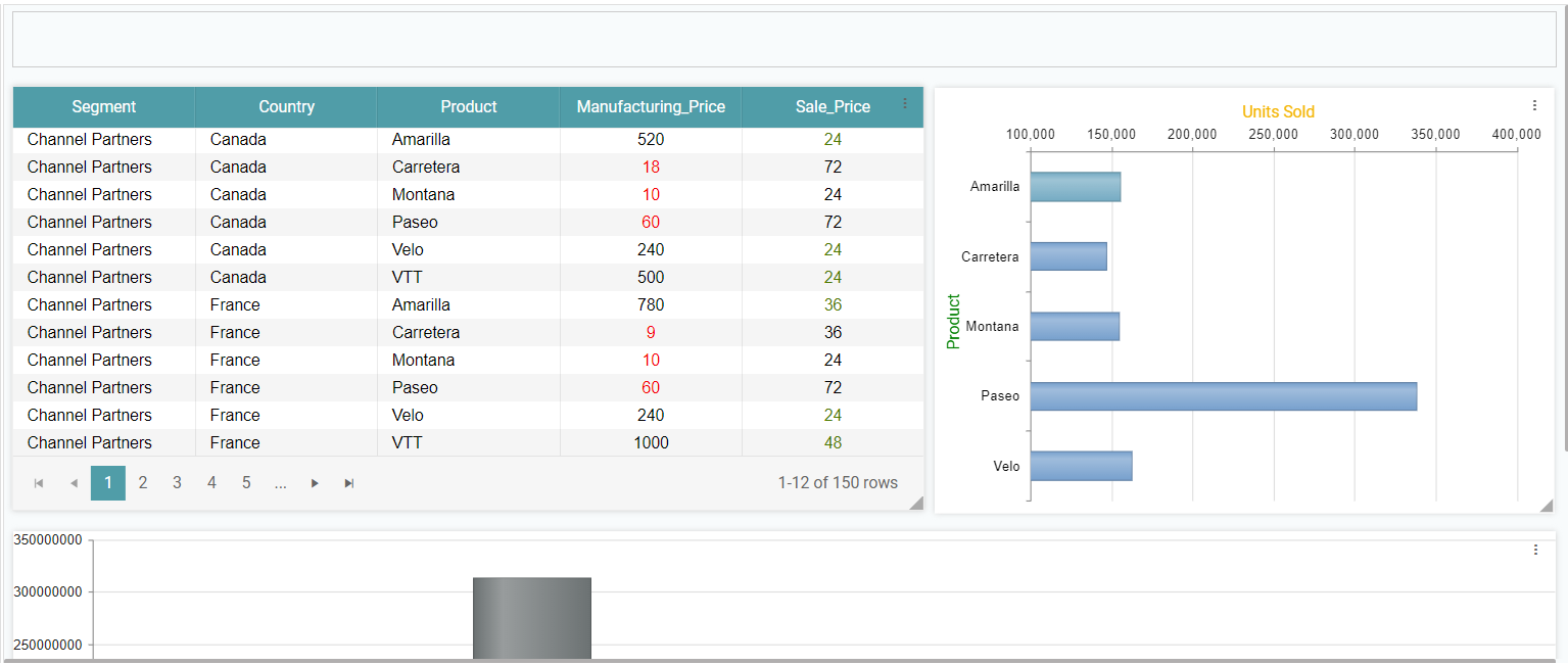
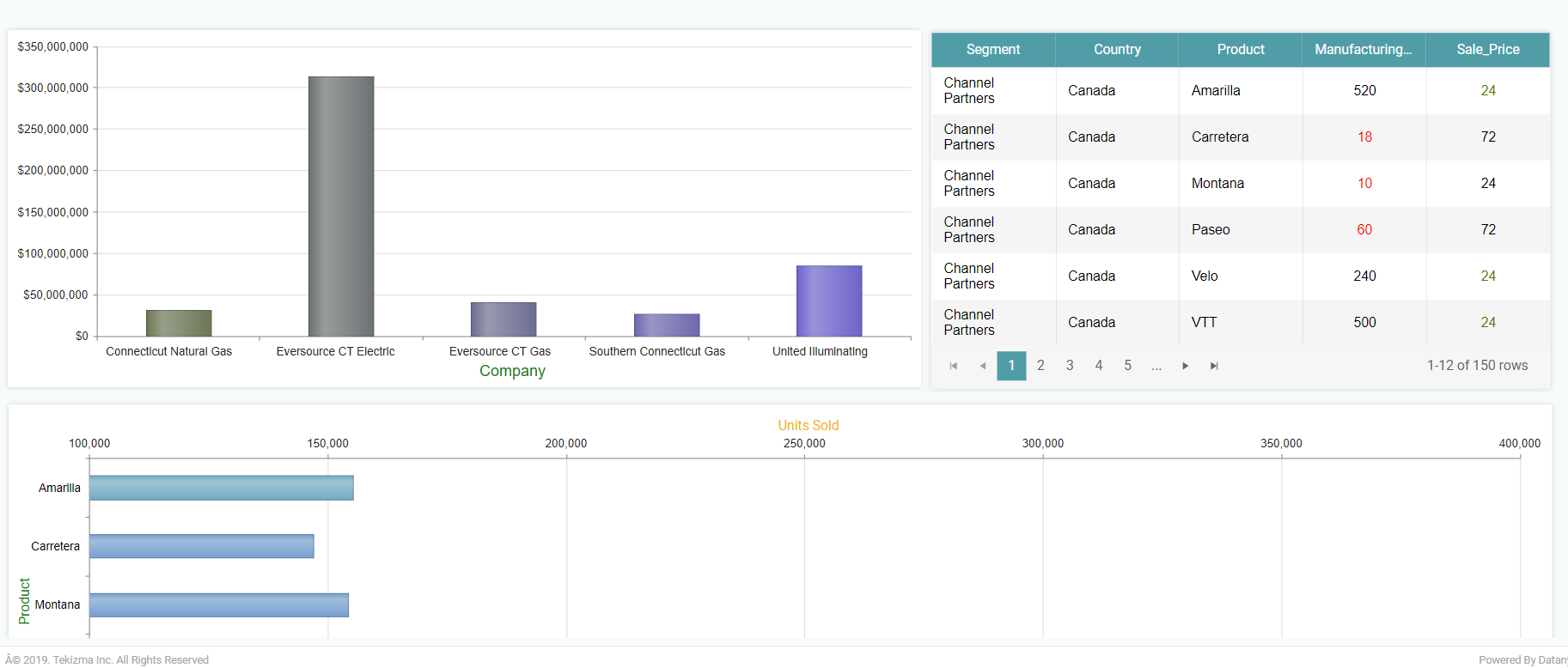
Step 6: Now, Select the created Reports/Charts from the left navigation bar. Drag and drop the same on the main screen. (Refer to the image below).
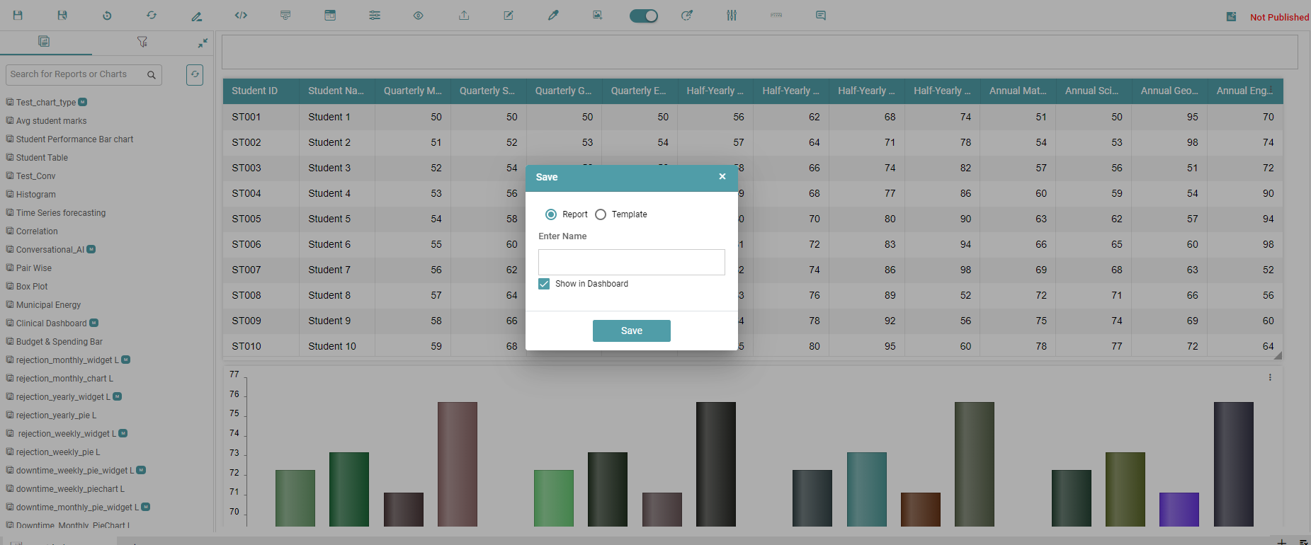
Step 7: Click on the save icon once you’ve done the required changes to your report.
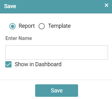
Step 8: Select the Report radio button and enter the name for the report. You can check the show in dashboard option if you want your report to be shown on the dashboard.
Note: You can choose not to show the created report on the dashboard. If at any point you want to show the said report on the dashboard, navigate to the Library and click on Report. Publish the said report and click on the show in dashboard option.
Step 9: Click on save, then the report is saved. (Refer to the image below).
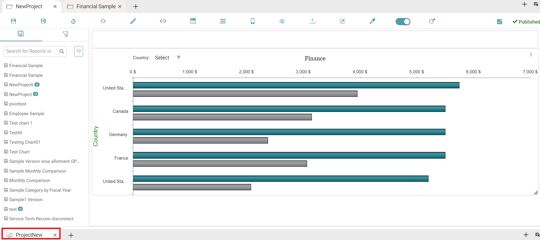
Step 10: You can also navigate between multiple reports in a project by using the tabs at the bottom to switch between reports.
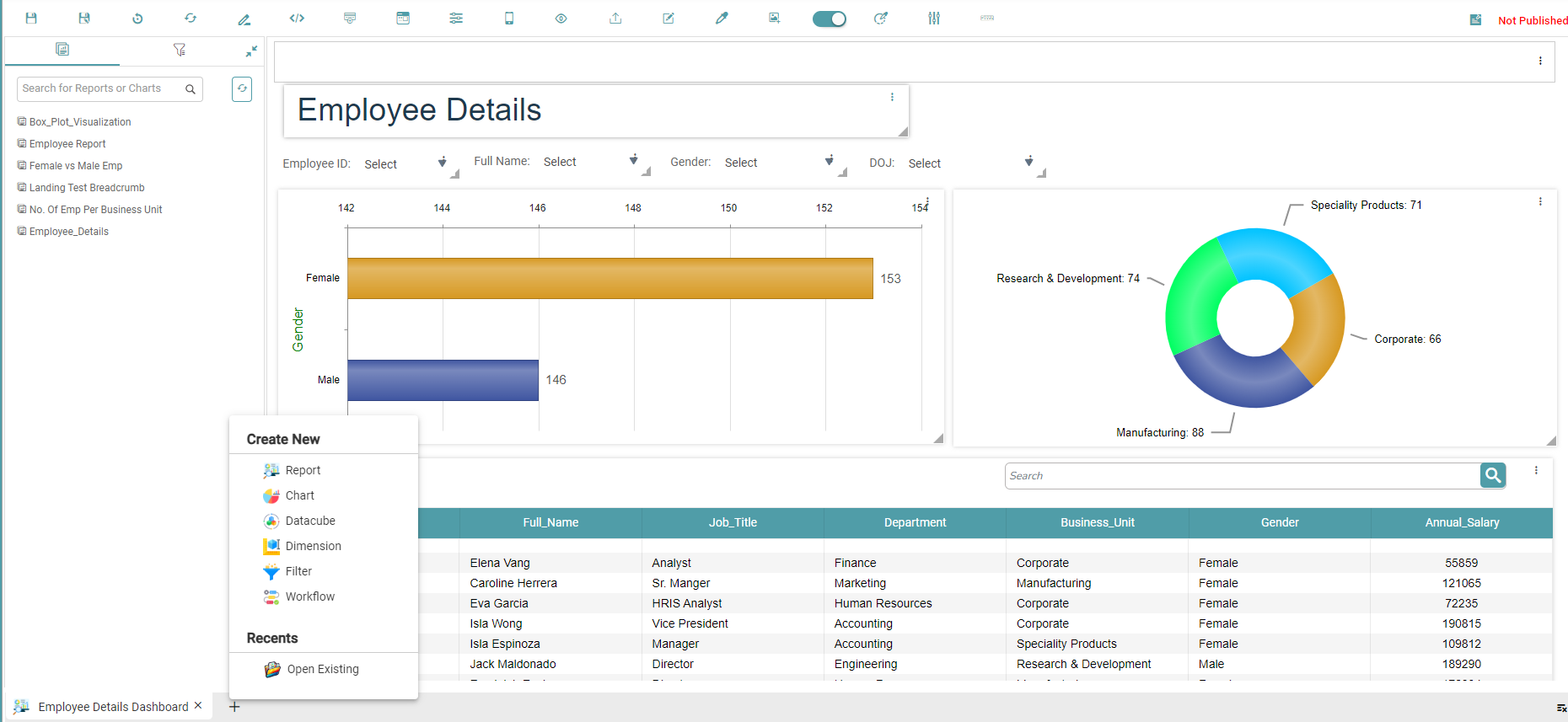
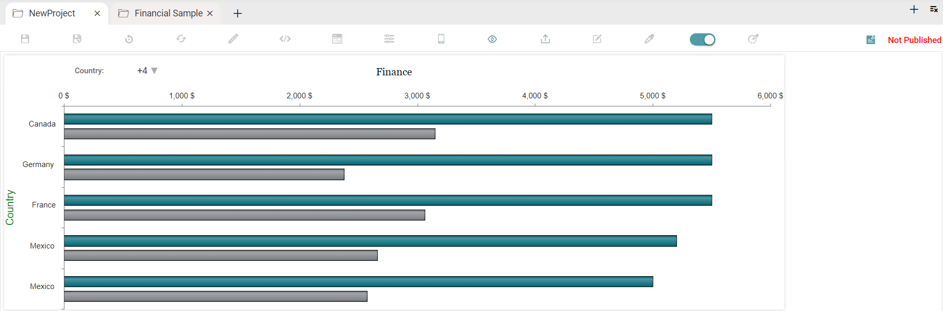
Step 11: You can add a new report, chart, workflow, dimension and filter to the current project by clicking on the add icon at the bottom. Click on Open Existing to open an old report.(Refer to the image below).
Reports Tool Bar
Save
Step1: Select any existing report or create a report.
Step 2: Click on the save icon.
Step 3: Select the Report radio button and enter the name for the report (Refer to the image below).
Step 4: Click on the save button.
Step 5: The report name will be updated.
Step 6: You can uncheck the Show in Dashboard checkbox and click save button. The report will not be available on the dashboard page, it will be added only to the report list.
Step 7: If you need the report to be available on the dashboard page, check the show in dashboard checkbox.
Reset
Step 1: Click on the Design Tab on the Main Navigation tool bar.
Step 2: Click on the add icon on the bottom right of the screen.
Step 3: Click the add new icon. Click the Report icon to create a new report.
Step 4: Drag and drop the charts/reports onto the main screen.
Step 5: Click on the reset icon.
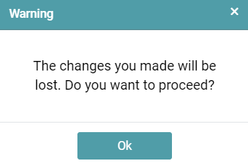
Step 6: A warning message popup will appear. Click the OK button.
Step 7: Then all the changes will be lost. (Refer to the image below).
Edit/ Refresh
Step 1: Click on the Library Tab on the Main Navigation tool bar and select Report or click the add icon on the bottom tab and select the open existing option .
Step 2: Now you can search and select the report you want to edit.
Step 3: Click on the edit icon in chart/report and it will navigate you to the selected chart/report.
Step 4: Make any changes to the chart/report and come back to the report page.
Step 5: Click on the refresh icon.
Step 6: Then the changes made in the chart/report are updated on the report page.
Editor
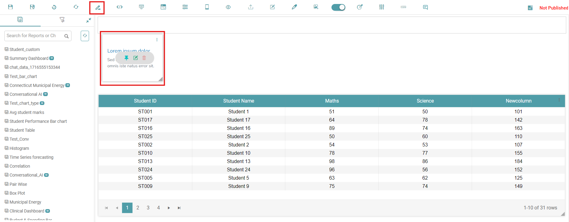
Step 1: Click on the Editor icon in the report page.
Step 2: The editor box will appear. You can pin, edit and delete the editor. (Refer to the image below).
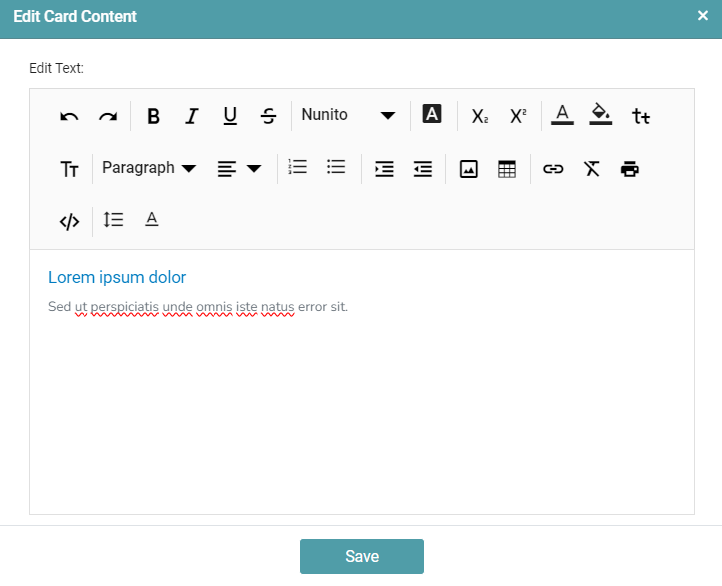
Step 3: Click on the edit option, edit card content window appears. This window contains options to change the Font Color, Size, Style, Alignment of the text and various other formatting options. (Refer to the image below).
Step 4: You are also able to select what to do with the editor box once you click on the three dots on the box. (Refer to the image below).
HTML DOM Content
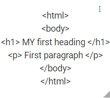
Step 1: Click on the HTML DOM Content icon in the report.
Step 2: Click on the edit icon and place the cursor in the top left corner and add html code. Place the cursor outside of HTML Dom widget. (Refer to the image below).
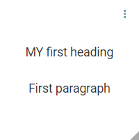
Step 3: HTML code is converted to solid code. (Refer to the image below).
Vertical Align
Step 1: Click on the Content icon or HTML DOM in the report page.
Step 2: Content box or HTML widget will appear. Add content to it. (Refer to the image below).
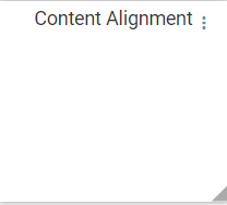
Step 3: Click on the menu icon (3 dots) and select vertical align checkbox.
Step 4: Now, the content is vertically aligned. (Refer to the image below).

Properties
Step 1: Click on the Content icon or HTML DOM in the report page.
Step 2: Content box or HTML widget will appear, click on the menu icon (3 dots) and click on properties.
Step 3: The Properties popup will appear. Enter the key and value, click on the save button. (Refer to the image below).
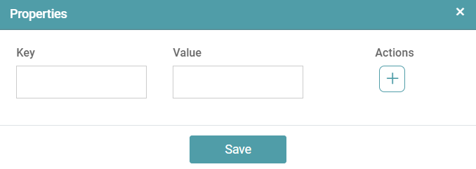
Step 4: It will work based on the key and value entered. The key and value can be used in the html code.
Behavior
Step 1: Click on the Content icon or HTML DOM in the report page.
Step 2: Content box or HTML widget will appear. Click on the menu icon (3 dots) and click on behavior.
Step 3: Properties popup will appear, select any radio button option (video, question and answer or scroll event) and click save. (Refer to the image below).
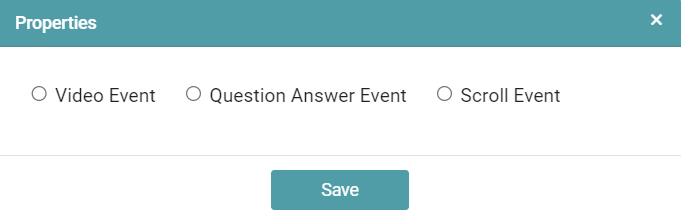
Step 4: Then it will work based on the selected event/behavior.
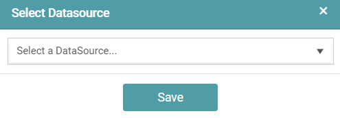
Attach Data Source
Step 1: Click on the Content icon or HTML DOM in the report page.
Step 2: Content box or HTML widget will appear. Click on menu icon (3 dots) and click on attach data source.
Step 3: Select Data Source popup will appear. Select any data source and click save. (Refer to the image below).
Cards – Creating a Landing Page
Step 1: Navigate to “Design” on the main navigation bar. Create a new Folder.
Step 2: Click on the add new icon and select the Report icon to create a new report.
Step 3: Click on the “cards” icon to add the widget in the work area. (Refer to the image below).
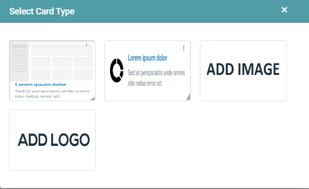
Step 4: A select card pop-up appears. You can select the desired card, add images and add logo. (Refer to the image below).
Step 5: Once the required card has been chosen, you can edit the said card by hovering on it.
Step 6: You can also pin, edit and delete the card. The widget can also be moved and placed according to your requirement.
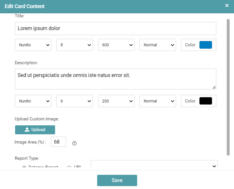
Step 7: Clicking on the Edit button opens another pop-up dialog box wherein you can edit the content of the card. (Refer to the image below).

Step 8: You can add the title of the card, set a description, upload a custom image and link a report to the card.
Step 9: Click on the save button.
Edit Card – Card Properties
In the Edit card content dialogue box, the user can edit every property present in the widget.
Step 1: Title – The users can add the desired title to the report. The user has multiple options and can change the font type, size, weight, color and style of the text.
Step 2: Description – The users can add the desired description to the report. The user has multiple options and can change the font type, size, weight, color and style of the text.
Step 3: Image Placement – The user is able to place the image inside the widget.
Step 4: Image Position – The user is able to make changes in the image placement by positioning the image to start, center and end.
Step 5: Image Area – The user is able to adjust the image area in accordance with their preference.
Step 6: Select Icons – The user is able to select various icons from the given list.
Step 7: Upload Custom Image – The user is able to add an image to the widget by clicking on the Upload button. If the user removes the image selected, then it will show the user the default image.
Step 8: Report Type – The user can select the desired category by clicking on the Datanyx Report and URL radio button.
A) Datanyx Report: The user can select an existing report in Datanyx.
B) URL: The user can paste an external report link.
(Refer to the image below).
Note: The user can use any external URL links.
Template
Creating a New Template
Step 1: Create a New Report with the required chart widgets.
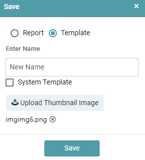
Step 2: Click on the save button. Select the Template Radio button. Upload an Image for the Template and click Save. (Refer to the image below).
Step 3: The Report will be saved as a template. You can use this template to create different reports.
Creating a Report using Template
Provides a basic structure for a dashboard that can be customized based on individual data sources. This template includes key components commonly found in dashboards such as data displays, charts, tables, and filters. Users can plug in their own data to generate insights.
Step 1: Click on the template icon in the report page.
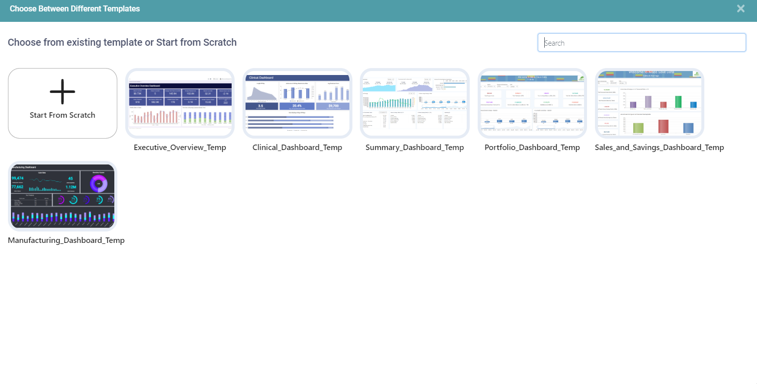
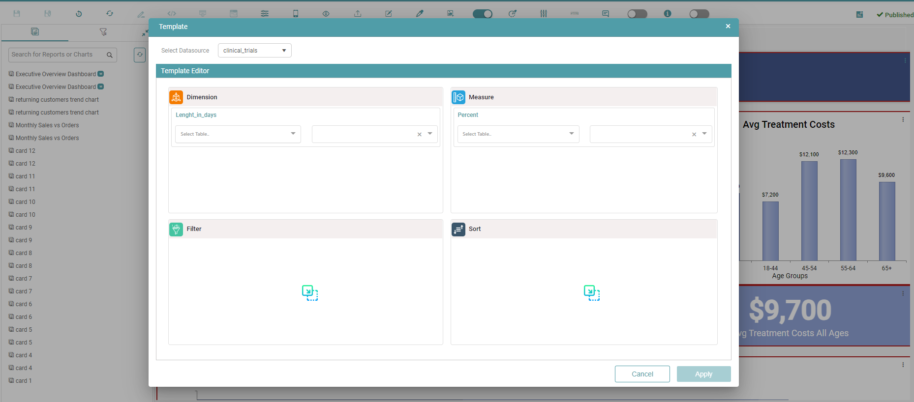
Step 2: Choose between different templates popup will appear. Choose the required template. (Refer to the image below).
Step 3: Now, make the changes in the template by clicking on the settings icon. (Refer to the image below).
Step 4: The template pop up appears, make the necessary changes with respect to the Datasource, dimension and measure and click on apply. (Refer to the image below).
Step 5: After all the widgets have been changed, click on the save as icon. Name the report and click on save.
Preferences
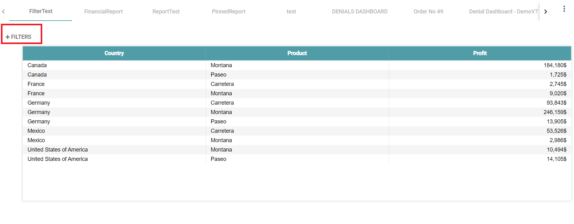
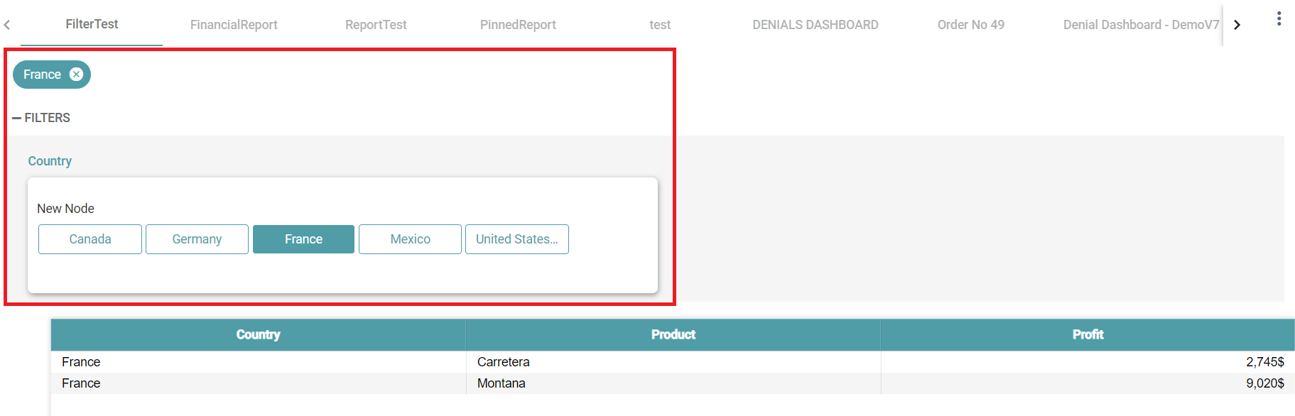
Filter
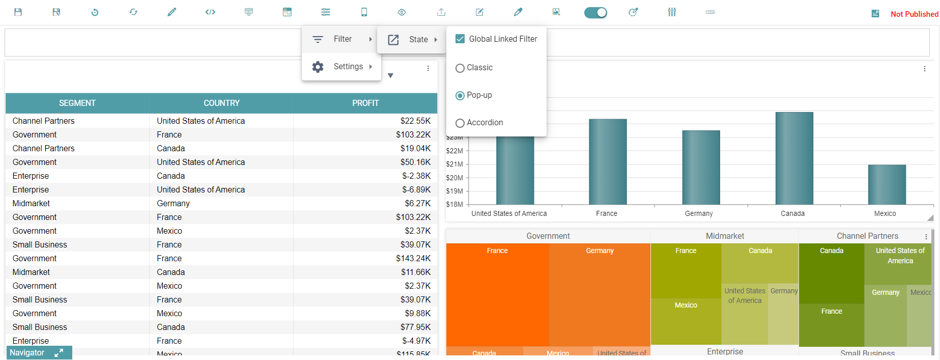
State
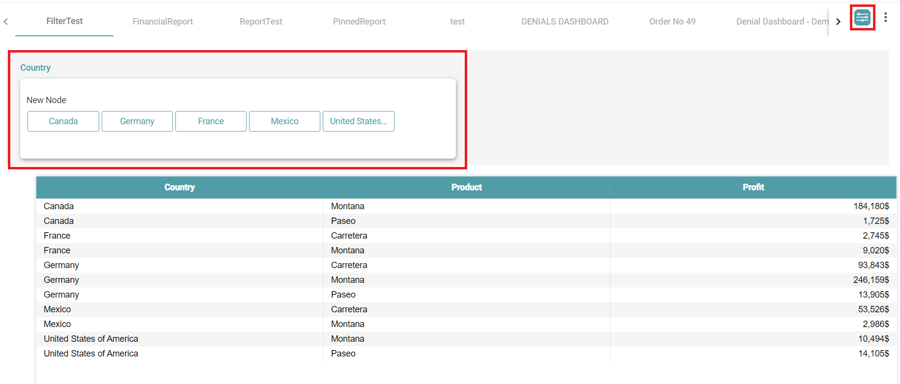
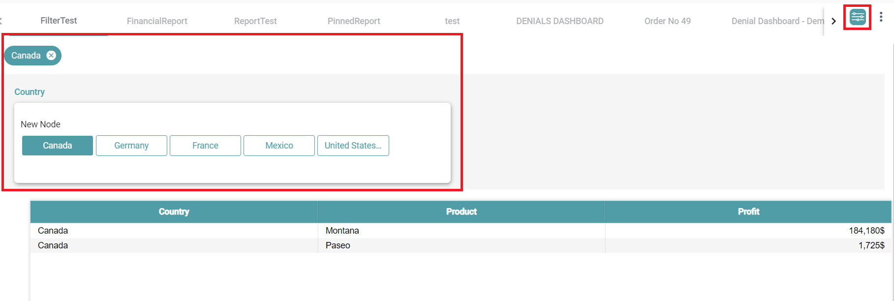
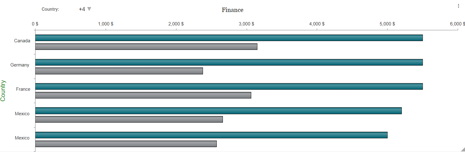
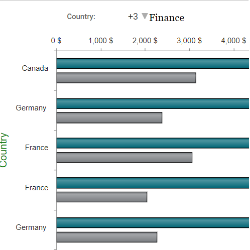
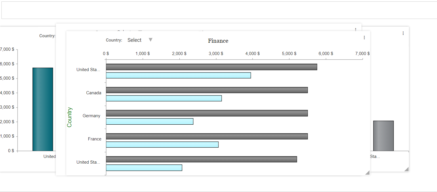
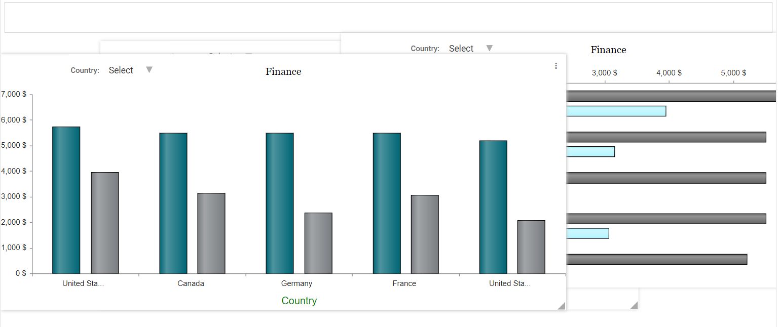
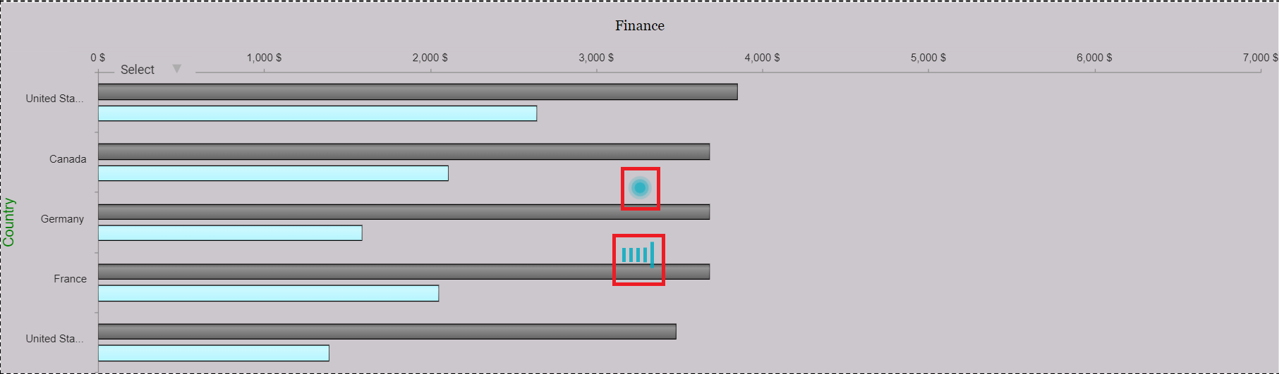
Global Linked Filter
Step 1: Drag and drop the table/ chart onto the main screen.
Step 2: Click on the preferences icon and select filter then state. Select the global linked filter checkbox.
Step 3: Save the report. Navigate to the dashboard from the main navigation bar.
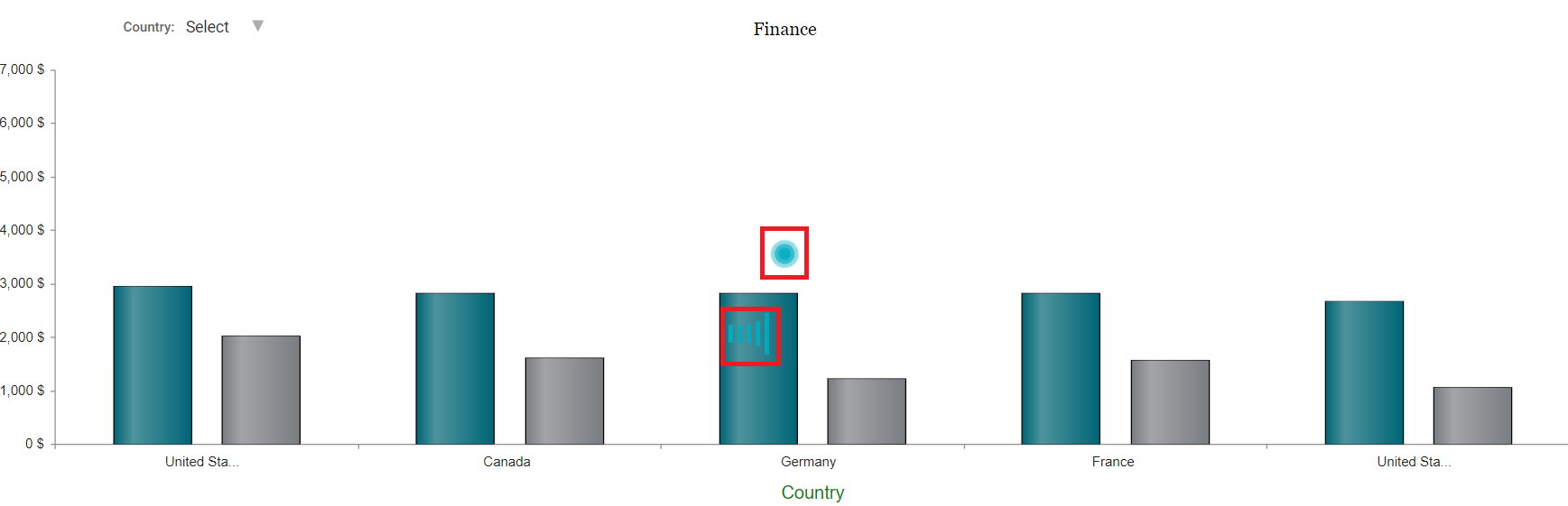
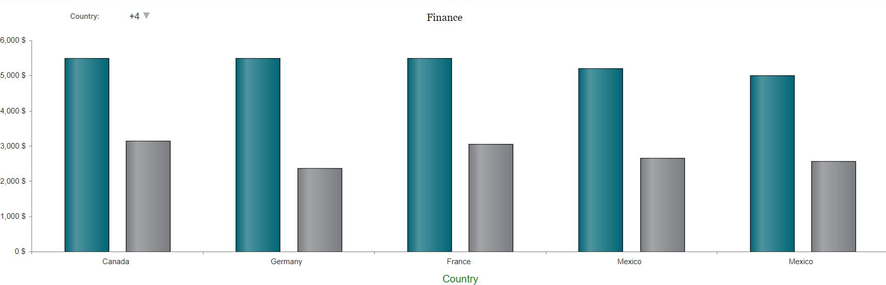
Step 4: In the Example below, the filter on the table is country. When the user clicks on any country in one of the charts in this report, then the other charts get filtered in accordance with that country. (Refer to the images below).
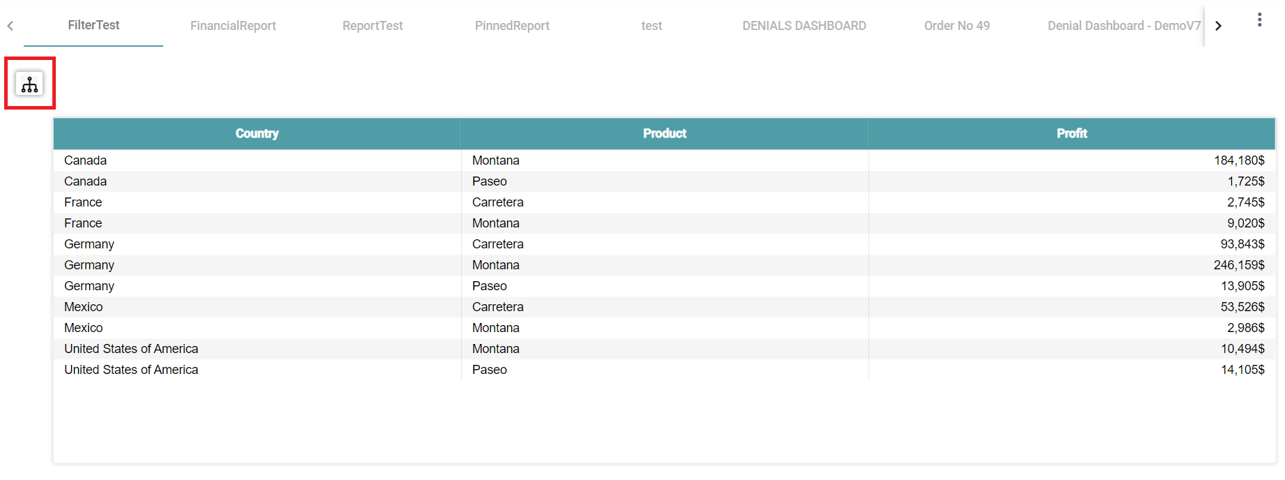
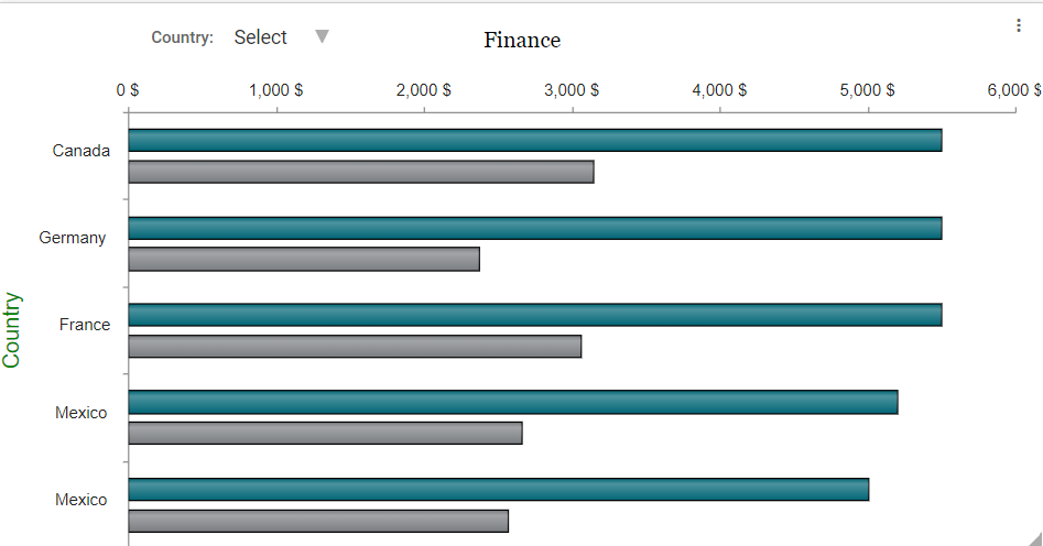
Classic
Step 1: Drag and drop the table/ chart onto the main screen.
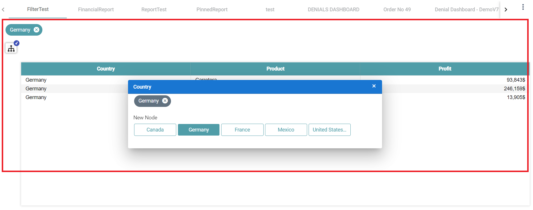
Step 2: Click on the preferences icon and select filter then state. Select the filter state as classic.
Step 3: Click on the filter on the report page. Now, drag and drop the related filter icon in the report. (Refer to the image below).
Step 4: Save and publish the report.
Step 5: Go to the dashboard page and select the report on which the filter has been applied. Click on the filter icon. (Refer to the image below).
Step 6: Select the values in the popup and the data is filtered based on the selected values. (Refer to the image below).
Pop-up
Step 1: Drag and drop the table/ chart onto the main screen.
Step 2: Click on the preferences icon and select filter. Select the filter state as pop up.
Step 3: Click on the filter on the report page. Now, drag and drop the related filter icon in the report. (Refer to the image below).

Step 4: Save and publish the report.
Step 5: Go to the dashboard page and select the report on which the filter has been applied. (Refer to the image below).
Step 6: Select the values in the popup and the data is filtered based on the selected values. (Refer to the image below).
Accordion
Step 1: Drag and drop the table/ chart onto the main screen.
Step 2: Click on the preferences icon and select filter. Select the filter state as accordion.
Step 3: Click on the filter on the report page. Now, drag and drop the related filter icon in the report. (Refer to the image below).

Step 4: Save and publish the report.
Step 5: Go to the dashboard page and select the report on which the filter has been applied. (Refer to the image below).
Step 6: Select the values in popup and the data is filtered based on the selected values. (Refer to the image below).
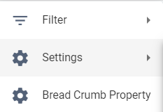
Settings
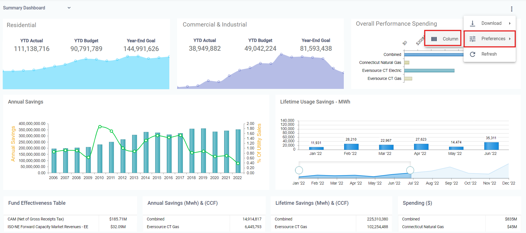
Step 1: In the Report designer page, navigate to Preferences and click on settings. (Refer to the image below).
Step 2: You can choose the options to be visible in the Dashboard Page for the current report. (Refer to the image below).
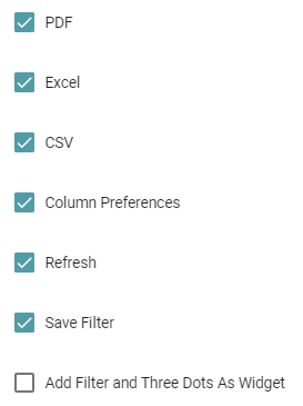
Step 3: The options that have been checked will be visible on the dashboard. They are explained below:
PDF: The Report that has been created can be downloaded as a PDF.
Excel: The Report that has been created can be downloaded as a Excel.
CSV: The Report that has been created can be downloaded as a CSV.
Column Preferences: The created report will have columns present on different charts. You can choose to enable it or disable that by clicking on the column preferences option. (Refer to the images below).
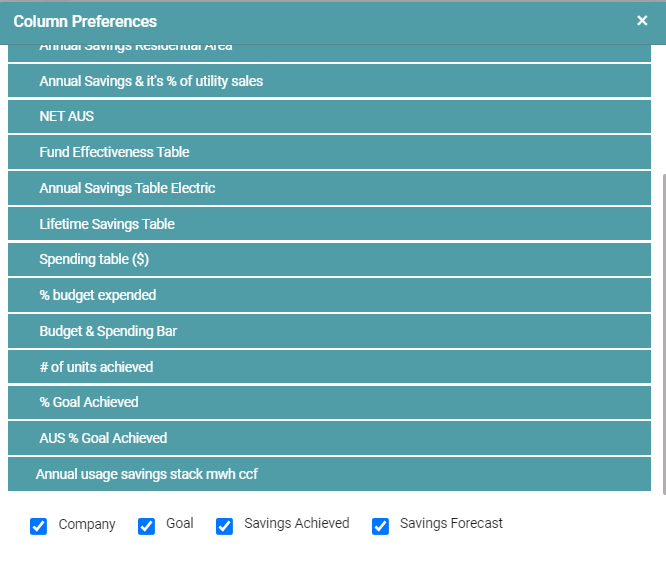
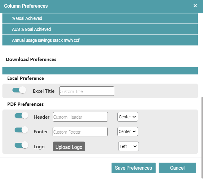
You can also choose a Download Preference:
- In the case of an Excel, you can choose a custom title.
- In the case of an PDF, you can create a Custom Header, Custom Footer, Upload a Logo and set their positions. (Refer to the image below).
Refresh: Toggling this would allow you to refresh your Dashboard.
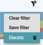
Save Filter: The Save Filter option lets you save a specific filter applied to the dashboard. When you load the dashboard next time, you can click on the saved filter to apply it instantly.
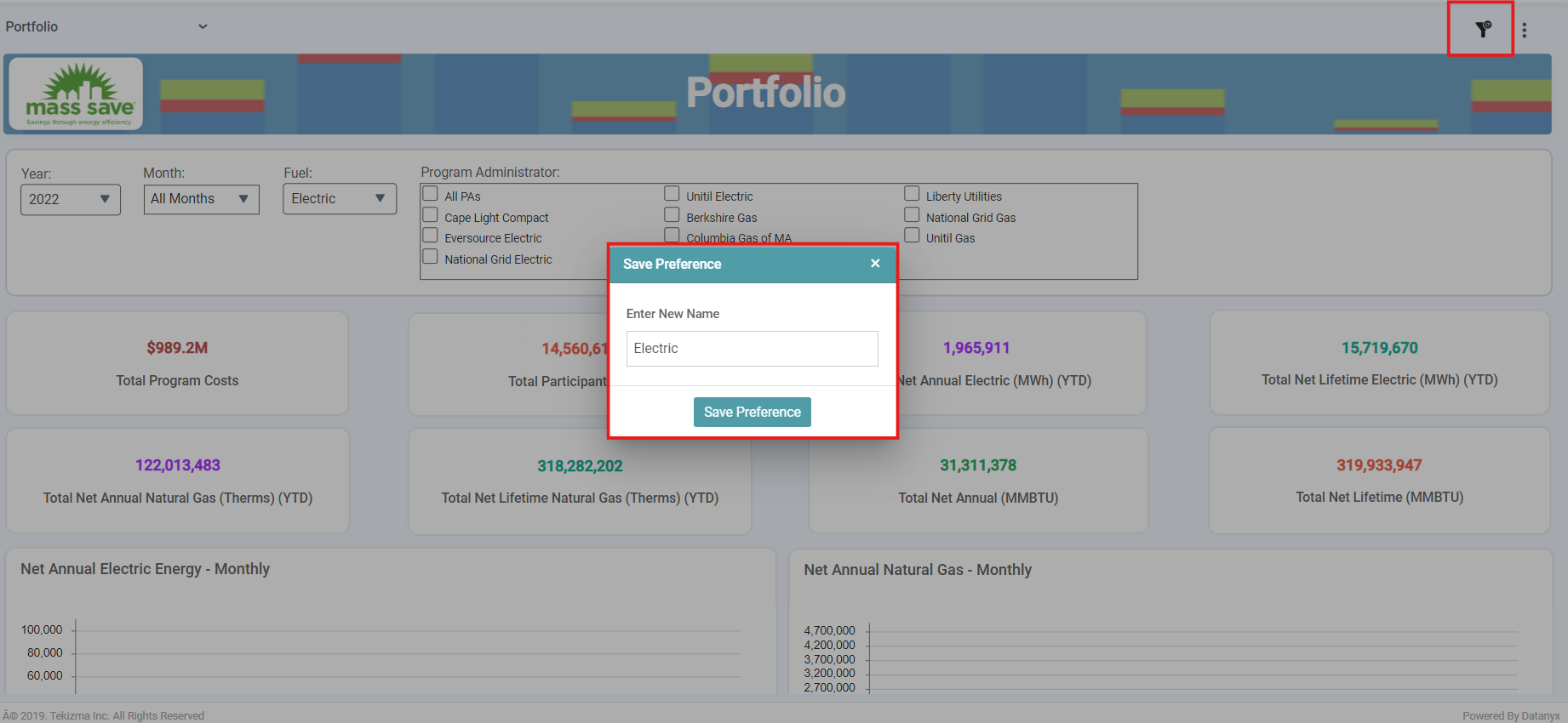
Note: Click on Clear to clear the filter selection. You can also delete the filter that you have saved by clicking on the delete button. (Refer to the image below).
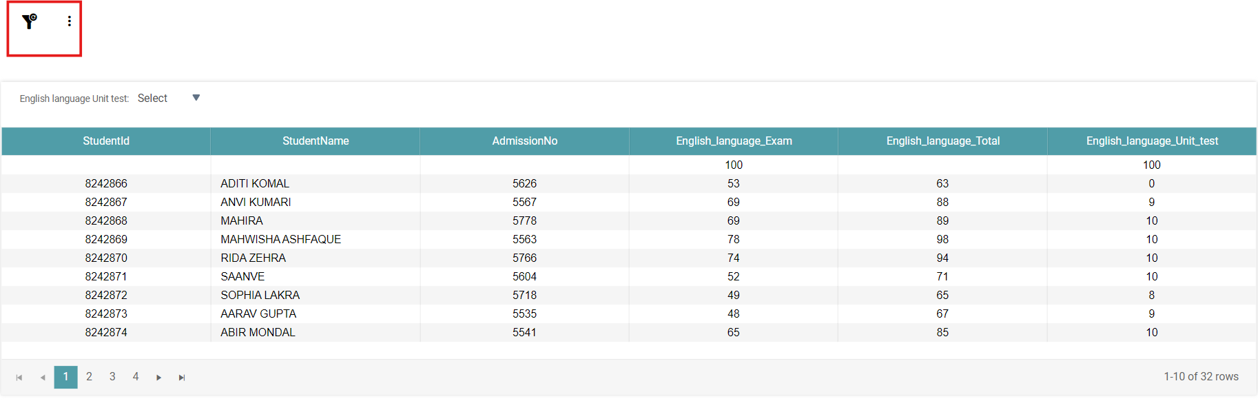
Note: If your dashboard does not have any filters, then the Filter Option on the top right corner of the screen will not be visible.
Add Filter and Three Dots as a Widget: This option adds your filter icon as a widget, allowing you to apply all the same formatting options available for widgets to this filter type. (Refer to the image below).
Bread Crumb Property
Step 1: Navigate to “Design” on the main navigation bar. Create a new Folder.
Step 2: Click on the add new icon and select the Report icon to create a new report.
Step 3: Click on the “cards” icon to add the widget in the work area.
Step 4: Create the Landing Page with Links within Datanyx or from URL.
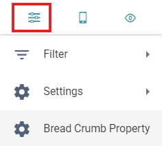
Step 6: Navigate to Preferences and click on Bread Crumb Property. (Refer to the image below).
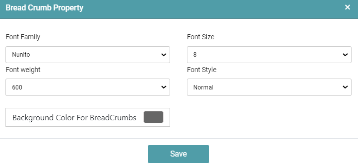
Step 7: In the Bread Crumb Property pop-up that appears, you can format the appearance of the Bread Crumbs.
Step 8: You can change the Font family, Font size, Font weight, Font style and Background color for the Bread Crumbs.
Step 9: Click on Save. (Refer to the image below).
Step 10: Once you’ve saved the report, navigate to the Dashboard Page and click on the cards. The Bread Crumb appears on the top of the page. (Refer to the image below).
Responsive Layouts
Desktop
Step 1: Drag and drop any chart/report onto the main screen.
Step 2: Create a report and save it.
Step 3: Click on the responsive layouts icon and select desktop option.
Step 4: The report is displayed in desktop view. (Refer to the image below).
Mobile Portrait
Step 1: Drag and drop any chart/report onto the main screen.
Step 2: Create a report and save it.
Step 3: Click on the responsive layouts icon and select mobile portrait option.
Step 4: The report is displayed in mobile portrait view. (Refer to the image below).
Tablet
Step 1: Drag and drop any chart/report onto the main screen.
Step 2: Create a report and save it.
Step 3: Click on the responsive layouts icon and select tablet option.
Step 4: The report is displayed in tablet view. (Refer to the image below).
Mobile Landscape
Step 1: Drag and drop any chart/report onto the main screen.
Step 2: Create a report and save it.
Step 3: Click on the responsive layouts icon and select mobile landscape option.
Step 4: The report is displayed in mobile landscape view. (Refer to the image below).
TV
Step 1: Drag and drop any chart/report onto the main screen.
Step 2: Create a report and save it.
Step 3: Click on the responsive layouts icon and select TV option.
Step 4: The report is displayed in TV view.
Preview
Step 1: Drag and drop any chart/report onto the main screen.
Step 2: Click on the preview icon.
Step 3: The chart/report will be displayed on the screen. (Refer to the image below).
Export
Step 1: Create a report or select any existing report.
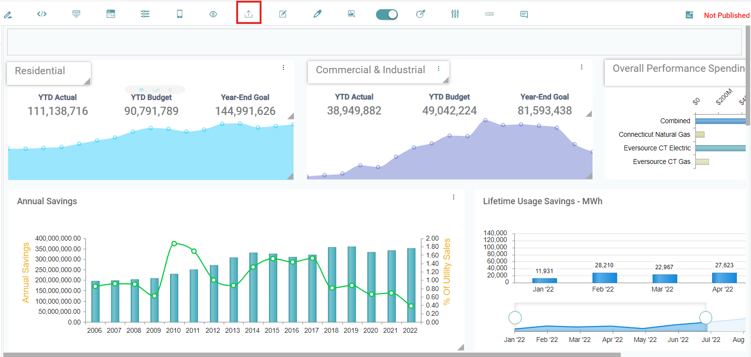
Step 2: Click on the Export report icon on the report page.
Step 3: RPT file is downloaded onto the local device. (Refer to the image below).
Note: The Report can be Imported through the Library using the RPT that has been downloaded.
Rename
Step 1: Select any saved report and click on the rename icon.
Step 2: Rename popup will appear. Now enter a new name for the report. (Refer to the image below).
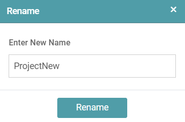
Step 3: Click on the Rename button and the project will be renamed successfully. (Refer to the image below).
Dashboard Background
Step 1: Drag any chart/report onto the main screen.
Step 2: Click on the Dashboard Background icon on the report page. (Refer to the image below).

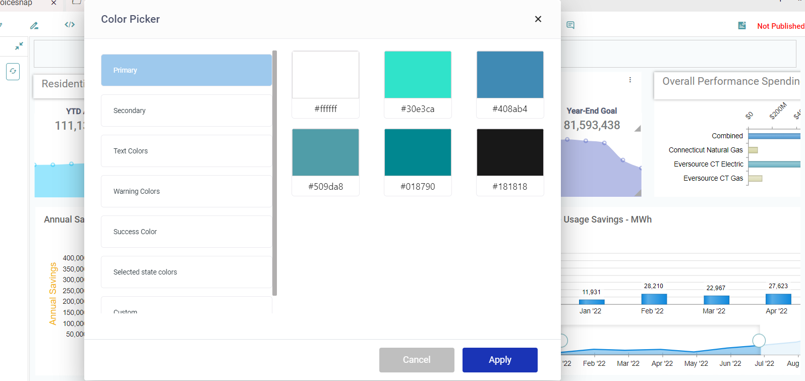
Step 3: Color picker popup will appear. Select any color from theme/custom and then click on the apply button. (Refer to the image below).
Step 4: The selected theme/custom color is applied to the report page.
Dashboard Background Image
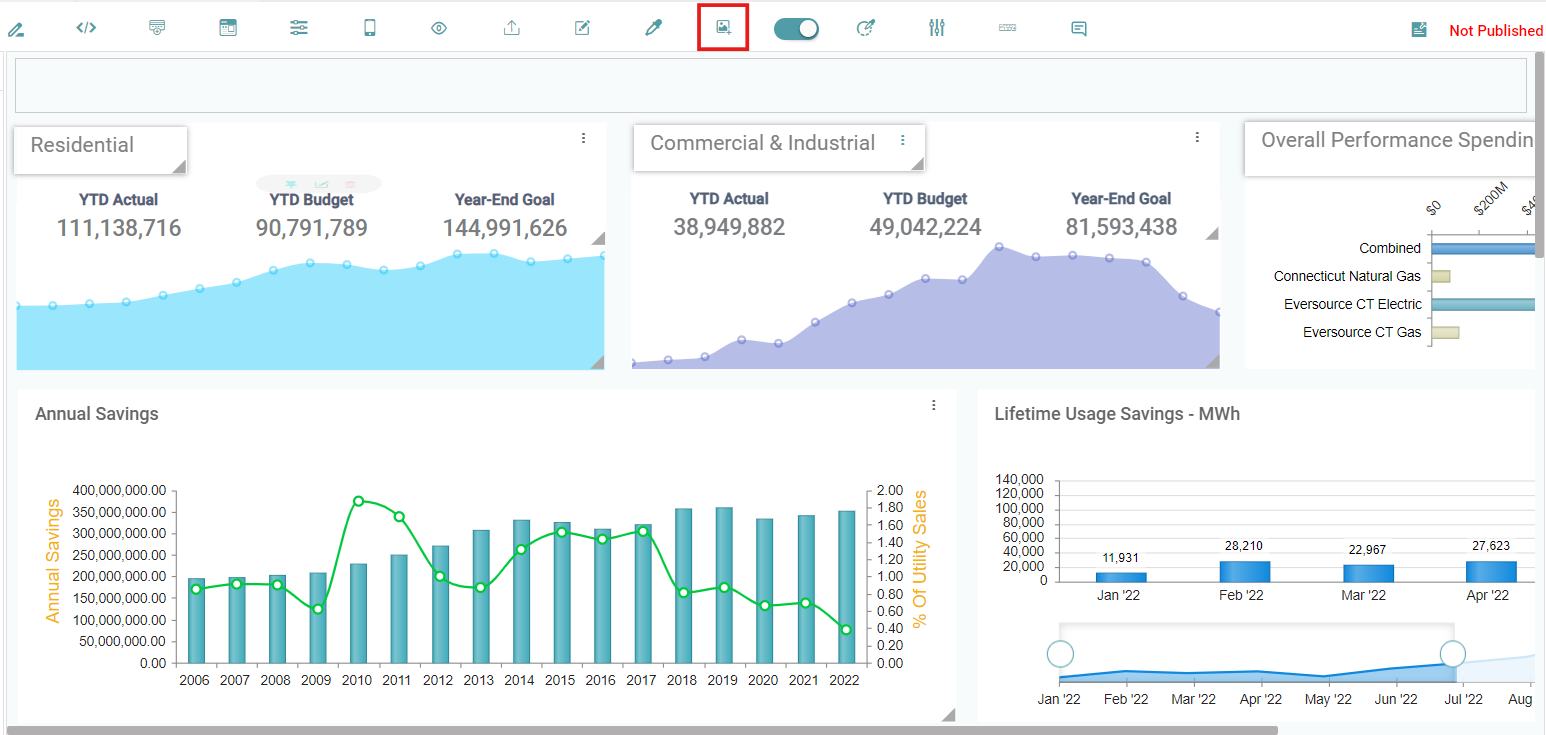
Step 1: Drag any chart/report onto the main screen.
Step 2: Click on Dashboard Background Image icon on the report page. (Refer to the image below).
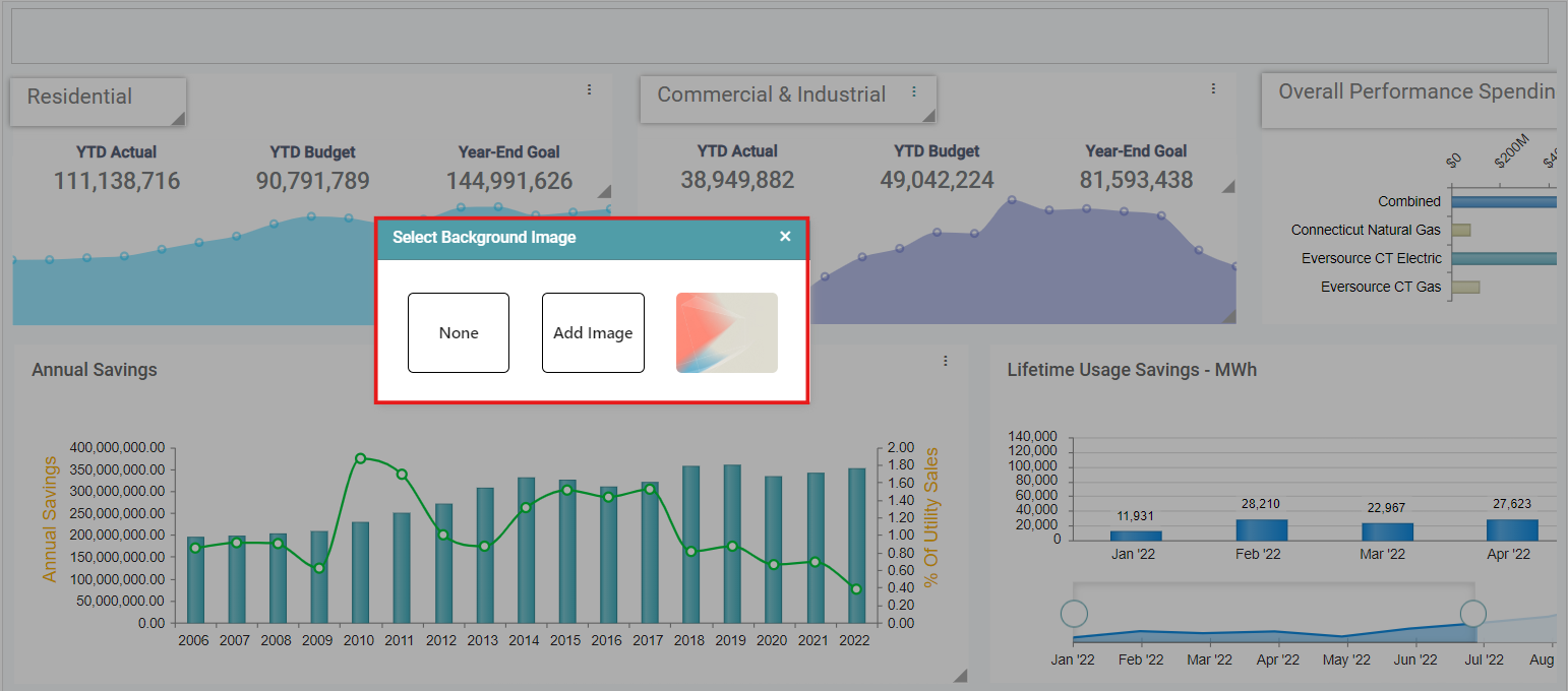
Step 3: A select background image pop-up appears. You can add an image of their preference (Refer to the image below).
Loader
Step 1: Drag and drop multiple charts/reports onto the main screen.
Step 2: Enable loader on the report page and save the report.
Step 3: Publish the report and go to the dashboard page.
Step 4: Select the published report, then all the reports display the loading symbol while loading on the dashboard. (Refer to the image below).
Step 5: Disable the loader on the report page. Save and publish the report and the report in the dashboard page appears without the loader. (Refer to the image below).
System Reports
Step 1: Navigate to “Design” on the main navigation bar. Create a new project.
Step 2: Click on the add new icon and select the Report icon to create a new report.
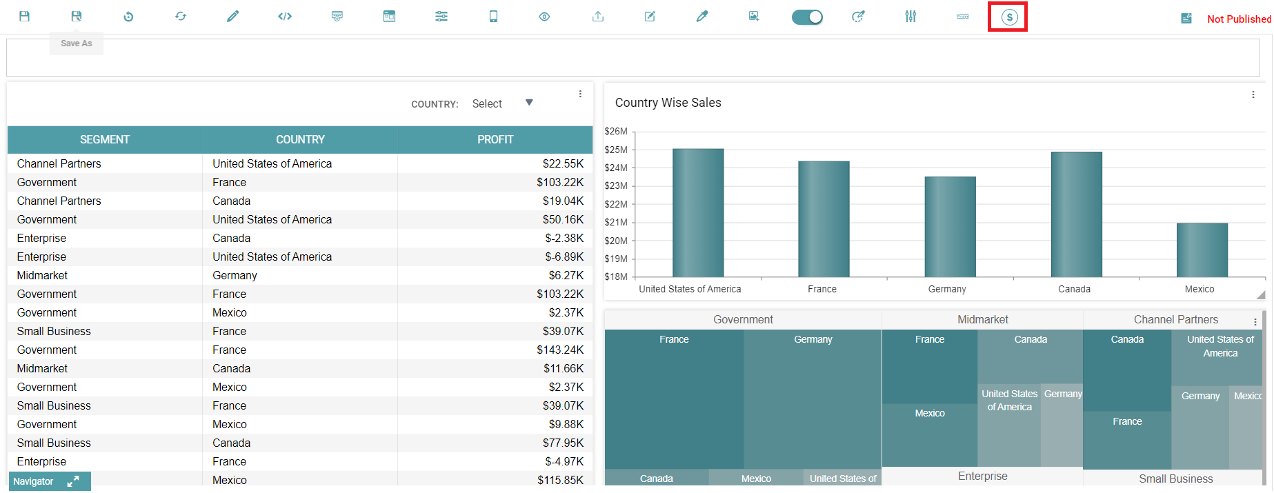
Step 3: Upon the report’s creation, click on the System Report Icon to convert it into a system report. The icon will be represented by an “R” initially which indicates that it is a normal report. Once the user clicks on the “R” icon, it will be represented by an “S” which indicates that it is a System Report. (Refer to the images below).

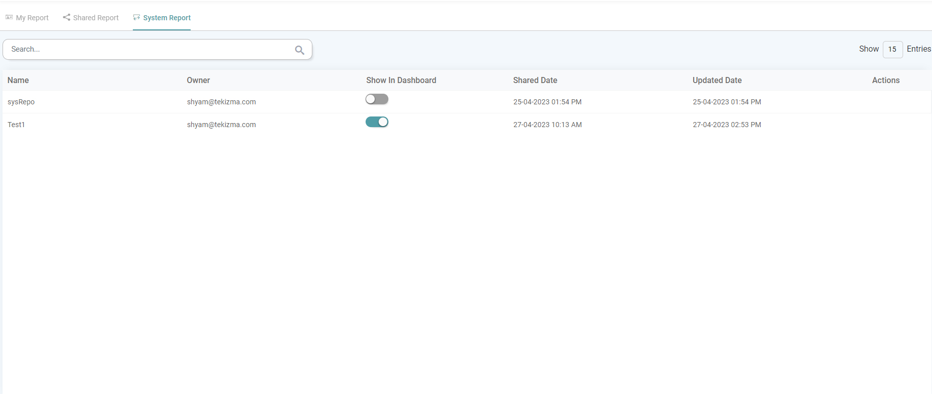
Step 4: Navigate to “Library” and then “Reports”. The report is now under the System Reports tab. (Refer to the image below).
Ruler
Step 1: You can enable the ruler functionality by simply clicking on it in the bar on the top. (Refer to the image below).
Step 2: Drag and drop the widgets/ charts onto the work area. Once the ruler has been placed in accordance with the user requirement, drag the said widget near the ruler.
Step 3: As you move the widget/ chart closer to the ruler, it automatically locks onto it. Adjust the position of the charts until the desired position is achieved.
Step 4: Click on the ruler option once more to disable it.
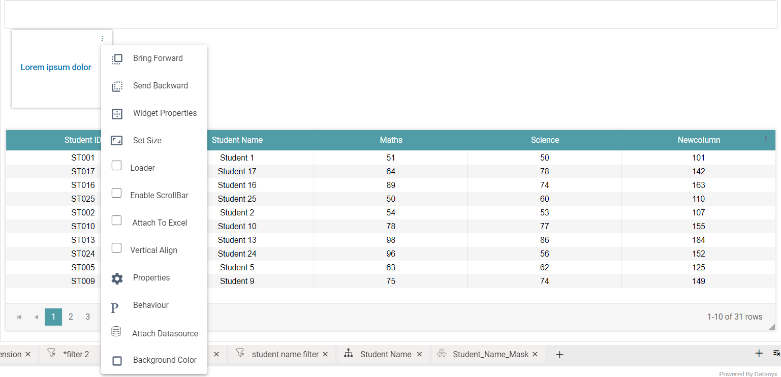
Three Dots
Bring Forward
Step 1: Drag and drop two or more charts/reports onto the screen.
Step 2: Place the charts/reports, one on top of the other.
Step 3: Click on the Menu options(3dots) in the chart/report.
Step 4: Click on the Bring Forward option.
Step 5: The chart/report appears in the front. (Refer to the image below).
Send Backward
Step 1: Drag and drop two or more charts/reports onto the screen.
Step 2: Place the charts/reports, one on top of the other.
Step 3: Click on the Menu options(3dots) in the chart/report.
Step 4: Click on the Send Backward option.
Step 5: The chart/report moves to the back. (Refer to the image below).
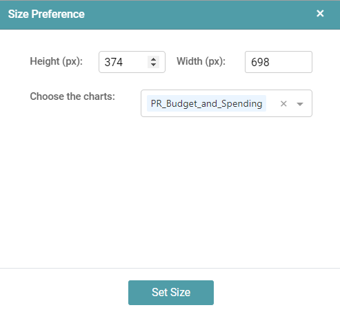
Widget Properties
Step 1: Drag and drop report/chart onto the screen.
Step 2: Click on the Menu options(3dots) in the chart/report.
Step 3: Select the widget properties option.
Step 4: Choose border width, style, radius, color, vertical offset and horizontal offset. (Refer to the image below).
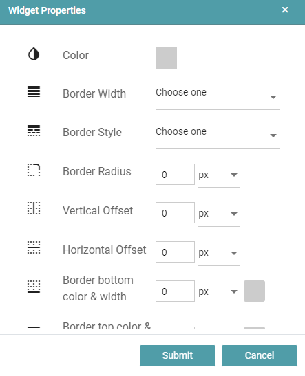
Step 5: Click on the Submit button.
Step 6: The changes will be applied to the chart or report.
Rotate Widget/ Editor
Step 1: Drag and drop report/chart onto the screen.
Step 2: Click on the Menu options(3dots) in the chart/report.
Step 3: Select the widget properties option.
Step 4: Choose Rotate options and select the text rotation degree.
Step 5: Click the dropdown, select from the list of 0 degrees, 90 degrees, 180 degrees and 270 degrees. (Refer to the image below).
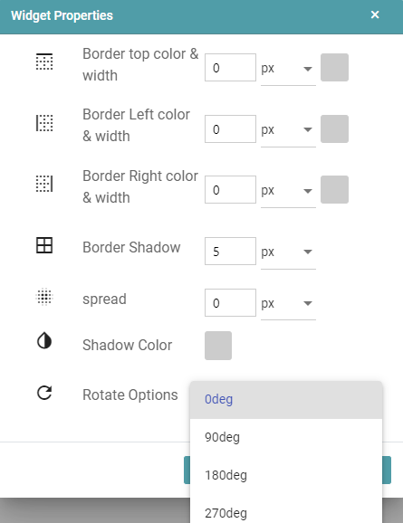
Step 6: Click on the Submit button.
Step 7: The required changes will be applied to the chart or report.
Set Size
Step 1: Drag and drop chart/report onto the main screen.
Step 2: Click on the Menu options(3dots) in the chart/report.
Step 3: Select Set Size.
Step 4: Size Preference popup will appear. You can set the Height and Width of the widget.
Step 5: You can also choose more than one chart in the current report to which you want the set height and width to be applied to. (Refer to the image below).
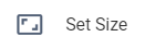
Step 6: Click on the set size button to apply the changes.
Applying Background
Step 1: Drag and drop chart/report onto the main screen.
Step 2: Click on the Menu options(3dots) in the chart/report.
Step 3: Select the Background color.
Step 4: Color picker popup will appear. Select any color from the available Themes or from the Custom option. Click the Apply button. (Refer to the image below).

Step 5: Selected color/theme is applied to the chart/report. (Refer to the image below).
Enabling Loader
Step1: Drag and drop the chart/report onto the main screen.
Step 2: Click on the Menu options(3dots) in the chart/report.
Step 3: Select the check box of loader.
Step 4: Save the report and publish it.
Step 5: Click on the dashboard icon in navigation panel.
Step 6: Select the report which is published.
Step 7: Then loader symbol will appear while loading the report. (Refer to the image below).
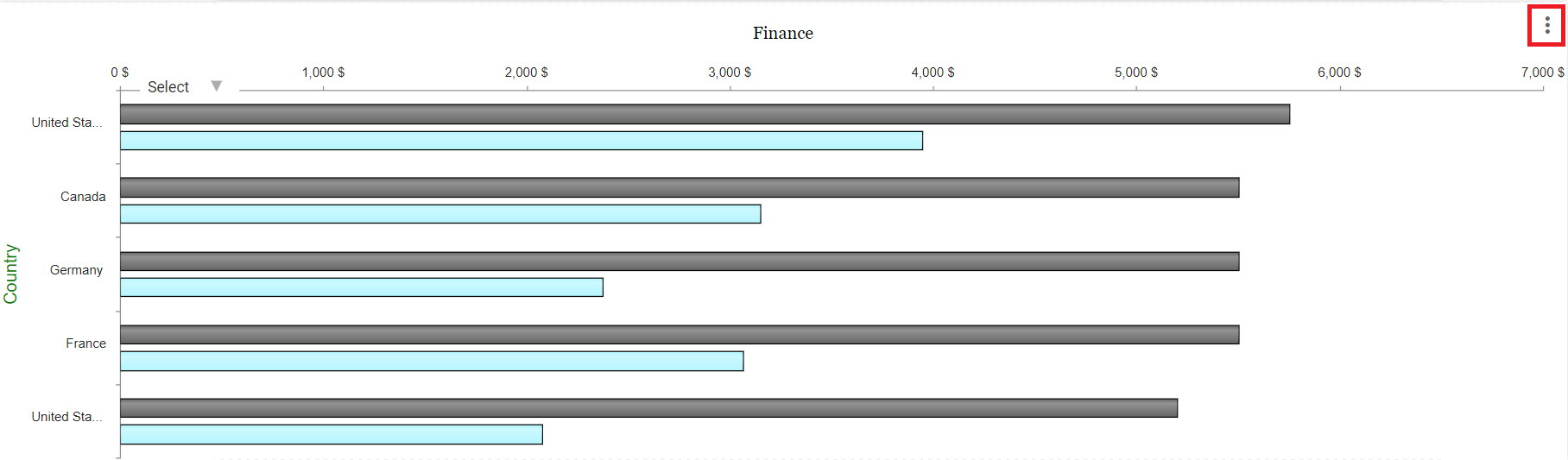
Show Options
You can choose to show the three dots menu on the dashboard for the selected chart.
Step 1: Drag and drop the chart/report onto the main screen.
Step 2: Click on the Menu options(3dots) in the chart/report.
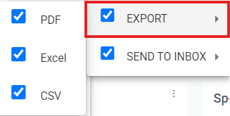
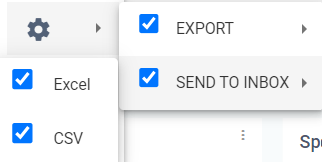
Step 3: Select the check box of show options. Now you can choose the Export Option and/ or the Send to Inbox Option. (Refer to the image below).
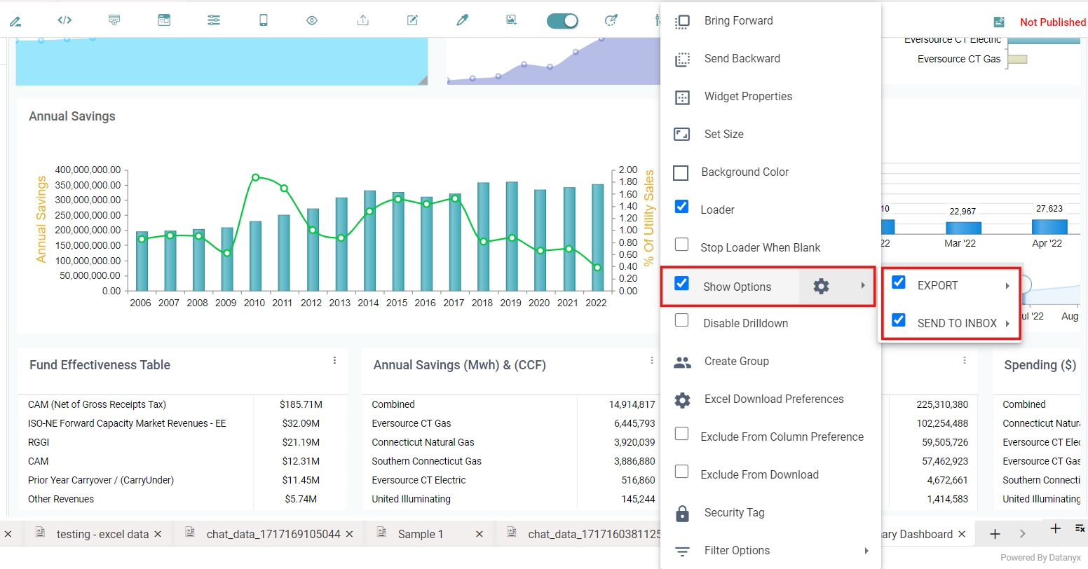
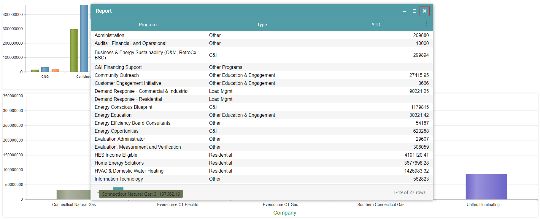
Step 4: Export option allows you to export the chart by direct download in the dashboard page. Click on the three dots on the dashboard page to download. You can export as a PDF, Excel and CSV. (Refer to the image below).
Step 5: The Send to Inbox option sends the respective chart to your secure Inbox from where you will be able to download the said chart. (Refer to the image below).
Step 6: Save the report and publish it. Click on the dashboard icon in navigation panel.
Step 7: Select the report which is published.
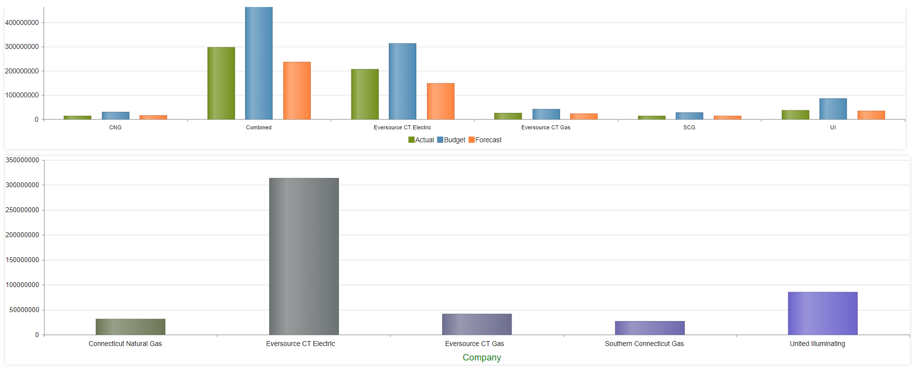
Step 8: The report in the dashboard has menu icons (3dots) now. (Refer to the image below).
Disable Drilldown
Step1: Drag and drop the chart/report onto the main screen.
Step 2: Click on the Menu options(3dots) in the chart/report.
Step 3: Select the “Disable Drilldown” option to disable drilldown for the required chart.
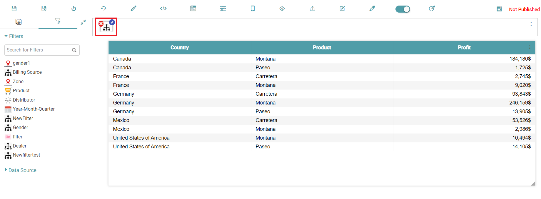
Step 4: Once this checkbox has been clicked, you will no longer be able to open the drilldown attached to that particular chart in the dashboard upon clicking. The before and the after images have been given below. (Refer to the images below).
Create Group
Step1: Drag and drop the chart/report onto the main screen.
Step 2: Click on the Menu options (3dots) in the chart/report.
Step 3: Select the Create Group option to create groups in the report.
Step 4: The create group dialog box appears. You can create a group, select the group and give it an order number. (Refer to the image below).
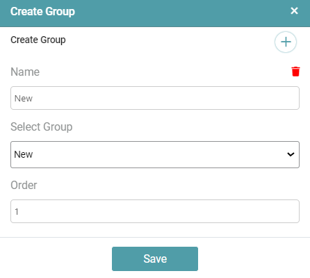
Note: Note that the process above needs to be followed for all the charts in the dashboard such that they would be ordered in a group. Using the identical name would categorize the charts within the group sharing that name.
Step 5: Click on the save button once the desired preferences have been set. Save the report and select the show in dashboard checkbox.
Step 6: The before and after images have been given below. (Refer to the image below).
Excel Download Preference
Step1: Drag and drop the chart/report onto the main screen.
Step 2: Click on the Menu options(3dots) in the chart/report.
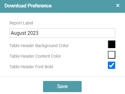
Step 3: Select the Excel Download Preference option to set a download preference when downloading the report as an Excel.
Step 4: The Excel Download Preference dialog box appears. (Refer to the image below).
Step 5: Click on the save button once the desired preferences have been set. Save the report and select the show in dashboard checkbox.
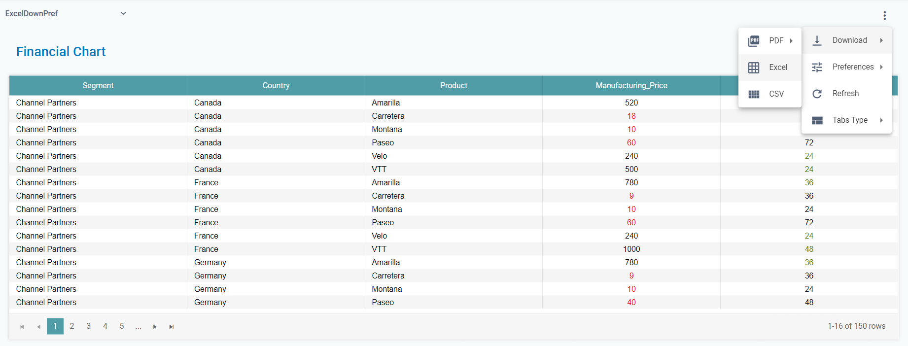
Step 6: Navigate to the dashboard using the main navigation bar on the left. Click on the Menu options (3dots) that is available on the top right-hand corner of the screen.
Step 7: Navigate to the download option and click on Excel. (Refer to the image below).
Step 8: You will get a pop-up which indicates that the report is being generated and you will be able to download the same from your inbox. (Refer to the image below).
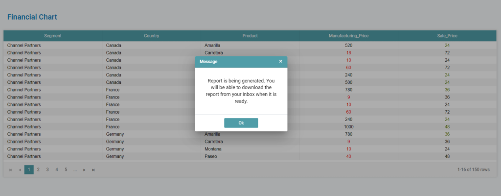
Step 9: You can download the report from the inbox that is available on the main navigation bar.
Security Tag
Step1: Drag and drop the chart/report onto the main screen.
Step 2: Click on the Menu options(3dots) in the chart/report.
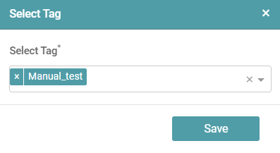
Step 3: Select the Security Tag option to add a security tag to a particular chart in the report. (Refer to the image below).
Step 4: Click on the save button.
Note: Note that you should have created a security tag under Admin section and should assign this tag to a Role that has been created. Further, this role needs to be assigned to the users with whom you wish to share information tailored to them.
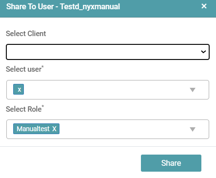
Step 5: Now, click on library and reports. Click on the publish icon under settings to publish the report.
Step 6: Click on the share option. You will be able to share the report with the other users. The share to user dialog box appears. Choose the client, select the user and the user role. Click on share. (Refer to the image below).
Step 7: The user will not be able to see the charts in the report based on the security tag settings. (Please go to the admin section to know more about security tags). (Refer to the image below).
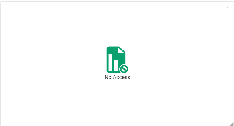
Note: Note that the security tag above is set such that the other user will not be able to access the chart/ report.
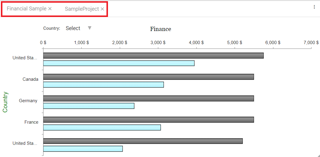
Creating Pinned Reports
Step 1: Drag any chart/report onto the main screen, hover on the middle of the chart/report and enable the pin icon.
Step 2: Drag and drop the other charts/reports and place it on the first chart/report. By default, the reports appear in Tab form. (Refer to the image below).
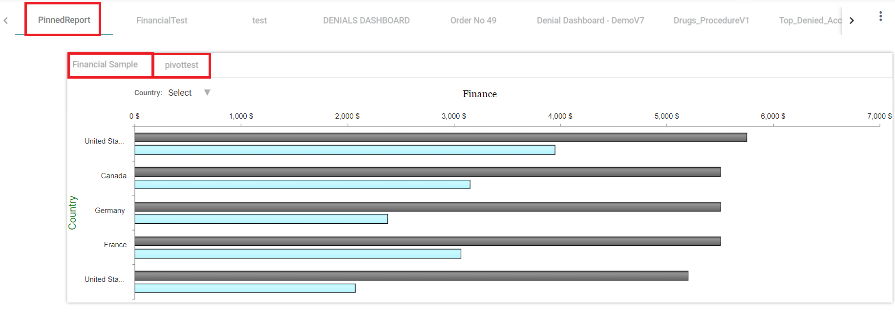
Step 3: Click on the save icon. Save the pinned report and publish it.
Step 4: Go to the dashboard and select the pinned report. The pinned report is available on the dashboard. (Refer to the image below).
Alignment for Pinned Reports
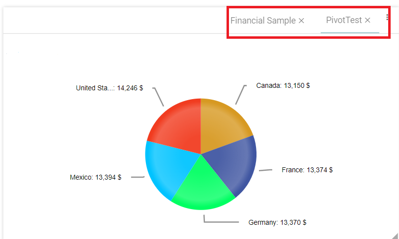
Step 1: Create a pinned report and click on the menu icons(3dots).
Step 2: Click on the Alignment option and select right.
Step 3: The pinned report tabs are right aligned. (Refer to the image below).
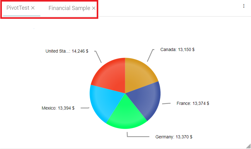
Step 4: Click on Alignment option and select left.
Step 5: The pinned report tabs are left aligned. (Refer to the image below).
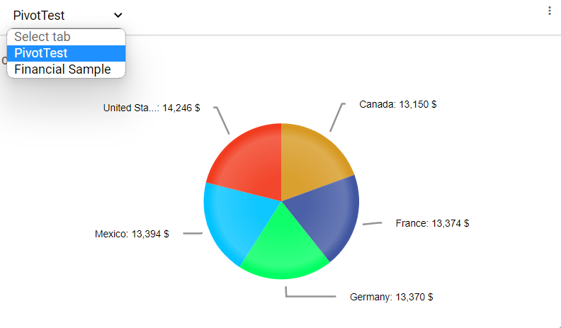
Tab Types – Report
Dropdown
Step 1: Create a pinned report and click on the menu icons(3dots).
Step 2: Click on Tab type and select the dropdown option.
Step 3: The Pinned report will be displayed as a dropdown. (Refer to the images below).
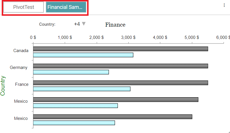
Button
Step 1: Create a pinned report and click on the menu icons(3dots).
Step 2: Click on Tab type and select the button option.
Step 3: The Pinned report will be displayed as a button type. (Refer to the image below).
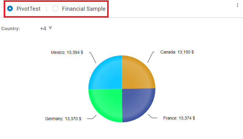
Radio
Step 1: Create a pinned report and click on the menu icons(3dots).
Step 2: Click on Tab type and select radio option.
Step 3: The Pinned report will be displayed as a radio type. (Refer to the image below).
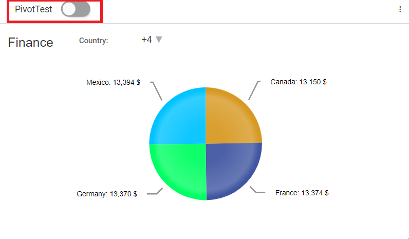
Toggle
Step 1: Create a pinned report and click on the menu icons(3dots).
Step 2: Click on Tab type and select toggle option.
Step 3: The user can use a toggle to switch between reports. (Refer to the images below).
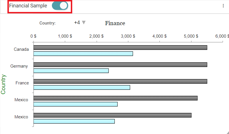
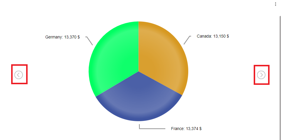
Carousel
Step 1: Create a pinned report and click on the menu icons(3dots).
Step 2: Click on Tab type and select thecarousel option.
Step 3: The pinned report will be displayed as a carousel type. (Refer to the image below).
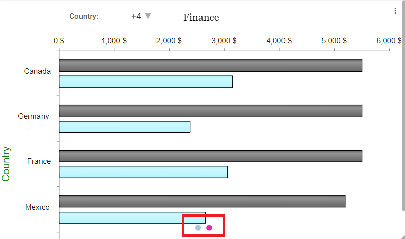
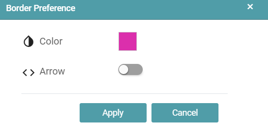
Step 4: Enable arrows in carousel tab type, click on carousel properties and the popup will appear.
Step 5: Select color, enable arrow toggle and click on apply. (Refer to the image below).
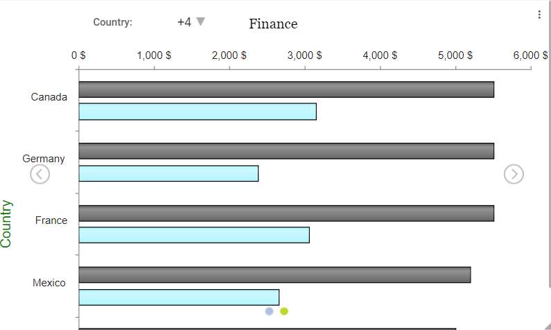
Step 6: The pinned report contains arrows and selected color carousel icons in the report. (Refer to the image below).
Gallery
Step 1: Create a pinned report and click on the menu icons(3dots).
Step 2: Click on Tab type and select the gallery option.
Step 3: The pinned report will be displayed as a gallery type. (Refer to the image below).
Edit
Step 1: Click on the Design Tab on the Main Navigation tool bar.
Step 2: Click on the add icon on the bottom right on the screen. Now, click on Open Existing.
Step 3: Reports list will appear once you click on the Report button at the top. Click on the edit icon. (Refer to the image below).
Step 4: Now, you are directed to that particular report/chart.
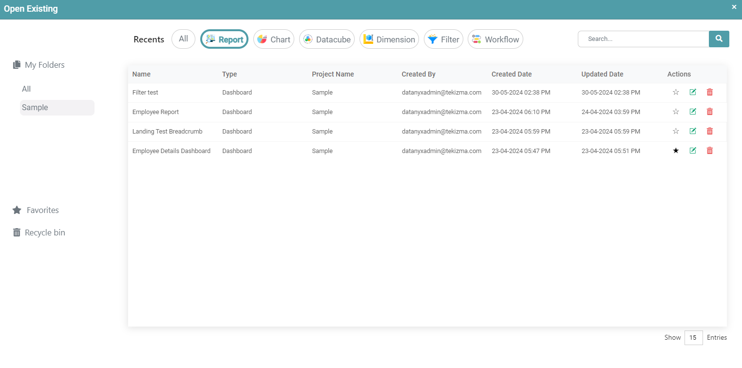
Delete
Step 1: On the main navigation bar click on design.
Step 2: Click on the add icon on the bottom right of the screen. Now, click on Open Existing.
Step 3: Reports will appear once you click on the Report button at the top. (Refer to the image below).

Step 4: Click on the delete icon.
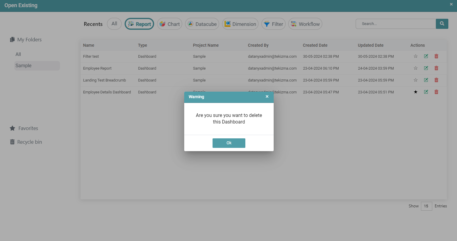
Step 5: A warning pop-up appears. Click on ok. (Refer to the image below).
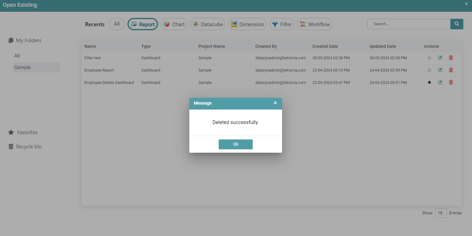
Step 6: You will get a message that the report has been successfully deleted. Click ok. The report has been deleted from the list. (Refer to the image below).
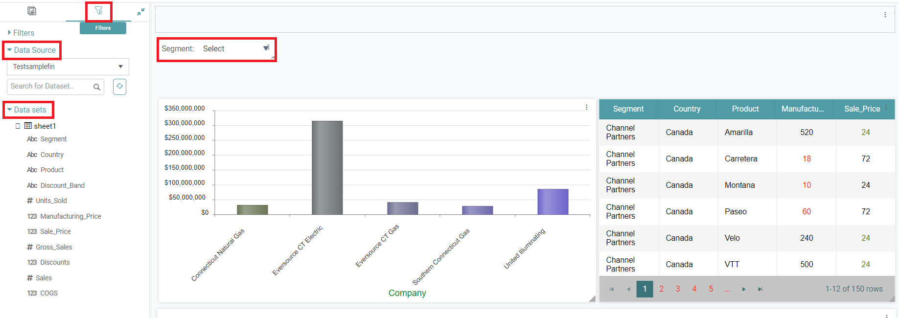
Filter Configuration
Filters can be added either from datasets or from custom scripts. Follow the steps below to configure them.
Filters from Dataset
Step 1: Once you are on the report page, click on the filter icon that is located to your left. Then click on the DataSource dropdown to select the required Data Source.
Step 2: Drag and drop the required column by clicking on the Data Sets dropdown. (Refer to the image below).
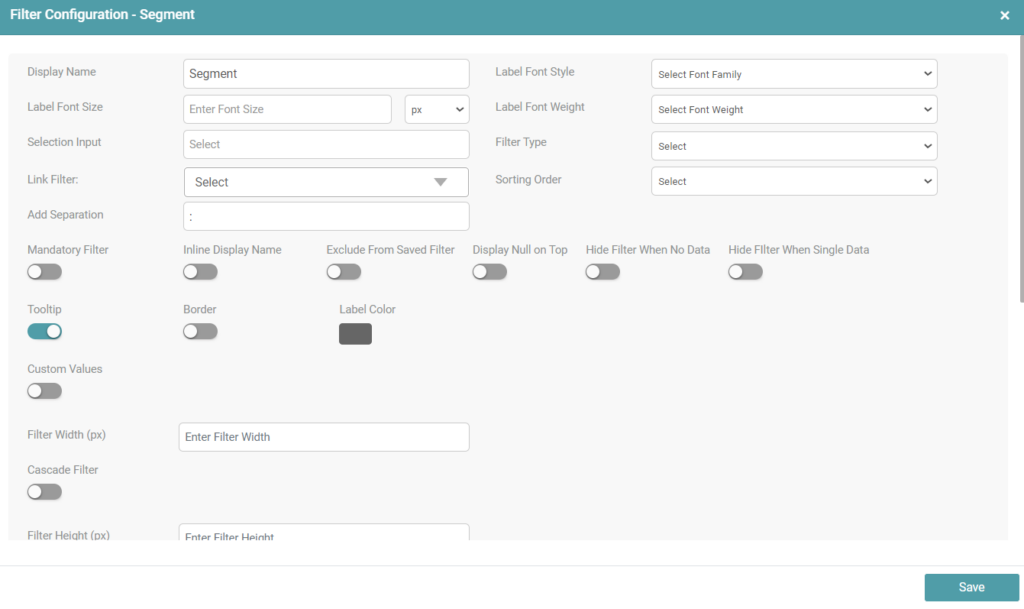
Step 3: You can configure the filters on the report page by clicking on the edit icon. (Refer to the image below).

Step 4: The filter configuration dialog box appears. (Refer to the image below).
Step 5: You can format the filters by using the various formatting options given.
Step 6: You are also able to use a variety of settings for your desired filter by clicking on the toggle. It is as described below:
Mandatory Filter: You can select all items in the filter by clicking on the select all checkbox, and by re-clicking, you can deselect them. In the case of mandatory filters, once applied, you cannot deselect or disable them.
Inline Display Name: The name of the filter will be displayed inside the filter dropdown instead of the “Select All” option.
Exclude from Saved Filter: You have the option to remove a particular filter on the dashboard page, if you prefer not to save it.
Exclude from Download: The filter will be excluded when the dashboard is being downloaded.
Display Null on Top: The column, which is null will be displayed at the top, followed by the rest of the filter items.
Hide Filter: Hides the filter from the dashboard view, while still applying the default selected filter value in the background.
Hide Filter When Single Data: The filter items will be hidden in scenarios where there is when there’s only a single data in the filter.
Hide Filter When No Data: The filter items will be hidden in scenarios where there is when there’s no data in the filter.
Server-Side Search: By default, a maximum of 200 filter options are shown in the filter. To display more than 200 items, you can enable server-side search, which will extract and display all available data.
Strict search: Case-sensitive. If the text does not match the exact case, it won’t be found. This toggle appears once the Server-Side Search toggle has been enabled.
Apply filter on click: Automatically filters the data upon selection, without the need for additional clicks.
Exclude from Saved Filter: Enabling this toggle prevents the filter selection from being saved on the dashboard page. This filter will be omitted from the saved filter set.
Exclude Filter From Download: Enabling this toggle ensures the filter is excluded when downloading the report or dashboard.
Display Null on Top: Enabling this option brings the “Null” data to the top of the filter options.
Group by Count: For example, with an age filter, if there are 4 people aged 20, enabling this toggle groups them together with a count, displaying as 20 (4).
Clear All Filters: Enabling this toggle provides a “Clear All” button that clears all filter selections. You can also customize the color of the “Clear All” button.
Tooltip: Enabling this toggle adds a tooltip for the filter on the dashboard page.
Exclude from Scheduler: Enabling this toggle excludes the specified filter from the scheduler.
Border: Enabling this toggle adds a border around your filter. You can customize the color, width, height, and radius of the border.
Custom Values: Enabling this toggle allows you to input your own custom values for the filter.
Retain Current Filter: Enabling this toggle allows you to retain the current filter selection on the dashboard.
Disable Suggestion List: This toggle applies to the input filter. Enabling it will disable the suggestion list that appears when you input the filter value.
Filters from Custom Script
When using custom scripts, you can configure filters by editing the script.
Note: If there are no filters applied, you must use
isEmptybefore the@Filterstatement to ensure all records are fetched. This typically goes after theWHEREcondition, followed byAND.
Dropdown or Multiselect Filters
Step 1: Open the custom script for the report.
Step 2: Insert the filter reference.
- If the filter is from a dataset:
@Filter.dataset_name.column_name
- If the filter is from a custom script:
@Filter.customscript_name.column_name
Step 3: Add a condition with isEmpty to handle cases when no filter is applied.
Example:
AND ( @Filter.dataset_name.column_name.isEmpty OR table_alias.actual_column_name IN (@Filter.dataset_name.column_name) )
(Replace dataset_name, column_name, and table_alias.actual_column_name with your actual dataset, column, and table names.)
Date Range Filters
Step 1: Open the custom script for the report.
Step 2: Insert a filter condition using a date column.
Step 3: Add isEmpty handling for cases with no filter selection.
Example:
AND ( @Filter.dataset_name.date_column.isEmpty OR table_alias.date_column @Filter.dataset_name.date_column )
(Replace dataset_name.date_column and table_alias.date_column with the relevant dataset and column names.)
Filter Formatting – Types
You can customize the filter according to the requirement.
Step 1: You can configure the filters on the report page by clicking on the edit icon. (Refer to the image below).
Step 2: The filter configuration dialog box appears. (Refer to the image below).
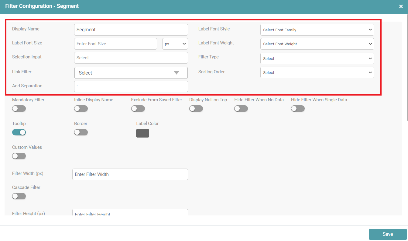
Step 3: You can customize the Display Name, Label Font Style, Label Font Size, Label Font Weight, choose a specific selection input that the filter ought to display, select the filter type, link the filter with other filters, select the sorting order and can also choose to add the separation between the filter label and the dropdown of the filter.
Identifier Name
In the case of a custom script, if the user gives two filters to the same column, then that filter is given an identifier name. This identifier name makes the filter unique.
Step 1: Drag and drop any chart/report onto the main screen.
Step 2: Create a report, make the required changes and save it.
Step 3: Click on the filter icon. Select a Data Source from the dropdown and choose a dataset.
Step 4: Drag and drop the required columns that need to be filtered onto the main screen.
Step 5: The user can see that there is a ‘Close’ and ‘Edit’ icon on each of the columns selected to be filtered.
Step 6: Click on the ‘Edit’ icon. A filter configuration po-up appears.
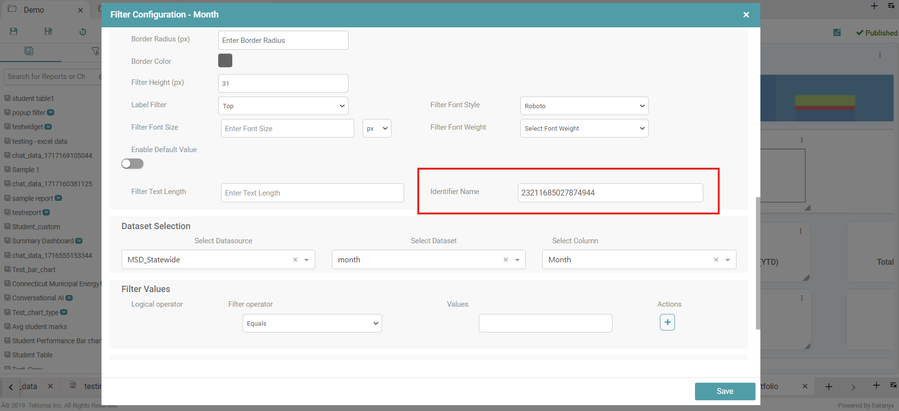
Step 7: The identifier name is already present.
Step 8: If one column has two filters then an identifier name is required. The identifier name makes filters unique. (Refer to the image below).
Step 9: The user is able to edit the identifier and enter any name they desire. After the required changes have been made, click on the save button.
Filter Text Length
Step 1: Drag and drop any chart/report onto the main screen.
Step 2: Create a report, make the required changes and save it.
Step 3: Click on the filter icon. Select a data source from the dropdown and choose a dataset.
Step 4: Drag and drop the required columns that need to be filtered onto the main screen.
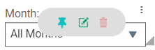
Step 5: The user can see that there is a ‘Close’ and ‘Edit’ icon on each of the columns selected to be filtered. (Refer to the image below).

Step 6: Click on the ‘Edit’ icon. A filter configuration pop-up appears.
Step 7: Enter the required ‘Filter Text Length’.
Step 8: Click on the save button. (Refer to the image below).
Step 9: You can see that the text length of the filter is in accordance with the value entered.
Filter Width
Step 1: Drag and drop any chart/report onto the main screen.
Step 2: Create a report, make the required changes and save it.
Step 3: Click on the filter icon. Select a Datasource from the dropdown and choose a dataset.
Step 4: Drag and drop the required columns that need to be filtered onto the main screen.
Step 5: You can see that there is a ‘Close’ and ‘Edit’ icon on each of the columns selected to be filtered. (Refer to the image below).

Step 6: Click on the ‘Edit’ icon. A filter configuration po-up appears.
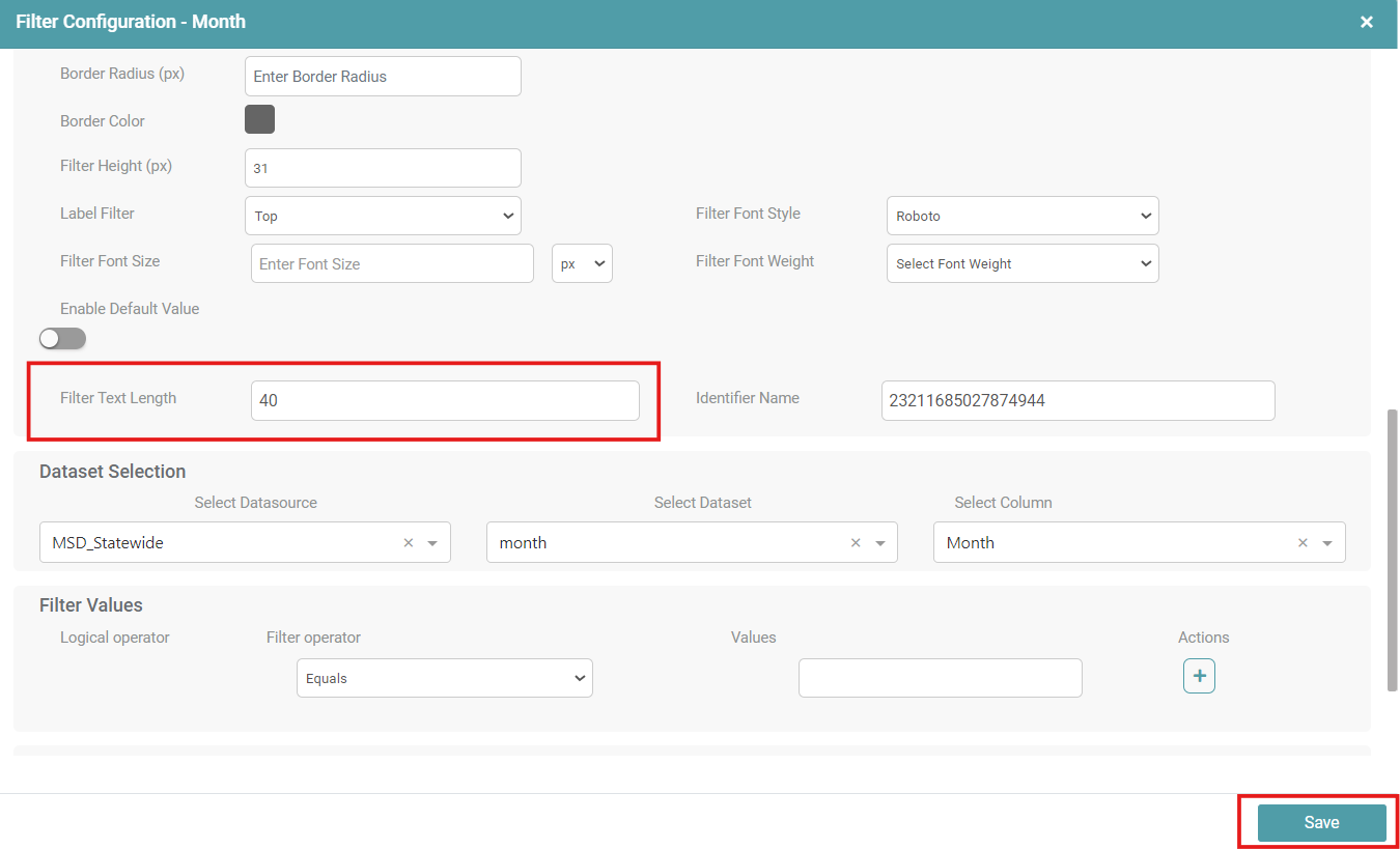
Step 7: Enter the required ‘Filter Width’.
Step 8: Click on the save button. (Refer to the image below).
Step 9: You can see that the filter width has been increased in accordance with the value entered.