Bar Plot – Introduction
Step 1: Once data is imported, click on the statistics tab.
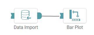
Step 2: Drag and drop the bar plot node onto the main screen. Connect the two nodes. (Refer to the image below).
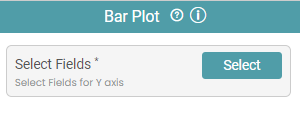
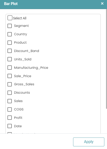
Step 3: Once a successful connection is made between ‘data import and bar plot’, click on the select button to choose the X and Y axis of the plot. A bar plot pop-up appears. (Refer to the images below).
Step 4: Once the columns have been selected, click on the run button to run the workflow. Click on the “Show Results” on the bottom line to view the result.
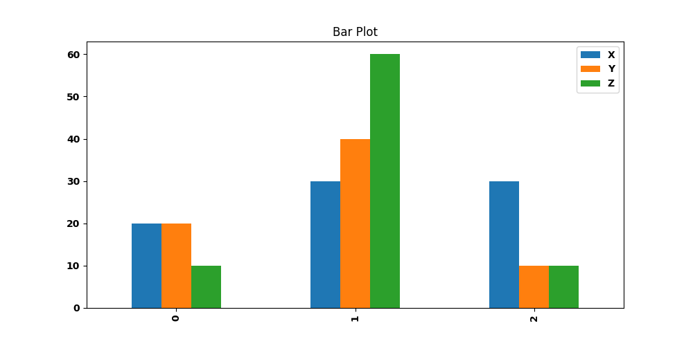
Step 5: The data is reflected in the form of a bar plot. (Refer to the image below).


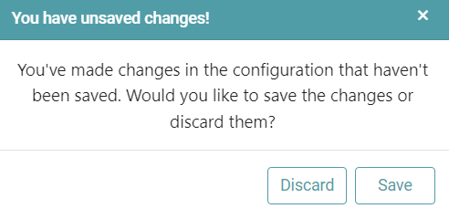
Note: After configuring a node, ensure you click “Save” to retain the changes. If you need to undo the configuration, click “Discard.” Failing to choose either “Save” or “Discard” will trigger a warning pop-up. (Refer to the image below).