Histogram – Introduction
Like bar charts, “Histogram” are graphs which show the frequency distribution. It is used to plot the frequency of score occurrences in a continuous data set.
Step 1: Once data is imported, click on the Statistics tab.
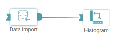
Step 2: Drag and drop the histogram node onto the main screen. Connect the two nodes. (Refer to the image below).
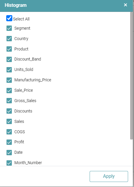
Step 3: Once a successful connection is made between ‘data import and histogram’, click on the select button. A pop-up appears with the columns present in the data.
Step 4: Columns can be selected in accordance with the user requirement.
Step 5: Click on ‘Apply’. (Refer to the image below).
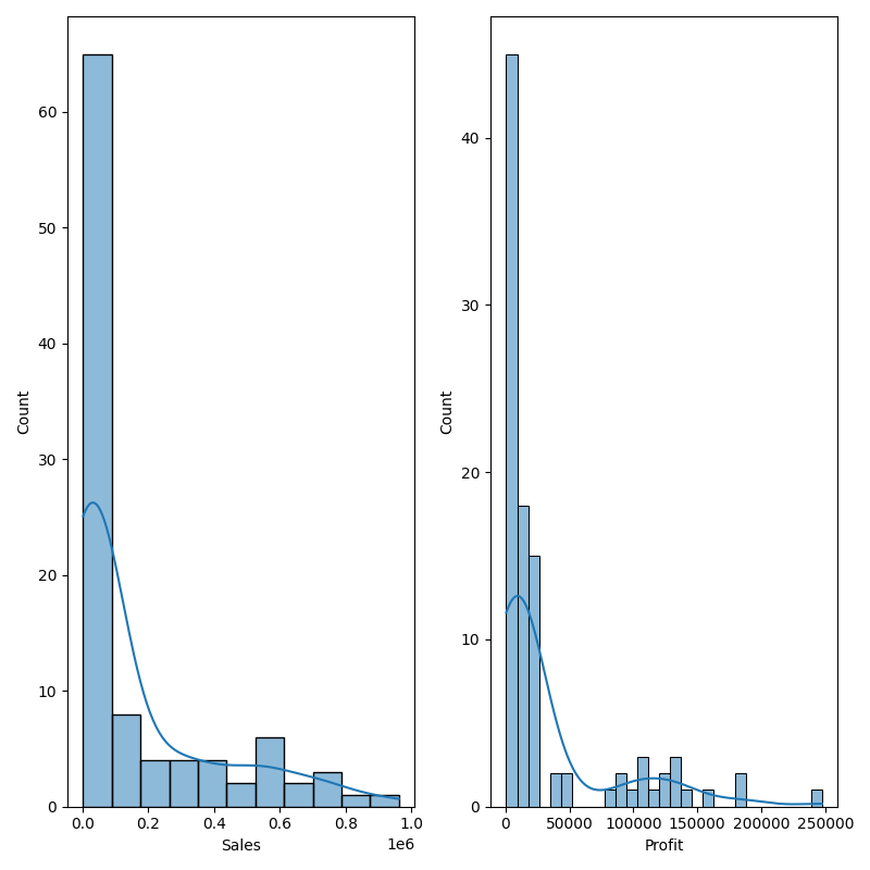
Step 6: Once the columns and the operations that need to be performed have been selected, click on the run button to run the workflow. Click on the “Show Results” on the bottom line to view the result.
Step 7: The data is reflected in the form of a histogram. (Refer to the image below).


Note: After configuring a node, ensure you click “Save” to retain the changes. If you need to undo the configuration, click “Discard.” Failing to choose either “Save” or “Discard” will trigger a warning pop-up. (Refer to the image below).
