Stack Plot – Introduction
A stack plot, also known as a stacked area plot or stacked line plot, is a type of data visualization that displays multiple data series as layers stacked on top of each other, creating a cumulative effect. Each layer represents a different data category or subgroup, and the height of the stack at any given point represents the combined value of all the layers at that point.
Step 1: Once data is imported, click on the statistics tab.
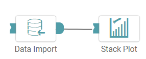
Step 2: Drag and drop the stack plot node onto the main screen. Connect the two nodes. (Refer to the image below).
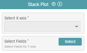
Step 3: Once a successful connection is made between ‘data import and fill between’, click on the “x” dropdown to choose the X axis of the plot. You can also choose the required fields by clicking on the select button. (Refer to the images below).
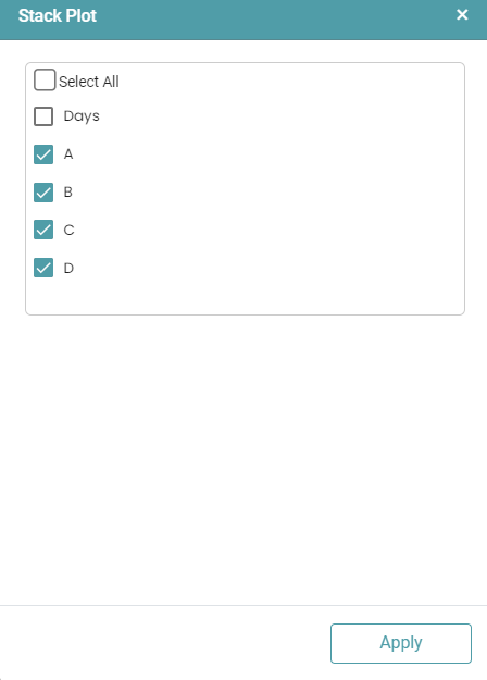
Step 4: Once this has been done, click on the apply button.
Step 5: Click on the run button to run the workflow. Click on the “Show Results” on the bottom line to view the result.
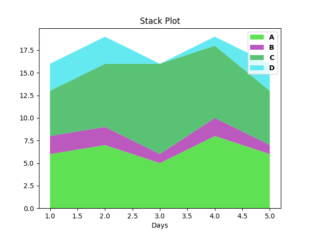
Step 6: The data is reflected in the form of a stack plot. (Refer to the image below).


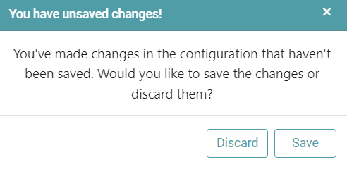
Note: After configuring a node, ensure you click “Save” to retain the changes. If you need to undo the configuration, click “Discard.” Failing to choose either “Save” or “Discard” will trigger a warning pop-up. (Refer to the image below).